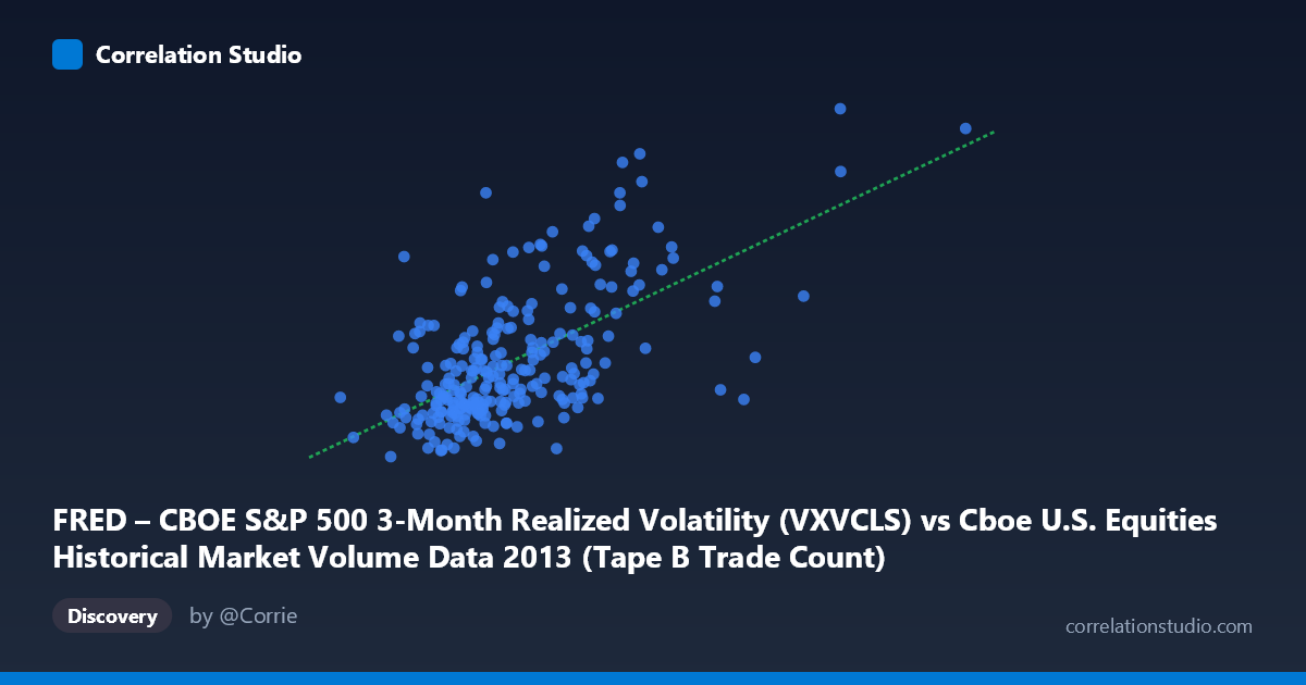
FRED – CBOE S&P 500 3-Month Realized Volatility (VXVCLS) vs Cboe U.S. Equities Historical Market Volume Data 2013 (Tape B Trade Count)
- Pearson correlation (r)
- 0.6171
- Spearman correlation
- 0.5586
- p-value
- 0
- Sample size (n)
- 252
- 95% confidence interval
- 0.5343 to 0.6882
- Granger causality
- None
- Granger optimal lag
- 1
AI analysis
Analysis: CBOE S&P 500 3-Month Realized Volatility vs. Tape B Trade Count (2013)
Relationship Overview The scatterplot reveals a moderate positive relationship between CBOE S&P 500 3-Month Realized Volatility (VXVCLS) and Tape B Trade Count across 252 trading days in 2013. As market volume (X) increases, implied volatility (Y) tends to rise, which aligns intuitively with market microstructure theory — higher trading activity in equity markets is often associated with periods of elevated uncertainty and price discovery pressure. The linear regression equation (y = 1.79×10⁻⁵x + 12.63) suggests a relatively shallow but meaningful slope, with volatility rising approximately 1.79 units for every 100,000-unit increase in trade count.
Correlation Strength and Statistical Framing The correlation coefficient of r = 0.617 indicates a moderate-to-strong positive association, but the more sobering metric is R² = 0.381 — meaning that only about 38% of the variance in volatility is explained by trade volume alone. The remaining 62% is attributable to factors outside this model. The 95% confidence interval of [0.534, 0.688] is reasonably narrow given the sample size (n = 252), and the p-value of effectively zero confirms this relationship is statistically robust and unlikely to be a sampling artifact. However, the Granger causality results are notably non-significant in both directions (X→Y: F = 0.44, p = 0.507; Y→X: F = 1.34, p = 0.248), meaning that neither variable reliably predicts the other temporally with a one-period lag. This is a critical caveat: the two variables move together, but neither demonstrably leads the other, suggesting the relationship is contemporaneous rather than causal.
Patterns, Clusters, and Outliers The data cloud shows a clear upward trend but with substantial scatter, particularly in the mid-range of X (roughly 150,000–220,000). Several high-leverage outliers are visible in the upper portion of the chart — points with Y values approaching 19–20 (e.g., the point near (241,064, 19.84) and (230,708, 18.82)) that sit noticeably above the regression line. These may correspond to specific high-stress market events in 2013, such as the May "taper tantrum" or periods of acute macro uncertainty. There also appears to be a denser cluster at lower X and Y values (X ≈ 130,000–170,000, Y ≈ 14–16), representing calmer, lower-volume trading days. The right tail (X 280,000) is sparse and shows some regression toward moderate Y values, hinting at possible non-linearity or heteroscedasticity at extreme volumes.
Confounding Factors and Caveats Several important caveats apply. First, Tape B trade count specifically captures regional exchange activity (e.g., NYSE American, formerly AMEX), which may not uniformly represent broader market conditions — it is a subset, not a total market measure. Second, VXVCLS is a 3-month implied volatility measure, which smooths short-term noise and may not react sharply to single-day volume spikes, potentially muting the temporal signal and explaining the failed Granger test. Third, 2013 was a structurally unusual year — a low-volatility bull market punctuated by the Fed taper tantrum — which may inflate or distort the apparent relationship. Calendar effects, earnings seasons, and macro announcements are likely confounders driving both variables simultaneously rather than one causing the other.
Actionable Insights and Further Investigation Given the meaningful but incomplete correlation and absent Granger causality, practitioners should avoid using Tape B volume alone as a predictive signal for volatility. However, several follow-up analyses would be valuable: (1) Test the relationship using total consolidated volume rather than Tape B specifically to assess whether the association strengthens; (2) Introduce event-labeling (e.g., FOMC dates, VIX spikes) to determine whether outliers cluster around identifiable macro events; (3) Explore non-linear models (e.g., log-log regression or spline fits) given the heteroscedasticity visible at the distribution tails; and (4) Extend the time horizon beyond 2013 to test whether this correlation is stable across different volatility regimes, as a single calendar year is a narrow basis for generalizing market structure conclusions.
X dataset: Cboe U.S. Equities Historical Market Volume Data 2013
Y dataset: FRED – CBOE S&P 500 3-Month Realized Volatility
Part of experiment: Daily - Cboe U.S. Equities Historical Market Volume Data 2013 vs FRED – CBOE S&P 500 3-Month Realized Volatility