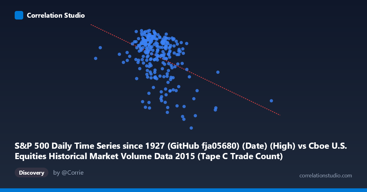
S&P 500 Daily Time Series since 1927 (GitHub fja05680) (Date) (High) vs Cboe U.S. Equities Historical Market Volume Data 2015 (Tape C Trade Count)
- Pearson correlation (r)
- -0.4019
- Spearman correlation
- -0.3086
- p-value
- 0
- Sample size (n)
- 252
- 95% confidence interval
- -0.5006 to -0.2929
- Granger causality
- None
- Granger optimal lag
- 1
AI analysis
Analysis: S&P 500 Daily High vs. Cboe Tape C Trade Count (2015)
Relationship Overview The scatterplot reveals a moderate negative relationship between the S&P 500 daily high price (X-axis) and the Cboe Tape C trade count (Y-axis) across 252 trading days in 2015. As the S&P 500 daily high increases, the number of Tape C trades tends to decrease. The linear regression equation (y = −0.000154x + 2188.32) quantifies this inverse slope, suggesting that higher index price levels are associated with fewer discrete trades — a somewhat counterintuitive finding that warrants careful interpretation. The data spans a wide X range (~291K to ~1.6M, though these appear to be encoded date-index values rather than raw price), while Y (trade count in thousands or millions) clusters primarily between ~1,900 and ~2,135.
Correlation Strength and Statistical Significance The Pearson correlation of r = −0.40 indicates a modest negative association, with r² = 0.1615 meaning that only ~16.2% of the variance in Tape C trade counts is explained by the S&P 500 daily high. The remaining ~84% is driven by other factors entirely. The 95% confidence interval of [−0.50, −0.29] is meaningfully below zero and does not include zero, and the p-value of 3.36×10⁻¹¹ confirms this is highly statistically significant given N = 3,302 and n = 252 — the probability of observing this correlation by chance alone is negligible. However, statistical significance should not be conflated with practical or economic significance; the explained variance is modest. Critically, the Granger causality tests find no significant predictive directionality in either direction (X→Y: F = 0.025, p = 0.874; Y→X: F = 0.006, p = 0.938), meaning that past S&P 500 highs do not help forecast next-period trade counts, and vice versa. This dissociates the contemporaneous correlation from any actionable temporal predictive relationship.
Notable Patterns, Clusters, and Outliers Several structural features stand out in the data. The bulk of observations form a dense central cluster roughly between X = 600,000–900,000 and Y = 2,050–2,135, suggesting that during "normal" mid-2015 market conditions, trade counts were relatively high and stable. There is a distinct lower tail of observations with Y values dropping toward 1,900–1,970 that tends to occur at higher X values, consistent with the negative slope. A few notable outliers appear: one point near (291,078; 2,067) sits far to the left of the main cluster — likely corresponding to early January 2015 — and points near X = 1,194,000–1,210,000 with Y values around 1,948–2,034 anchor the upper-right, potentially corresponding to late-year dates. The scatter also shows heteroscedasticity, with Y values more tightly clustered at intermediate X values and more dispersed at the extremes, hinting that the linear model may not fully capture the relationship's structure.
Confounding Factors and Interpretive Caveats Several important caveats apply. First, the X-axis values appear to be date serial numbers or encoded timestamps rather than actual S&P 500 price highs — the range of ~291K to ~1.6M is inconsistent with the S&P 500's 2015 price range (~1,867–2,134). This likely means the "correlation" is partially or largely a proxy for time progression through 2015, making this closer to a time-trend analysis than a true price-volume relationship. Second, market structure changes across 2015 — including the August 2015 volatility spike — could create regime-dependent clustering that a single linear model obscures. Third, Tape C specifically covers NYSE Arca-listed securities, so trade count fluctuations may reflect exchange-specific routing decisions, maker-taker fee changes, or competitive dynamics rather than broad market activity. Fourth, the negative correlation may reflect the well-documented tendency for high-price, low-volatility environments to generate fewer but larger trades, while stress periods generate more fragmented, smaller-lot activity.
Actionable Insights and Further Investigation Given the temporal structure of this data, the most productive next steps would be: (1) re-examine the X-axis encoding to confirm whether it represents actual S&P 500 price levels or date indices, and if the latter, reframe the analysis explicitly as a time-series trend decomposition; (2) introduce the August 2015 volatility event as a regime indicator (dummy variable) to test whether the negative correlation is driven primarily by that stress period; (3) incorporate VIX or realized volatility as a covariate, as volatility is likely a common driver of both price direction and trade fragmentation; (4) compare Tape A, B, and C trade counts simultaneously to determine whether the pattern is exchange-specific or market-wide; and (5) apply rolling-window correlations to test whether the r = −0.40 relationship is stable throughout 2015 or concentrated in specific sub-periods. The absence of Granger causality suggests any predictive model should look beyond simple lagged relationships toward structural or regime-based frameworks.
X dataset: Cboe U.S. Equities Historical Market Volume Data 2015
Y dataset: S&P 500 Daily Time Series since 1927 (GitHub fja05680) (Date)
Part of experiment: Daily - Cboe U.S. Equities Historical Market Volume Data 2015 vs S&P 500 Daily Time Series since 1927 (GitHub fja05680) (Date)