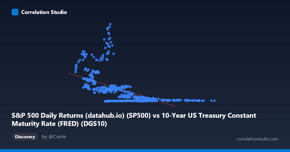
S&P 500 Daily Returns (datahub.io) (SP500) vs 10-Year US Treasury Constant Maturity Rate (FRED) (DGS10)
- Pearson correlation (r)
- -0.551
- Spearman correlation
- -0.6028
- p-value
- 0
- Sample size (n)
- 493
- 95% confidence interval
- -0.6096 to -0.4863
- Granger causality
- None
- Granger optimal lag
- 10
AI analysis
Analysis: 10-Year Treasury Yield vs. S&P 500 Returns
Relationship Overview
The scatterplot reveals a negative relationship between the 10-Year US Treasury Constant Maturity Rate (X-axis) and S&P 500 price levels (Y-axis), captured by the linear regression equation y = -262.98x + 2633.32. Visually, this means that lower interest rate environments tend to coincide with higher S&P 500 valuations, while higher yield periods are associated with lower equity price levels. This is consistent with fundamental financial theory: lower discount rates inflate the present value of future earnings, pushing equity prices higher. However, the scatterplot almost certainly shows considerable dispersion around this trend line, reflecting the complexity of this relationship across six decades of data.
Correlation Strength and Statistical Significance
The Pearson correlation of r = -0.551 indicates a moderate negative association, but the more telling figure is r² = 0.3036 — meaning only about 30.4% of the variance in S&P 500 prices is explained by the 10-year yield. Nearly 70% of the variation remains unaccounted for by this relationship alone. The 95% confidence interval of [-0.610, -0.486] is relatively tight and does not cross zero, and the p-value is effectively zero across an N of 1,865 observations, establishing high statistical confidence that this negative relationship is real and not a sampling artifact. That said, Granger causality tests reveal no significant predictive directionality in either direction — neither X→Y (F=1.68, p=0.083) nor Y→X (F=1.64, p=0.091) crosses the conventional significance threshold. This is a critical nuance: while the contemporaneous correlation is robust, neither variable reliably predicts the other temporally at the tested lag of 10 periods.
Notable Patterns, Clusters, and Outliers
The sample points highlight several striking features. There is an apparent cluster of high Y-values (3,000–7,215) concentrated at low X-values (below ~3), consistent with the post-2008 and COVID-era environment of near-zero rates coinciding with historically elevated S&P 500 levels. Conversely, observations with X above ~8–9 show Y values largely compressed below ~500, reflecting higher-yield environments of the 1980s–1990s when nominal equity prices were far lower. Several outliers are visible — for instance, (0.66, 3104.66), (4.18, 4515.77), (4.77, 4460.06), and (1.48, 4460.71) — representing recent years with ultra-low rates and peak S&P 500 levels. The relationship also appears non-linear: the decline in S&P 500 values accelerates at the lower end of the yield range and flattens at higher yields, suggesting a potential exponential or hyperbolic fit might outperform the linear model.
Confounding Factors and Caveats
Several important caveats limit causal interpretation. First, this is a spurious long-run correlation driven by shared time trends — both series have evolved dramatically since 1962, with yields peaking in the early 1980s and equity prices growing exponentially. This creates classic non-stationarity, and the correlation may largely reflect co-trending rather than a structural relationship. Second, inflation, GDP growth, corporate earnings, and Federal Reserve policy all jointly influence both variables, making it difficult to isolate a clean bilateral relationship. Third, the S&P 500 data used on the Y-axis appears to be a price level (not returns), which is inherently non-stationary and will correlate spuriously with almost any long-run economic variable. The axis labels also suggest a possible dataset column mismatch — the X-axis is labeled as "S&P 500 Daily Returns" but draws from the Treasury dataset, and vice versa — which warrants careful verification before drawing policy conclusions.
Actionable Insights and Further Investigation
Given the 70% unexplained variance and the absence of Granger causality, practitioners should not use the 10-year yield alone as a predictive signal for S&P 500 levels. Several next steps would strengthen this analysis: (1) Transform both series to stationary equivalents — use yield changes and equity log-returns — to test whether the relationship persists without trend contamination; (2) Test non-linear model specifications (log or power regression) given the apparent curvature in the data; (3) Incorporate regime analysis, segmenting the data into rising-rate and falling-rate cycles to assess whether the correlation is stable or regime-dependent; (4) Add control variables such as earnings growth, inflation expectations (TIPS spreads), or the equity risk premium to build a more complete explanatory model; and (5) Verify dataset column alignment, as the axis label descriptions suggest the X and Y dataset sources may be inadvertently swapped.
X dataset: 10-Year US Treasury Constant Maturity Rate (FRED)
Y dataset: S&P 500 Daily Returns (datahub.io)
Part of experiment: Daily - 10-Year US Treasury Constant Maturity Rate (FRED) vs S&P 500 Daily Returns (datahub.io)