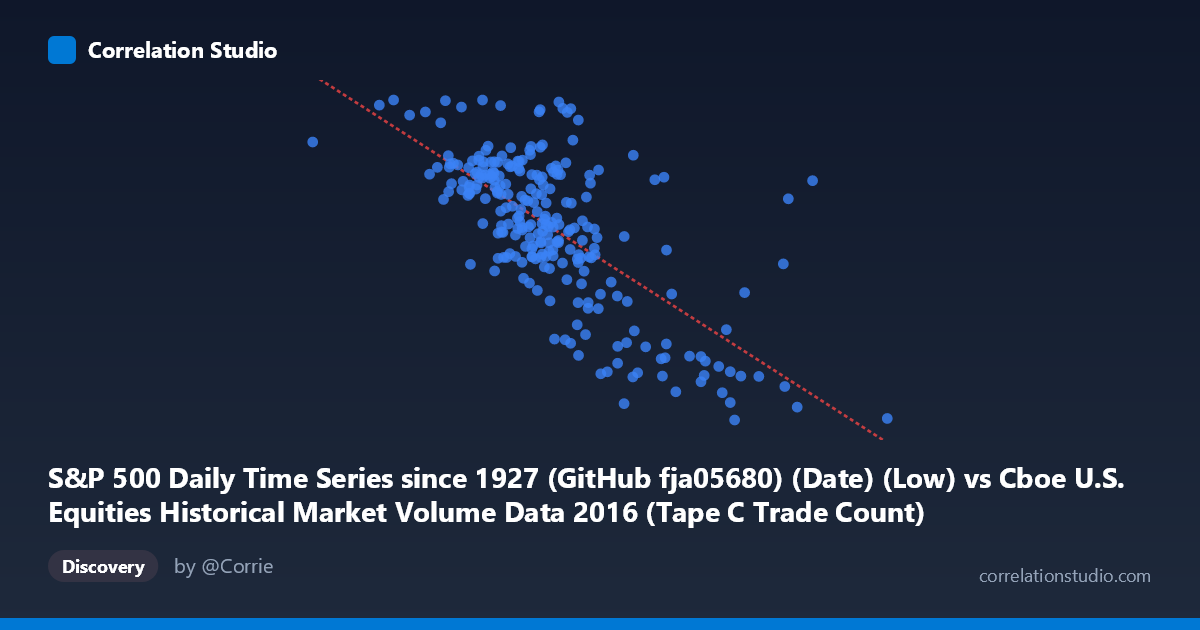
S&P 500 Daily Time Series since 1927 (GitHub fja05680) (Date) (Low) vs Cboe U.S. Equities Historical Market Volume Data 2016 (Tape C Trade Count)
- Pearson correlation (r)
- -0.6958
- Spearman correlation
- -0.6387
- p-value
- 0
- Sample size (n)
- 252
- 95% confidence interval
- -0.7545 to -0.6261
- Granger causality
- None
- Granger optimal lag
- 4
AI analysis
Analysis: S&P 500 Daily Low vs. Cboe Tape C Trade Count (2016)
1. Relationship Overview The scatterplot reveals a clear negative relationship between the S&P 500 daily low price and the Cboe Tape C trade count throughout 2016. As the index's daily low increases (i.e., higher market price levels), the number of trades recorded on Tape C tends to decrease. The linear regression equation (y = −0.000502x + 2441.66) captures this downward trend, suggesting that for every 100,000-point increase in the S&P 500 low, trade count drops by approximately 50 units. This pattern is visually consistent across much of the data range, though with notable dispersion, particularly at lower price values.
2. Correlation Strength, Direction, and Temporal Dynamics The Pearson correlation of r = −0.696 indicates a moderately strong negative association. The R² of 0.484 means that roughly 48.4% of the variance in Tape C trade count is explained by the S&P 500 daily low — a meaningful but incomplete picture, leaving over half the variance attributable to other factors. The 95% confidence interval of [−0.755, −0.626] is relatively tight and does not cross zero, reinforcing confidence in the direction and magnitude of the relationship. The p-value of ~0 confirms this is highly statistically significant and extremely unlikely to reflect sampling noise. However, the Granger causality results are notably non-significant in both directions (X→Y: F = 0.408, p = 0.803; Y→X: F = 1.122, p = 0.347), meaning that despite the strong contemporaneous correlation, neither variable reliably predicts the other's future values at a 4-period lag. This is a critical distinction: correlation exists in the present, but no temporal predictive arrow can be confidently drawn.
3. Notable Patterns, Clusters, and Outliers The data reveals a dense central cluster between roughly X = 600,000–800,000 and Y = 2,040–2,200, suggesting these represent the most common market conditions during 2016. At the lower X extreme (prices below ~500,000), trade counts are notably elevated — including one striking outlier near (519,410; 2,265), representing the highest trade count in the sample. Conversely, the upper X tail (values exceeding ~900,000–1,023,000) shows consistently depressed trade counts near or below 1,875, with points sitting well below the regression line's central tendency. This asymmetry hints at possible non-linearity or heteroscedasticity, where variance in trade count is larger at lower price levels and compresses at higher levels, a pattern worth modeling beyond simple linear regression.
4. Confounding Factors and Interpretive Caveats Several important caveats apply here. The datasets are being joined on date, meaning this correlation captures co-movement over time rather than a direct causal mechanism between price and trade count. The negative relationship likely reflects broader 2016 market dynamics: early 2016 saw market turbulence and lower index levels associated with elevated trading activity, while the post-election rally late in the year pushed prices higher amid shifting (and potentially lower retail-driven) trade volumes on Tape C specifically. Tape C covers NYSE Arca-listed securities, so its trade count doesn't represent total market activity. Additionally, the time-series nature of the data means observations are not independent — autocorrelation in both series could inflate the apparent correlation. Seasonal effects, macroeconomic events (Brexit, U.S. election), and Federal Reserve policy shifts are all potential confounders.
5. Actionable Insights and Further Investigation The absence of Granger causality suggests this relationship is contemporaneous and likely driven by a shared underlying factor — possibly market volatility or investor sentiment — rather than one variable mechanistically driving the other. A productive next step would be to incorporate the VIX (volatility index) as a mediating variable to test whether it explains much of the shared variance. Researchers should also consider applying a log transformation to the X variable or fitting a non-linear model to better capture the apparent curvature at the extremes. Segmenting the data into distinct 2016 market regimes (pre-Brexit, post-Brexit, post-election) could reveal whether the correlation holds consistently or is driven by specific episodes. Finally, expanding the analysis to Tape A and Tape B trade counts would clarify whether this pattern is unique to Tape C or a broader market phenomenon.
X dataset: Cboe U.S. Equities Historical Market Volume Data 2016
Y dataset: S&P 500 Daily Time Series since 1927 (GitHub fja05680) (Date)
Part of experiment: Daily - Cboe U.S. Equities Historical Market Volume Data 2016 vs S&P 500 Daily Time Series since 1927 (GitHub fja05680) (Date)