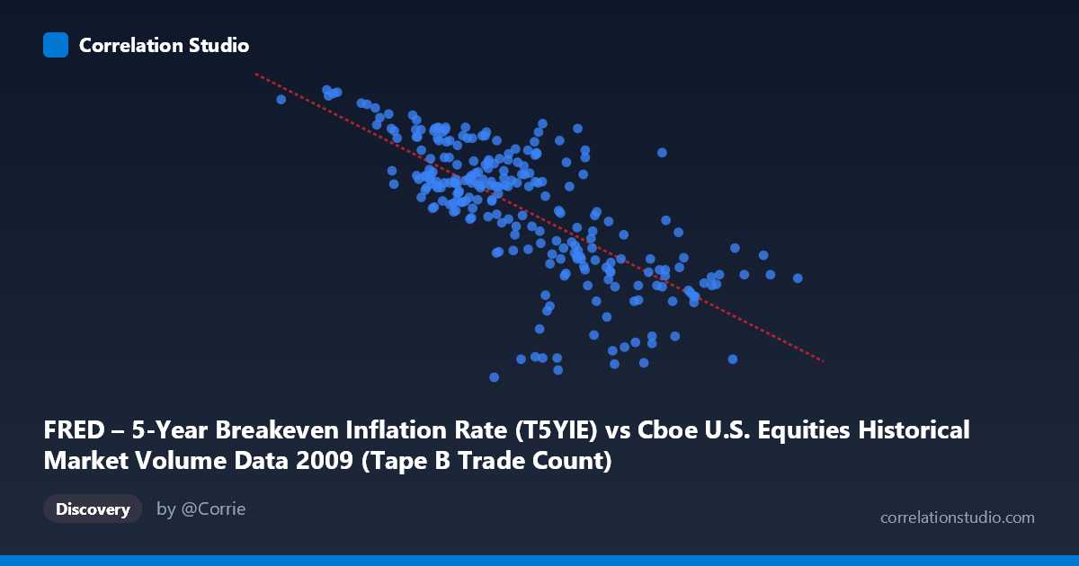
FRED – 5-Year Breakeven Inflation Rate (T5YIE) vs Cboe U.S. Equities Historical Market Volume Data 2009 (Tape B Trade Count)
- Pearson correlation (r)
- -0.7243
- Spearman correlation
- -0.7326
- p-value
- 0
- Sample size (n)
- 250
- 95% confidence interval
- -0.7785 to -0.6596
- Granger causality
- None
- Granger optimal lag
- 1
AI analysis
Scatterplot Analysis: 5-Year Breakeven Inflation Rate vs. Cboe Tape B Trade Count (2009)
Relationship Overview
The scatterplot reveals a moderately strong negative relationship between the Cboe U.S. Equities Tape B Trade Count (X-axis) and the 5-Year Breakeven Inflation Rate (Y-axis) across the 2009 trading year. The linear regression equation (y = -3.16081E-06x + 2.41307) shows that as daily equity trade counts increase, the breakeven inflation rate tends to decline. Visually, the data points form a downward-sloping cloud, with higher trade volumes clustering in the 400,000–650,000 range and corresponding to relatively lower inflation expectations (roughly 0.3–1.0), while lower trade volumes below ~350,000 tend to associate with higher inflation readings of 1.2–2.1. This inverse pattern is consistent and visually apparent across the full range of the data.
Correlation Strength and Statistical Significance
The Pearson correlation of r = -0.7243 indicates a moderately strong negative association, and the R² of 0.5247 means that approximately 52.5% of the variance in the breakeven inflation rate is statistically explained by variation in Tape B trade count — a meaningful but incomplete explanatory share, leaving nearly half the variance attributable to other factors. The 95% confidence interval of [-0.7785, -0.6596] is relatively narrow and does not cross zero, lending substantial confidence to the direction and approximate magnitude of this relationship. The p-value of essentially zero confirms this is highly unlikely to be a chance finding given the sample of 250 paired observations drawn from a population of 3,232. However, the Granger causality results tell a very different story: neither direction (X→Y: F = 0.0283, p = 0.867; Y→X: F = 1.005, p = 0.317) approaches statistical significance at even the most lenient thresholds. This means that while the two series are strongly correlated contemporaneously, neither variable temporally predicts the other — a critical caveat against inferring any mechanistic or causal relationship.
Patterns, Clusters, and Outliers
Several structural features stand out in the data. The lower-left region of the plot is notably sparse — very low trade counts with very low inflation rates are essentially absent — suggesting a floor effect or that these two extremes simply did not co-occur in 2009. There is a visible cluster of points with trade counts in the 460,000–550,000 range producing a wide spread of inflation values (roughly 0.4–1.8), indicating heteroscedasticity where the relationship's predictive precision degrades at mid-range volumes. A handful of apparent outliers are worth noting: the points near X ≈ 418,613–418,633 with Y values of -0.08 and 1.37 respectively (nearly identical trade counts but dramatically different inflation readings) may reflect consecutive trading days straddling a structural break or data anomaly. The extreme low-X observations (e.g., 81,703 at Y = 2.05; 156,192 at Y = 2.11) align with early 2009 conditions when markets were deeply distressed and inflation expectations had collapsed before recovering — these early-year points may be driving a disproportionate share of the observed correlation.
Confounding Factors and Interpretive Caveats
The most important caveat here is the temporal confound: both series share a strong common trend across 2009. Breakeven inflation rates began the year deeply depressed (near or below zero in early 2009 following the financial crisis) and recovered substantially as the year progressed, while equity trading volumes were elevated during peak crisis periods and normalized as markets stabilized. This means the observed correlation may largely reflect parallel recovery trajectories rather than any direct economic linkage between equity trade activity and inflation expectations. The axis labels also appear to be inverted from their dataset descriptions — the X-axis is labeled as the inflation breakeven rate but sourced from the Cboe volume dataset, and vice versa, which warrants verification before drawing substantive conclusions. Additionally, Tape B specifically covers NYSE American and regional exchange securities, a subset of total market activity, so this correlation may not generalize to broader market volume measures.
Actionable Insights and Further Investigation
Given the strong contemporaneous correlation but absent Granger causality, the most productive next steps would involve controlling for the shared time trend by detrending or differencing both series and re-examining whether any residual correlation persists — this would distinguish genuine cross-sectional co-movement from spurious trend alignment. Researchers should also investigate the late-2008 to early-2009 transition period more closely, as the cluster of high-Y, low-X observations likely reflects the acute crisis phase and may behave as a structural regime distinct from the recovery period. Expanding the analysis to include total market volume across all tapes rather than Tape B alone, and incorporating macroeconomic controls such as the VIX or credit spreads, would help isolate whether this relationship holds after accounting for shared drivers of market stress. Finally, the axis label discrepancy should be resolved before any findings are communicated or acted upon, as the practical interpretation reverses entirely depending on which variable is truly the predictor.
X dataset: Cboe U.S. Equities Historical Market Volume Data 2009
Y dataset: FRED – 5-Year Breakeven Inflation Rate
Part of experiment: Daily - Cboe U.S. Equities Historical Market Volume Data 2009 vs FRED – 5-Year Breakeven Inflation Rate