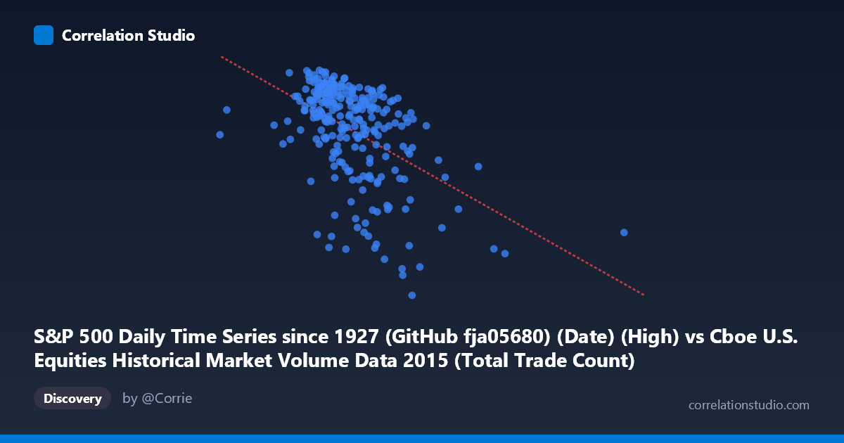
S&P 500 Daily Time Series since 1927 (GitHub fja05680) (Date) (High) vs Cboe U.S. Equities Historical Market Volume Data 2015 (Total Trade Count)
- Pearson correlation (r)
- -0.4833
- Spearman correlation
- -0.4719
- p-value
- 0
- Sample size (n)
- 252
- 95% confidence interval
- -0.5727 to -0.3825
- Granger causality
- None
- Granger optimal lag
- 1
AI analysis
Analysis: S&P 500 Daily High vs. Total Trade Count (2015)
Relationship Overview The scatterplot reveals a moderate negative relationship between the S&P 500 daily high price (X-axis) and the total U.S. equity trade count (Y-axis) across 2015. As the S&P 500 index reached higher price levels, the total number of equity trades tended to be lower, suggesting that elevated market valuations in 2015 coincided with reduced trading activity. The linear regression equation (y = −5.23×10⁻⁵x + 2201.98) captures this downward slope, though the scatter around the regression line is substantial, indicating the relationship is real but far from deterministic.
Correlation Strength and Statistical Significance The Pearson correlation of r = −0.483 indicates a moderate negative association. However, the r² value of 0.234 means that only about 23.4% of the variance in trade count is explained by the S&P 500 daily high — leaving roughly 76.6% of variation unexplained by this linear relationship alone. The 95% confidence interval of [−0.573, −0.383] is entirely negative and meaningfully far from zero, affirming directional consistency. With a p-value of 4.4×10⁻¹⁶ across n = 252 paired observations (from a population of N = 3,302), the correlation is highly statistically significant, making chance an implausible explanation. That said, the Granger causality tests are notably uninformative — neither direction (X→Y: F = 0.0007, p = 0.979; Y→X: F = 0.0084, p = 0.927) approaches significance at any conventional threshold. This means that despite the cross-sectional correlation, neither variable temporally predicts the other at a one-period lag, strongly cautioning against any causal interpretation.
Notable Patterns, Clusters, and Outliers Several structural features stand out in the data. The bulk of observations cluster between X values of roughly 1,900,000–2,800,000 and Y values of 2,050–2,135, forming a relatively dense central cloud. However, there is a clear lower-right extension of points — notably observations like (3,907,922, 2034), (4,083,023, 1948), and (3,249,051, 1929) — representing days when the index was at high levels but trade counts were markedly lower, pulling the regression line downward. The point at (997,371, 2067) is a notable left-side outlier, far below the central X-axis range, possibly representing a data anomaly, a market disruption day, or a volume recording irregularity. There also appears to be a non-linear pattern: trade counts drop more steeply as prices enter the upper range (above ~3,000,000), hinting at a potential threshold or ceiling effect that a simple linear model may not fully capture.
Confounding Factors and Caveats Several important caveats temper interpretation. First, this relationship is almost certainly driven by shared temporal trends rather than a direct causal mechanism — both variables are indexed to calendar time in 2015, and the S&P 500 rose through much of the year while overall trade fragmentation and passive investing trends may have independently suppressed raw trade counts. Second, the axes are misaligned conceptually: the S&P 500 "Daily High" is a price level, not a volume or activity measure, so comparing it to trade counts conflates price dynamics with market microstructure behavior. Third, day-of-week effects, earnings seasons, Federal Reserve announcement days, and August 2015's volatility spike (visible in the lower-right cluster) likely introduce structured variation not captured by the linear model. The failure of Granger causality further underscores that this correlation likely reflects a common third driver — possibly macroeconomic conditions or the passage of time — rather than any direct predictive link.
Actionable Insights and Further Investigation Practitioners and researchers should consider several follow-up analyses. First, detrending both series (e.g., differencing or removing a common time trend) would reveal whether the correlation persists after removing secular drift, which would substantially strengthen any causal argument. Second, segmenting the data by volatility regime (e.g., pre- and post-August 2015 correction) could determine whether the relationship is stable or concentrated in specific market conditions — the lower-right cluster suggests the August selloff period may be disproportionately influential. Third, incorporating VIX data or bid-ask spreads as covariates could help isolate whether trade count is responding to uncertainty rather than to price levels per se. Finally, extending the analysis to multiple years would test whether 2015 reflects a durable structural relationship or a year-specific artifact, and applying a non-linear regression or spline model would better characterize the apparent threshold behavior at higher price levels.
X dataset: Cboe U.S. Equities Historical Market Volume Data 2015
Y dataset: S&P 500 Daily Time Series since 1927 (GitHub fja05680) (Date)
Part of experiment: Daily - Cboe U.S. Equities Historical Market Volume Data 2015 vs S&P 500 Daily Time Series since 1927 (GitHub fja05680) (Date)