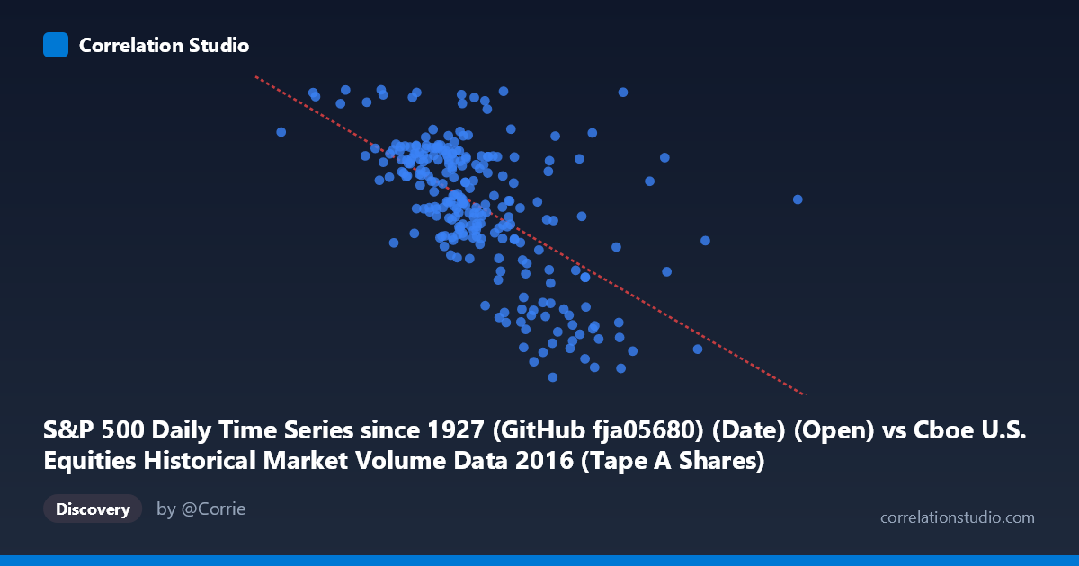
S&P 500 Daily Time Series since 1927 (GitHub fja05680) (Date) (Open) vs Cboe U.S. Equities Historical Market Volume Data 2016 (Tape A Shares)
- Pearson correlation (r)
- -0.6059
- Spearman correlation
- -0.6098
- p-value
- 0
- Sample size (n)
- 252
- 95% confidence interval
- -0.6787 to -0.5214
- Granger causality
- None
- Granger optimal lag
- 1
AI analysis
Analysis: S&P 500 Open Price vs. Cboe Tape A Share Volume (2016)
Relationship Overview The scatterplot reveals a moderate negative relationship between the S&P 500 daily open price (X-axis) and Cboe Tape A share volume (Y-axis) across 252 trading days in 2016. As the S&P 500 opened at higher price levels, Tape A share volume tended to be lower, and conversely, lower opening prices were associated with higher trading volumes. This inverse pattern is visually apparent as a downward-sloping cloud of points, consistent with the fitted regression line: y = -1.04 × 10⁻⁶x + 2377.91. The relationship is intuitive in a broad sense — periods of market stress or lower valuations often coincide with elevated trading activity as participants react to volatility.
Correlation Strength and Statistical Significance The Pearson correlation of r = -0.6059 indicates a moderate-to-strong negative association, and the R² of 0.3672 means that approximately 36.7% of the variance in Tape A share volume is explained by the S&P 500 open price alone — meaningful, but leaving nearly two-thirds of the variance unexplained by this single predictor. The 95% confidence interval of [-0.6787, -0.5214] is reasonably tight and entirely negative, confirming the direction of the effect with high confidence. The p-value of effectively zero (derived from a population of N = 3,622) strongly rejects the null hypothesis of no correlation. However, the Granger causality tests reveal no significant temporal predictive relationship in either direction (X→Y: F = 0.076, p = 0.783; Y→X: F = 0.641, p = 0.424), meaning that while the two variables are contemporaneously correlated, neither reliably predicts the other on the following trading day. This is a critical distinction: correlation here is likely driven by shared underlying conditions rather than a directional causal mechanism.
Notable Patterns, Clusters, and Outliers The data cloud shows a moderately dense central cluster roughly between S&P 500 opens of 200M–310M (index points in the open price range ~2040–2175 for Tape A volume), suggesting most of 2016's trading days fell within a relatively stable regime. However, several notable features stand out. A cluster of high-volume, lower-price points appears in the lower-left region (open prices ~105M–220M range), likely corresponding to the early 2016 market selloff (January–February), when equity markets dropped sharply and volume spiked. Conversely, a visible cluster of lower-volume, higher-price days in the upper-right aligns with the mid-to-late 2016 bull run. One prominent high-volume outlier near (190M, 2270) — possibly reflecting an extreme volatility event — sits above the general trend, and a few points at very high open price values (~363M, ~543M) appear at the far right with relatively low volume, potentially flagging data anomalies or non-trading calendar artifacts worth investigating.
Confounding Factors and Caveats Several important caveats temper interpretation. First, 2016 was a structurally unusual year — it encompassed the early-year global growth scare, Brexit (June), and the U.S. presidential election (November), each of which independently drove both price and volume in ways that could artificially inflate the observed correlation. Second, both series are time-indexed, meaning the correlation may partly reflect a spurious trend effect: S&P 500 prices trended upward throughout 2016 while volume patterns shifted seasonally and structurally, creating a coincidental negative co-movement that isn't necessarily causal. Third, Tape A volume specifically (NYSE-listed securities) may be influenced by exchange market share dynamics, algorithmic trading flows, and ETF rebalancing activity that have no direct link to the S&P 500 level. Fourth, the unit mismatch in the axis labels (X described as a "Date" column mapped to open price) warrants verification that the data join is correctly aligned on trading dates.
Actionable Insights and Further Investigation Practitioners should not use S&P 500 open price as a standalone predictor of Tape A volume given the lack of Granger causality — the relationship is contemporaneous, not predictive. A more productive direction would be to incorporate VIX (volatility index) as a mediating variable, as it likely explains a significant portion of both the price-volume relationship and the residual variance (~63%). It would also be valuable to decompose the analysis by market regime (e.g., pre/post-Brexit, pre/post-election) to test whether the correlation is stable or regime-dependent — the clustered structure in the scatterplot strongly hints at regime shifts. Additionally, multivariate regression incorporating lagged volume, day-of-week effects, and macro event dummies would improve explanatory power. Finally, confirming the data alignment and resolving the apparent axis label ambiguity (Open price vs. date serial numbers) is a necessary data quality step before drawing further conclusions.
X dataset: Cboe U.S. Equities Historical Market Volume Data 2016
Y dataset: S&P 500 Daily Time Series since 1927 (GitHub fja05680) (Date)
Part of experiment: Daily - Cboe U.S. Equities Historical Market Volume Data 2016 vs S&P 500 Daily Time Series since 1927 (GitHub fja05680) (Date)