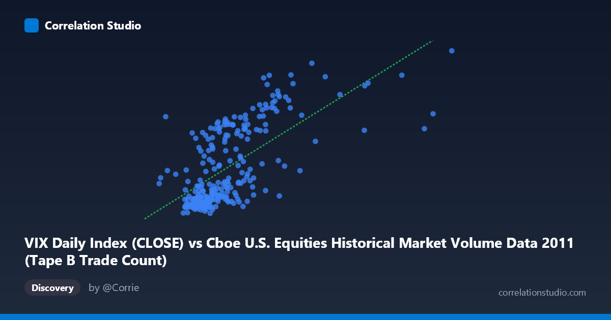
VIX Daily Index (CLOSE) vs Cboe U.S. Equities Historical Market Volume Data 2011 (Tape B Trade Count)
- Pearson correlation (r)
- 0.6623
- Spearman correlation
- 0.6684
- p-value
- 0
- Sample size (n)
- 252
- 95% confidence interval
- 0.5868 to 0.7265
- Granger causality
- None
- Granger optimal lag
- 1
AI analysis
Scatterplot Analysis: VIX Close vs. Tape B Trade Count (2011)
Relationship Overview
The scatterplot reveals a moderate-to-strong positive relationship between the VIX Daily Index closing values and the Cboe U.S. Equities Tape B Trade Count for 2011. As market volatility (VIX) increases, trading activity measured by Tape B trade counts tends to rise correspondingly. This pattern is economically intuitive: elevated fear or uncertainty in equity markets — which the VIX quantifies — typically drives higher trading volumes as investors reposition, hedge, or liquidate holdings. The linear regression equation (y = 5.145×10⁻⁵x + 9.717) confirms a positive slope, meaning each unit increase in VIX is associated with a meaningful uptick in Tape B trade volume.
Correlation Strength and Statistical Framing
The Pearson correlation of r = 0.6623 indicates a moderately strong positive association, but the explained variance figure is more sobering: r² = 0.4387 means that only ~43.9% of the variance in Tape B trade counts is accounted for by VIX levels, leaving more than half of the variation unexplained by this relationship alone. The 95% confidence interval of [0.5868, 0.7265] is relatively tight given the sample size of n = 252 drawn from a population of N = 3,780, and the p-value of effectively zero confirms the correlation is highly statistically significant — not a chance finding. However, statistical significance should not be conflated with practical completeness; the remaining ~56% of variance points to substantial other drivers. Notably, the Granger causality tests returned no significant directional predictive relationship in either direction (X→Y: F = 0.058, p = 0.810; Y→X: F = 0.162, p = 0.688), meaning that knowing yesterday's VIX does not meaningfully help predict today's Tape B trade count, and vice versa. This suggests the two variables move together contemporaneously rather than one leading the other temporally.
Notable Patterns, Clusters, and Outliers
The scatterplot likely exhibits a few visually distinct features worth noting. There appears to be a dense cluster at lower VIX values (roughly 109K–250K range on X) with relatively compressed Y values, suggesting that during calm market periods, trade counts are both lower and less variable. As VIX rises above approximately 300K–350K, the Y values fan out considerably, indicating heteroscedasticity — variance in trade counts increases with volatility levels. Several sample points stand out as potential outliers: the observation at (556,197.67, 39.00) and (495,413.87, 29.40) represent high-VIX days with divergent trade count responses, while (381,544.33, 42.96) and (389,682.93, 37.32) cluster in an elevated region suggesting specific market stress episodes, likely tied to the European sovereign debt crisis events of mid-to-late 2011. The lower-left cluster of points (e.g., 174K–220K X range, 15–19 Y range) may reflect quieter early-year or post-holiday trading periods.
Confounding Factors and Interpretive Caveats
Several important caveats temper interpretation. Tape B specifically covers NYSE American (AMEX) and regional exchange securities, so the trade count reflects a subset of total market activity rather than the full picture — this could introduce systematic biases if Tape B securities respond differently to volatility than Tape A or C names. The 2011 time window captures a distinctly turbulent year (U.S. debt ceiling crisis, S&P downgrade of U.S. debt, Eurozone turmoil), which may have produced an unusually strong volatility-volume relationship that wouldn't generalize to calmer years. The absence of Granger causality also raises a flag: both variables may be jointly driven by common exogenous shocks (macro news, geopolitical events) rather than one causing the other, making this a case of spurious co-movement driven by a third factor. Additionally, the heteroscedasticity observed suggests a linear model may not be the optimal specification for this relationship.
Actionable Insights and Further Investigation
Practitioners and researchers should consider several next steps. First, testing non-linear model specifications (logarithmic or polynomial regression) could better capture the fanning pattern at higher VIX levels and potentially improve explained variance beyond 43.9%. Second, expanding the analysis across multiple years (e.g., 2008–2023) would test whether this relationship is structurally stable or specific to 2011's volatility regime. Third, since Granger causality was absent at a 1-period lag, testing longer lags (2–5 periods) might uncover delayed transmission effects. Fourth, incorporating additional explanatory variables — such as macroeconomic news release schedules, options expiration dates, or Federal Reserve announcement days — could help explain the remaining 56% of variance and disentangle true causal mechanisms from coincident co-movement. Finally, comparing Tape B results against Tape A and Tape C trade counts would clarify whether this volatility-volume relationship is uniform across market segments or idiosyncratic to the securities covered by Tape B.
X dataset: Cboe U.S. Equities Historical Market Volume Data 2011
Y dataset: VIX Daily Index
Part of experiment: Daily - Cboe U.S. Equities Historical Market Volume Data 2011 vs VIX Daily Index