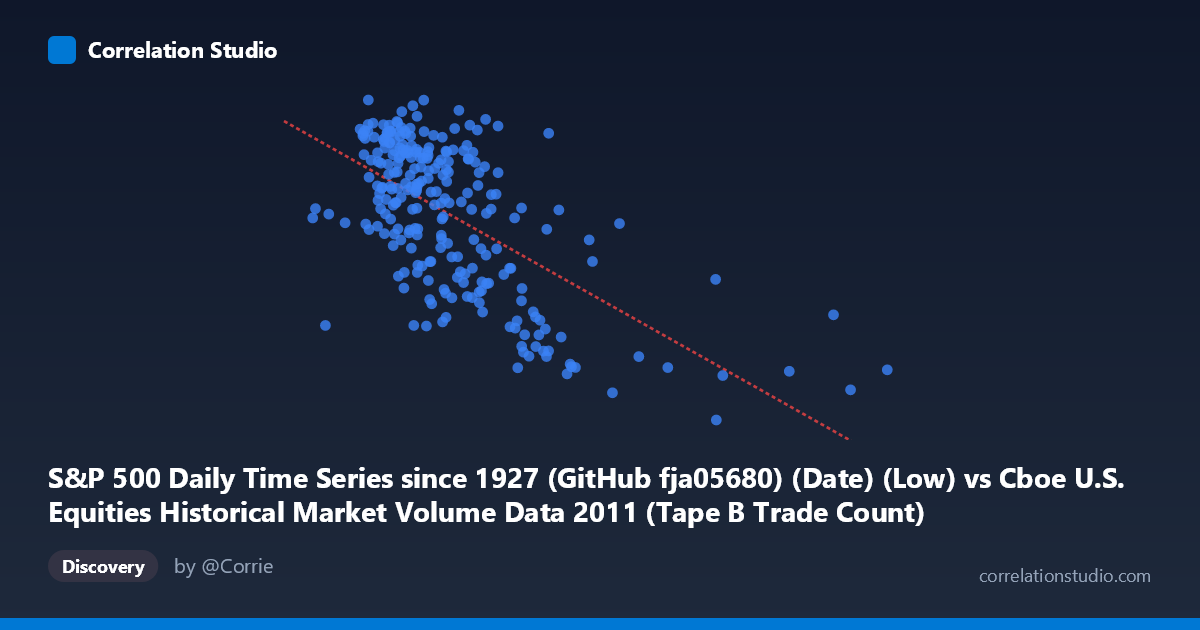
S&P 500 Daily Time Series since 1927 (GitHub fja05680) (Date) (Low) vs Cboe U.S. Equities Historical Market Volume Data 2011 (Tape B Trade Count)
- Pearson correlation (r)
- -0.6307
- Spearman correlation
- -0.5569
- p-value
- 0
- Sample size (n)
- 252
- 95% confidence interval
- -0.6998 to -0.55
- Granger causality
- None
- Granger optimal lag
- 4
AI analysis
Analysis: S&P 500 Daily Low vs. Cboe Tape B Trade Count (2011)
Relationship Overview The scatterplot reveals a moderate negative relationship between the S&P 500 daily low price and the Cboe Tape B trade count across 2011. As the S&P 500 low increases (i.e., the market trades at higher price levels), the number of Tape B trades tends to decrease. This is visually apparent in the downward-sloping regression line (y = -0.000398x + 1,369.12), though the scatter around the line is substantial, indicating meaningful unexplained variation. The data spans a wide X range (~109K to ~832K notional territory), with most observations clustered below 500K, and the Y values (trade counts) concentrated roughly between 1,100 and 1,360.
Correlation Strength and Statistical Interpretation The Pearson correlation of r = -0.631 indicates a moderate negative association, with r² = 0.398 meaning that only ~39.8% of the variance in Tape B trade counts is explained by the S&P 500 daily low. While statistically significant (p ≈ 0, n = 252, N = 3,780), the 95% confidence interval of [-0.700, -0.550] confirms the effect is reliably negative but not strong enough to be predictively dominant — roughly 60% of the variance remains unexplained by this linear relationship alone. Critically, the Granger causality tests show no significant predictive directionality in either direction (X→Y: F = 1.84, p = 0.12; Y→X: F = 0.34, p = 0.85), meaning that despite the contemporaneous correlation, neither variable meaningfully predicts the other's future values at the optimal 4-period lag. This is an important caveat: the relationship appears structural or coincident rather than temporally causal.
Notable Patterns and Outliers Several features stand out in the scatterplot. There is a dense cluster of points in the lower-left region (S&P low ~150K–350K, trade counts ~1,200–1,350), consistent with the majority of 2011 trading days when the market operated at lower price levels with higher relative trading activity. As X values extend beyond ~450K–500K, the scatter becomes more sparse and the trade counts drop noticeably toward 1,100–1,250, suggesting that high-price-level days see relatively fewer Tape B trades. A few apparent outliers at the far right (X 600K, including one near 832K) pull the regression tail considerably and may disproportionately influence the slope estimate. These high-X points may correspond to unusual trading days or data anomalies worth verifying.
Confounding Factors and Caveats This correlation likely reflects a shared temporal driver rather than a direct causal mechanism. In 2011, the S&P 500 experienced significant volatility — including the August debt-ceiling crisis — meaning both price levels and trading volumes were jointly influenced by macroeconomic stress events. Higher market stress (lower prices) tends to drive increased trading activity across all tapes, which would naturally produce the observed negative correlation. Additionally, Tape B specifically covers NYSE American (AMEX)-listed securities, so the relationship may reflect sector-specific dynamics rather than broad market behavior. The dataset join between S&P 500 price data and Cboe volume data introduces potential alignment and attribution issues, since these measure different market segments. The linear model also forces a potentially oversimplified functional form on what may be a more complex relationship.
Actionable Insights and Further Investigation Given that ~40% of variance is explained and Granger causality is absent, this correlation is informative for structural understanding but not suitable for short-term forecasting. Practitioners should investigate whether market volatility (e.g., VIX) serves as a better common predictor of both variables, which would confirm the confounding hypothesis. Segmenting the data by pre- and post-August 2011 crash periods would test whether the correlation is regime-dependent. Further analysis should explore non-linear models (e.g., polynomial or piecewise regression), given the visual suggestion of diminishing sensitivity at high X values. Finally, extending the analysis to other Tape designations (A and C) would clarify whether the Tape B relationship is idiosyncratic or a market-wide phenomenon.
X dataset: Cboe U.S. Equities Historical Market Volume Data 2011
Y dataset: S&P 500 Daily Time Series since 1927 (GitHub fja05680) (Date)
Part of experiment: Daily - Cboe U.S. Equities Historical Market Volume Data 2011 vs S&P 500 Daily Time Series since 1927 (GitHub fja05680) (Date)