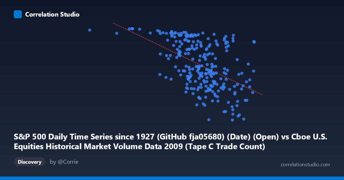
S&P 500 Daily Time Series since 1927 (GitHub fja05680) (Date) (Open) vs Cboe U.S. Equities Historical Market Volume Data 2009 (Tape C Trade Count)
- Pearson correlation (r)
- -0.5098
- Spearman correlation
- -0.5114
- p-value
- 0
- Sample size (n)
- 252
- 95% confidence interval
- -0.5958 to -0.4122
- Granger causality
- X → Y
- Granger optimal lag
- 4
AI analysis
Analysis: S&P 500 Opening Price vs. Cboe Tape C Trade Count (2009)
Relationship Overview The scatterplot reveals a moderate negative relationship between the S&P 500 daily opening price (X) and the Cboe Tape C trade count (Y) across 2009. As the S&P 500 opened at higher price levels, the number of trades on Tape C (primarily NYSE-listed securities) tended to decline. This inverse pattern is visually apparent in the downward-sloping regression line (y = −0.000588x + 1320.86), and it reflects the well-documented market dynamic of 2009: the index began the year near its crisis lows with extreme trading activity, and as prices recovered through the year, trading volumes and counts gradually normalized and contracted.
Correlation Strength and Statistical Interpretation The Pearson correlation of r = −0.510 indicates a moderate negative association, with the linear model explaining 26.0% of the variance in trade counts (r² = 0.2599). While statistically unambiguous — the p-value is effectively zero and the 95% confidence interval [−0.596, −0.412] excludes zero entirely — the remaining 74% of variance is unexplained, underscoring that price level alone is a poor standalone predictor of trade activity. Granger causality analysis adds meaningful temporal context: X (S&P 500 open) Granger-causes Y (trade count) unidirectionally at an optimal lag of 4 trading days (F = 2.545, p = 0.040), while the reverse direction fails to reach significance (p = 0.053). This suggests that S&P 500 price movements modestly predict subsequent trading activity roughly one week later, though the effect size is modest and the Y→X direction hovers near the conventional threshold, warranting caution about declaring strict unidirectionality.
Notable Patterns, Clusters, and Outliers Several structural features stand out in the data. There is a visible high-activity cluster at lower X values (roughly 500,000–620,000 range in the open price axis), corresponding to the crisis-period months of early 2009 when both volatility and trade counts were elevated — several points exceed 1,100 trade count units in this zone. Conversely, points at higher X values (above 750,000–800,000), representing the market recovery in Q3–Q4 2009, cluster at lower trade counts, often below 900. Two notable outliers warrant attention: the point near (185,887; 1,121) is a dramatic leverage on the X-axis — sitting far below the main data cloud — and likely represents an anomalous date or possible data alignment issue. Similarly, the point near (760,364; 679) represents an unusually low trade count at a mid-to-high price level, suggesting a possible low-volume session (e.g., a holiday-adjacent trading day). The scatter also appears to widen at intermediate X values, hinting at heteroscedasticity.
Confounding Factors and Caveats Several important caveats apply. First, 2009 was a structurally exceptional year — spanning the post-Lehman crisis trough (March 2009) through a strong recovery rally — meaning the price-to-volume relationship observed here may be largely driven by a one-directional secular trend rather than a stable structural mechanism. The correlation may be capturing little more than shared time-series trend (crisis → recovery), a form of spurious correlation driven by omitted temporal confounders. Second, the dataset alignment deserves scrutiny: the X-axis is labeled as S&P 500 date/open from one dataset while the Y-axis is trade count from a separate Cboe dataset, and the extreme outlier at X ≈ 185,887 raises questions about whether date-matching was perfectly consistent across sources. Third, Tape C specifically covers NYSE-listed equities, so trade count here does not represent total market activity; shifts in market share across exchanges could independently drive Tape C counts regardless of broad market price levels.
Actionable Insights and Further Investigation Practitioners and researchers should consider several follow-up directions. First, decompose the time series into trend and cyclical components to test whether the correlation persists after removing the shared 2009 recovery trend — a detrended or first-differenced analysis would clarify whether the relationship is structural or incidental. Second, given the 4-day Granger lag, it may be worth constructing a short-term predictive model incorporating lagged S&P 500 prices as a leading indicator of Tape C activity, potentially useful for exchange capacity planning or liquidity forecasting. Third, extend the analysis beyond 2009 to test whether this inverse relationship holds in non-crisis years; if the correlation weakens or reverses in normal market conditions, it would confirm that the 2009 result is crisis-regime-specific. Finally, incorporating volatility measures (e.g., VIX) alongside price level as a covariate would likely absorb substantial unexplained variance, given that fear and volatility — not price per se — are the more proximate drivers of elevated trade counts.
X dataset: Cboe U.S. Equities Historical Market Volume Data 2009
Y dataset: S&P 500 Daily Time Series since 1927 (GitHub fja05680) (Date)
Part of experiment: Daily - Cboe U.S. Equities Historical Market Volume Data 2009 vs S&P 500 Daily Time Series since 1927 (GitHub fja05680) (Date)