VIX Volatility Index Daily (FRED) (VIXCLS) vs Cboe U.S. Equities Historical Market Volume Data 2014 (Tape B Notional)
- Pearson correlation (r)
- 0.8201
- Spearman correlation
- 0.7052
- p-value
- 0
- Sample size (n)
- 252
- 95% confidence interval
- 0.7751 to 0.8569
- Granger causality
- None
- Granger optimal lag
- 1
AI analysis
Analysis: VIX Volatility Index vs. Tape B Notional Trading Volume (2014)
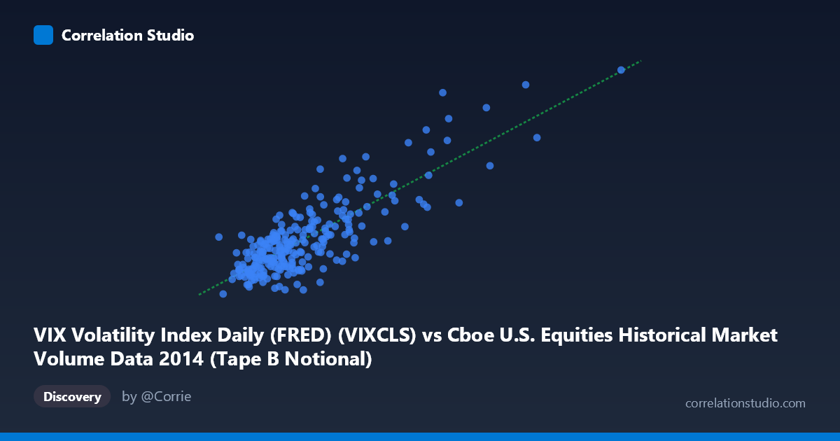
Relationship Overview The scatterplot reveals a clear positive relationship between Cboe Tape B notional trading volume (X-axis) and the VIX Volatility Index (Y-axis) across 252 trading days in 2014. As market volume increases, implied volatility tends to rise in tandem, which aligns intuitively with financial market theory: elevated trading activity often reflects heightened uncertainty, fear-driven repositioning, or institutional hedging behavior. The linear regression equation (y = 1.39×10⁻⁹x + 8.07) describes a shallow but consistent upward slope, with the intercept suggesting a baseline VIX around 8 even at minimal volume — though this extrapolation extends well beyond the observed data range.
Correlation Strength and Statistical Significance The Pearson correlation of r = 0.82 indicates a strong positive association, with r² = 0.6726 meaning that approximately 67.3% of the variance in VIX is explained by Tape B notional volume — a meaningfully large proportion for noisy financial data. The 95% confidence interval [0.775, 0.857] is relatively tight and entirely positive, reinforcing that this is not a chance finding, and the p-value of effectively 0 confirms statistical significance across the n=252 sample drawn from a population of N=3,686 observations. However, the Granger causality results are notably absent in both directions (X→Y: F=0.51, p=0.48; Y→X: F=0.02, p=0.88), meaning that neither variable temporally predicts the other at a 1-period lag. This is a critical caveat: despite the strong contemporaneous correlation, there is no evidence of a leading/lagging predictive relationship — both variables appear to move together simultaneously rather than one driving the other forward in time.
Notable Patterns, Clusters, and Outliers The data visibly clusters into two broad regimes. The majority of points concentrate in the lower-left region (X: ~2.1B–5.5B, Y: ~10–16), representing typical low-volatility, moderate-volume trading days characteristic of much of 2014's calm equity environment. A smaller but visually distinct upper-right cluster (X: ~7B–13B, Y: ~17–26) represents high-stress market episodes — likely corresponding to periods such as the October 2014 equity selloff, when VIX spiked toward 26. Several points at the extreme right (e.g., ~10.4B volume, VIX ~25.2 and ~9.4B, VIX ~23.6) appear as potential outliers that exert substantial leverage on the regression slope. The gap between the two clusters suggests the relationship may not be strictly linear — a piecewise or logarithmic model might better capture the regime-switching nature of volatility dynamics.
Confounding Factors and Interpretive Caveats Several important caveats apply. First, reverse causality is plausible within the same trading day: high VIX may itself drive volume rather than volume driving VIX, and the Granger test's failure to resolve directionality supports this ambiguity. Second, both variables are likely jointly driven by common underlying factors — macroeconomic shocks (e.g., geopolitical events, Federal Reserve announcements, or earnings seasons) that simultaneously spike fear and trading activity, making this correlation potentially spurious in a causal sense. Third, Tape B specifically covers NYSE American and regional exchanges, which may not fully represent total market activity, introducing a partial-market sampling bias. Finally, the relatively compact 2014 time window — a generally low-volatility year with one notable stress event — may produce an artificially inflated correlation that would not generalize across full market cycles.
Actionable Insights and Further Investigation Practitioners could use this relationship as a real-time regime indicator: unusually high Tape B notional volume may serve as a contemporaneous signal of elevated market stress even before VIX prints are widely disseminated. For further investigation, it would be valuable to (1) test across multiple years including high-volatility regimes (e.g., 2020, 2008) to assess whether the r² holds or degrades; (2) apply a logarithmic or spline regression to better model the apparent non-linearity and cluster separation; (3) introduce intraday granularity to resolve the causality question, since daily Granger tests may obscure minute-level dynamics; and (4) control for known confounders such as options expiration dates, FOMC meeting days, and earnings blackout periods that simultaneously inflate both volume and volatility. Exploring whether other Tape segments (A, C) show similar or stronger relationships would also help assess whether this is a Tape B–specific phenomenon or a market-wide structural feature.
X dataset: Cboe U.S. Equities Historical Market Volume Data 2014
Y dataset: VIX Volatility Index Daily (FRED)
Part of experiment: Daily - Cboe U.S. Equities Historical Market Volume Data 2014 vs VIX Volatility Index Daily (FRED)