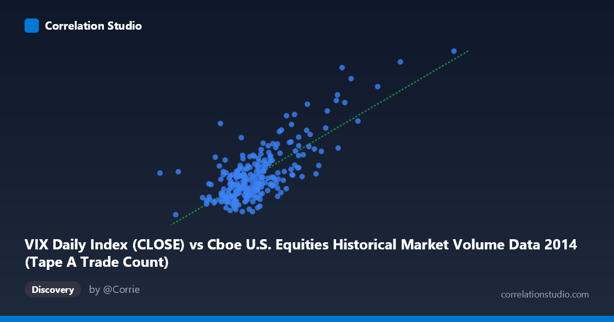
VIX Daily Index (CLOSE) vs Cboe U.S. Equities Historical Market Volume Data 2014 (Tape A Trade Count)
- Pearson correlation (r)
- 0.7478
- Spearman correlation
- 0.5929
- p-value
- 0
- Sample size (n)
- 252
- 95% confidence interval
- 0.6878 to 0.7977
- Granger causality
- None
- Granger optimal lag
- 1
AI analysis
Scatterplot Analysis: VIX vs. U.S. Equities Tape A Trade Count (2014)
Relationship Overview The scatterplot reveals a positive linear relationship between the CBOE Volatility Index (VIX) daily close values and U.S. equities Tape A trade counts throughout 2014. As VIX levels rise — reflecting heightened market uncertainty and fear — trading activity (measured by trade count) increases correspondingly. This is economically intuitive: volatile markets tend to trigger reactive trading behavior, with investors repositioning, hedging, or de-risking portfolios. The linear regression equation (y = 8.34×10⁻⁶x + 4.28) confirms a positive slope, though the very small coefficient reflects the scale difference between the raw trade count values (in the hundreds of thousands to millions) and the VIX index (roughly 10–26 in 2014).
Correlation Strength and Statistical Significance The Pearson correlation of r = 0.7478 indicates a moderately strong positive association. More precisely, r² = 0.5593 means that approximately 55.9% of the variance in Tape A trade counts is explained by VIX levels — a meaningful but incomplete explanation, leaving ~44% attributable to other factors. The 95% confidence interval of [0.6878, 0.7977] is relatively narrow given the sample size of n = 252 drawn from a population of N = 3,686, and the p-value of effectively zero confirms this relationship is highly unlikely to be due to chance. However, the Granger causality analysis complicates the picture: neither direction (X→Y nor Y→X) reaches conventional significance at the optimal lag of 1 period (VIX→Trade Count: F = 3.38, p = 0.067; Trade Count→VIX: F = 0.21, p = 0.645). This suggests that while contemporaneous correlation is strong, neither variable reliably predicts the other on a day-ahead basis, urging caution against assuming a clean predictive or causal mechanism from the correlation alone.
Notable Patterns, Clusters, and Outliers The data exhibits a clear clustering pattern in the lower-left region of the chart — a dense concentration of observations where VIX values fall between roughly 10–15 and trade counts are relatively moderate. This reflects the prolonged low-volatility environment that characterized much of 2014. However, there are several notable outliers in the upper-right quadrant, corresponding to VIX spikes above 20 (approaching 25–26) paired with very high trade counts. These points — likely associated with the market turbulence in mid-October 2014 related to Ebola fears and global growth concerns — appear to exert significant leverage on the regression line. There also appears to be modest heteroscedasticity: variance in trade counts fans out noticeably as VIX increases, suggesting the relationship may not be uniformly linear across the full VIX range, particularly in stress episodes.
Confounding Factors and Caveats Several important caveats apply. First, reverse causality is plausible: elevated trading volume itself can amplify price swings and contribute to VIX movements, meaning the relationship may be mutually reinforcing rather than directional — consistent with the non-significant Granger results. Second, common drivers such as major macroeconomic announcements, Federal Reserve policy communications, or geopolitical events likely simultaneously elevate both VIX and trade counts, making this a classic case of spurious correlation through shared external shocks rather than one variable mechanically causing the other. Third, the dataset covers only a single calendar year (2014), which was relatively calm for most of the year with one acute volatility spike; this limits generalizability to higher-volatility regimes. Finally, Tape A trade count is only one segment of U.S. equity market activity, and using total market volume might yield different results.
Actionable Insights and Further Investigation Despite the causality ambiguity, the strong contemporaneous correlation offers practical utility for risk and operations management: elevated VIX levels can serve as a real-time signal for exchanges and trading desks to anticipate surging order flow and scale infrastructure accordingly. To deepen this analysis, researchers should: (1) extend the time series across multiple years and market regimes (e.g., 2008–2009, 2020) to test whether the relationship holds under extreme volatility; (2) apply non-linear modeling (e.g., piecewise regression or GAMs) to capture potential threshold effects above VIX levels of ~20; (3) test lagged correlations at multiple horizons beyond 1 day to identify any medium-term predictive relationship that the single-lag Granger test may have missed; and (4) include additional covariates such as macroeconomic surprise indices, Fed meeting dates, and options expiration calendars to better isolate the independent contribution of VIX to trade activity.
X dataset: Cboe U.S. Equities Historical Market Volume Data 2014
Y dataset: VIX Daily Index
Part of experiment: Daily - Cboe U.S. Equities Historical Market Volume Data 2014 vs VIX Daily Index