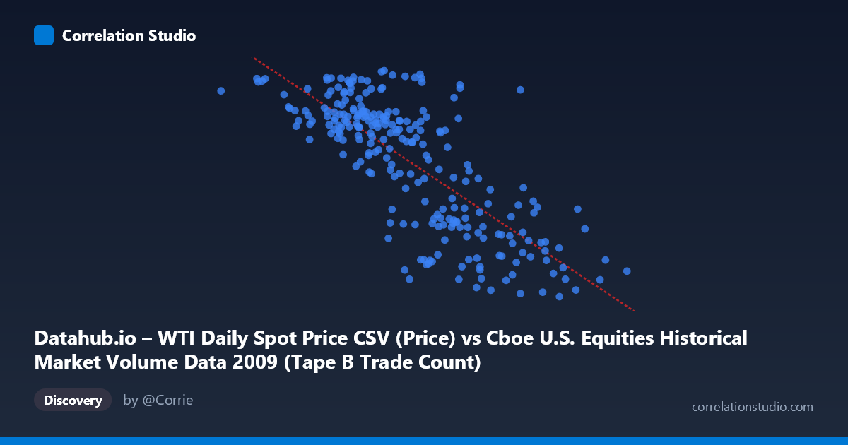
Datahub.io – WTI Daily Spot Price CSV (Price) vs Cboe U.S. Equities Historical Market Volume Data 2009 (Tape B Trade Count)
- Pearson correlation (r)
- -0.7646
- Spearman correlation
- -0.7395
- p-value
- 0
- Sample size (n)
- 252
- 95% confidence interval
- -0.8115 to -0.7079
- Granger causality
- None
- Granger optimal lag
- 1
AI analysis
Analysis: WTI Oil Price vs. Tape B Trade Count (2009)
Relationship Overview The scatterplot reveals a notable negative relationship between WTI crude oil spot prices (X-axis) and Cboe Tape B trade counts (Y-axis) across 2009 trading days. As oil prices rise, the number of Tape B equity trades tends to decline, and vice versa. This inverse pattern is visible throughout the point cloud, which slopes downward from left to right. The linear regression equation (y = -8.21×10⁻⁵x + 94.93) quantifies this: each one-dollar increase in WTI price is associated with roughly 0.000082 fewer Tape B trades — modest in absolute unit terms but meaningful given the scale of trading volumes involved.
Correlation Strength and Statistical Framing The Pearson correlation of r = -0.765 indicates a moderately strong negative association. More practically, R² = 0.585 means that approximately 58.5% of the variance in Tape B trade counts is statistically explained by WTI price levels — a substantial proportion for two seemingly disparate financial series. The 95% confidence interval of [-0.812, -0.708] is tight and entirely negative, reinforcing that this relationship is not a statistical artifact. The p-value of effectively zero confirms high statistical significance across the N = 3,232 population. However, the Granger causality results are telling: neither direction (X→Y: F=0.062, p=0.804; Y→X: F=2.31, p=0.130) reaches significance. This means that while the two variables move together, neither demonstrably predicts the other temporally — the correlation is contemporaneous rather than directionally causal, urging caution against any mechanistic interpretation.
Notable Patterns and Outliers Several features stand out within the point cloud. There is a visible concentration of high trade counts (70–81 trades) clustered at lower oil price levels (roughly $80,000–$350,000 range on the X-axis scale), while trade counts compress into a narrower, lower band ($37–$58) as prices exceed $500,000. A handful of points appear as potential outliers — notably the extreme right-side observation near X = 766,764 with a trade count of ~39, and the leftmost point near X = 81,703 with a trade count of ~77, both of which align well with the regression trend and likely represent the early-2009 low-price environment and late-2009 price recovery, respectively. Some vertical scatter is evident at mid-range X values, suggesting periods where trade counts varied considerably at similar price levels, hinting at non-price-driven volatility episodes.
Confounding Factors and Caveats The most significant caveat is that 2009 was an extraordinary market year, beginning in the depths of the global financial crisis and recovering through year-end. WTI oil prices roughly doubled from ~$35/barrel in February to ~$80/barrel by December, while equity market volumes were heavily influenced by panic selling, stimulus-driven rallies, and structural market microstructure changes — all largely independent of oil fundamentals. The apparent correlation may therefore largely reflect a shared temporal trend (both variables evolving through the crisis-to-recovery arc) rather than any genuine economic linkage. Additionally, Tape B specifically covers NYSE American and regional exchange stocks, which may have idiosyncratic volume dynamics. The dataset note mismatch (axes appear swapped in labeling) also warrants verification before drawing firm conclusions.
Actionable Insights and Further Investigation Given the strong contemporaneous correlation but absent Granger causality, the most productive next step would be to partial out the time trend — regressing both series on a time index and examining the residual correlation to determine whether the relationship persists beyond the shared crisis-recovery narrative. It would also be worthwhile to extend the analysis across multiple years to test whether this negative relationship is stable or specific to 2009's unique conditions. Examining whether other oil benchmarks (Brent, Henry Hub) or broader market volume metrics produce similar patterns could help isolate whether this is an oil-equity structural relationship or an artifact of this period. Finally, incorporating VIX or credit spread data as control variables would help disentangle fear-driven volume spikes from any oil-price-mediated effects on trading activity.
X dataset: Cboe U.S. Equities Historical Market Volume Data 2009
Y dataset: Datahub.io – WTI Daily Spot Price CSV
Part of experiment: Daily - Cboe U.S. Equities Historical Market Volume Data 2009 vs Datahub.io – WTI Daily Spot Price CSV