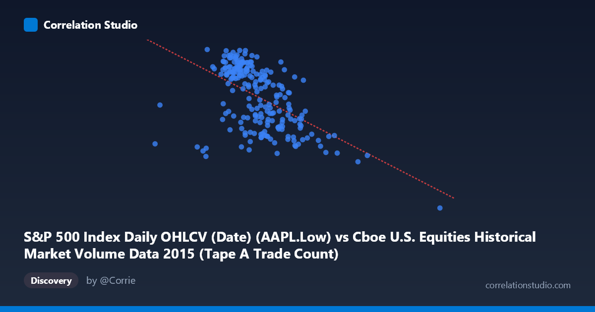
S&P 500 Index Daily OHLCV (Date) (AAPL.Low) vs Cboe U.S. Equities Historical Market Volume Data 2015 (Tape A Trade Count)
- Pearson correlation (r)
- -0.5277
- Spearman correlation
- -0.5459
- p-value
- 0
- Sample size (n)
- 222
- 95% confidence interval
- -0.6165 to -0.4256
- Granger causality
- None
- Granger optimal lag
- 1
AI analysis
Scatterplot Analysis: AAPL Low Price vs. Cboe Tape A Trade Count (2015)
Relationship Overview The scatterplot reveals a negative relationship between Apple's daily low price (X-axis) and the Cboe U.S. Equities Tape A Trade Count (Y-axis) across 2015. As AAPL's low price increases, trade count tends to decrease, and the linear regression equation (y = -1.56×10⁻⁵x + 141.856) quantifies this inverse slope. Visually, the bulk of data points cluster in a moderately downward-sloping band, with the relationship most apparent in the mid-to-upper price range, though considerable scatter exists throughout, suggesting the relationship is real but far from deterministic.
Correlation Strength and Statistical Interpretation The Pearson correlation of r = -0.5277 indicates a moderate negative association. However, the coefficient of determination r² = 0.2785 is the more practically informative metric — it means that only 27.8% of the variance in Tape A Trade Count is explained by AAPL's low price, leaving roughly 72% attributable to other factors. The 95% confidence interval of [-0.6165, -0.4256] is reasonably tight and does not cross zero, and the p-value of effectively 0 confirms this correlation is highly statistically significant and not a sampling artifact across the 222 paired observations. That said, statistical significance should not be conflated with practical magnitude — the explained variance remains modest. Critically, Granger causality tests yield no significant directional predictive relationship in either direction (X→Y: F=0.18, p=0.67; Y→X: F=0.02, p=0.88), meaning that past values of AAPL's low price do not reliably predict future trade counts, and vice versa. This strongly suggests the observed correlation reflects co-movement driven by shared underlying forces rather than any causal or temporally predictive mechanism.
Notable Patterns, Clusters, and Outliers The data exhibits several structurally important features. The main cluster sits roughly between AAPL low prices of $1.1M–$1.6M (in the scaled units shown) and trade counts of 110–131, where the inverse trend is most visible. Two prominent outliers stand out dramatically: the point near (2,923,236, 92.00) sits far to the right and bottom of the distribution, representing an anomalously high AAPL low value paired with the dataset's minimum trade count, potentially corresponding to a specific market event or data anomaly. Similarly, a point near (2,247,816, 103.50) extends well beyond the main cluster. A secondary sparse cluster appears at lower X values (around 576,208–971,306), with trade counts that don't follow the main trend cleanly. These outliers likely exert disproportionate leverage on the regression slope and correlation coefficient.
Confounding Factors and Interpretive Caveats Several important caveats apply. First, the dataset label mismatch deserves scrutiny — AAPL Low is drawn from one dataset while Tape A Trade Count comes from another, and their pairing by date assumes perfect alignment, which may introduce noise. Second, 2015 was a volatile year for equities (including the August flash crash), meaning both variables may be jointly driven by macro market conditions, VIX spikes, or Federal Reserve policy expectations rather than any direct relationship between AAPL pricing and broad exchange trade counts. Third, Tape A Trade Count reflects NYSE-listed securities broadly, not AAPL specifically, making a causal narrative tenuous. Fourth, the extreme outliers near X=2.9M and X=2.2M may represent data entry errors, unit inconsistencies, or extraordinary trading sessions that inflate the apparent correlation. Finally, with N=506 total observations but only n=222 paired, sample selection effects could influence results.
Actionable Insights and Further Investigation Given the moderate correlation without Granger causality, this relationship warrants cautious further investigation rather than direct application. Recommended next steps include: (1) Investigating the two extreme high-X outliers to determine if they represent data errors or genuine market events, as removing them may substantially alter r and r²; (2) Segmenting the analysis by market regime (pre/post August 2015 volatility) to test whether the correlation is stable or period-dependent; (3) Controlling for market-wide volatility (e.g., VIX, total market volume) to isolate whether the AAPL–trade count relationship persists after accounting for shared macro drivers; (4) Exploring non-linear models, as the scatter suggests potential curvature or regime breaks that a linear fit may underrepresent; and (5) testing whether other AAPL price metrics (volume, spread, close) produce stronger or more causally interpretable relationships with Tape A activity.
X dataset: Cboe U.S. Equities Historical Market Volume Data 2015
Y dataset: S&P 500 Index Daily OHLCV (Date)
Part of experiment: Daily - Cboe U.S. Equities Historical Market Volume Data 2015 vs S&P 500 Index Daily OHLCV (Date)