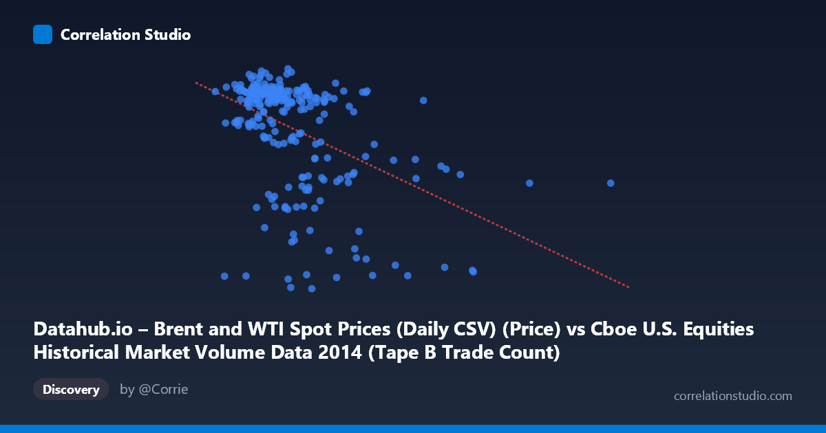
Datahub.io – Brent and WTI Spot Prices (Daily CSV) (Price) vs Cboe U.S. Equities Historical Market Volume Data 2014 (Tape B Trade Count)
- Pearson correlation (r)
- -0.4503
- Spearman correlation
- -0.4185
- p-value
- 0
- Sample size (n)
- 252
- 95% confidence interval
- -0.5436 to -0.3459
- Granger causality
- None
- Granger optimal lag
- 2
AI analysis
Analysis: Brent Oil Price vs. Cboe Tape B Trade Count (2014)
Relationship Overview The scatterplot reveals a moderate negative relationship between U.S. equity market trading volume (Tape B trade count, X-axis) and Brent crude oil spot prices (Y-axis) across 252 trading days in 2014. The linear regression equation (y = −9.00×10⁻⁵x + 118.83) indicates that as daily trade counts increase, Brent oil prices tend to decline. Visually, the data forms a loosely downward-sloping cloud with notable dispersion, suggesting the relationship is real but far from deterministic. The clustering of points at higher oil prices (~100–115 USD/barrel) corresponds predominantly to lower-to-moderate trade counts, while lower oil prices cluster at higher trade volumes.
Correlation Strength and Statistical Significance The Pearson correlation of r = −0.4503 reflects a moderate negative association, but the more telling figure is r² = 0.2027 — meaning only ~20% of the variance in Brent oil prices is explained by Tape B trade count. The remaining 80% is attributable to other factors entirely. The 95% confidence interval [−0.5436, −0.3459] is meaningfully bounded away from zero, and the p-value of 5.55×10⁻¹⁴ confirms this is highly statistically significant — not a chance finding given n = 252. However, statistical significance here is partly a function of the large population (N = 3,686) and sample size; significance does not imply practical importance. Critically, Granger causality tests show no significant predictive directionality in either direction (X→Y: F = 1.37, p = 0.255; Y→X: F = 0.82, p = 0.444), meaning neither variable reliably predicts the other temporally with a 2-period lag. This strongly cautions against any causal interpretation.
Notable Patterns, Clusters, and Outliers Several structural features stand out. There appear to be two broad regimes in the data: a dense cluster of points with Y values between ~100–115 USD/barrel (reflecting Brent's elevated price range in early-to-mid 2014) and a separate lower cluster around 55–85 USD/barrel (reflecting the sharp oil price decline in late 2014). Within the high-price cluster, trade counts are relatively compressed and moderate. The lower-price cluster shows greater spread in trade counts, including some very high-volume days. Specific outliers are visible — notably points near (478,251; 60.26), (559,868; 84.02), and (218,494; 55.60) — representing extreme combinations of high volume or anomalously low oil prices. The point at roughly (675,000; ~60) would represent the highest-volume trading day, coinciding with late-year oil price depression.
Confounding Factors and Caveats This correlation almost certainly reflects shared temporal trends rather than a direct causal mechanism. Both variables changed dramatically across 2014: Brent oil fell from ~$115 to ~$55/barrel in the second half of the year, while equity market volumes fluctuated with macroeconomic uncertainty, Fed policy signals, and geopolitical events (Ukraine, ISIS, OPEC decisions). The oil price collapse itself likely drove elevated market volatility and trading activity, meaning a third variable — market uncertainty or risk sentiment — plausibly drives both. Additionally, Tape B specifically covers NYSE American and regional exchange stocks, which may not be the most sensitive segment of the market to oil price movements. The absence of Granger causality further reinforces that this is a spurious or confounded correlation driven by the common 2014 time trend rather than a structural relationship.
Actionable Insights and Further Investigation Given these findings, practitioners should avoid using Tape B trade count as a predictive signal for oil prices or vice versa in isolation. More productive next steps would include: (1) controlling for the time trend by detrending or differencing both series before re-estimating correlation; (2) incorporating a volatility index (e.g., VIX) or broad market volume to test whether the relationship holds after accounting for risk sentiment; (3) examining whether energy-sector-specific equities show a stronger or more directional relationship with Brent prices; (4) extending the analysis to multiple years to determine whether 2014's oil shock creates a structurally unique correlation not present in calmer periods; and (5) applying regime-switching models to formally separate the high-price and low-price periods, which may reveal meaningfully different within-regime dynamics.
X dataset: Cboe U.S. Equities Historical Market Volume Data 2014
Y dataset: Datahub.io – Brent and WTI Spot Prices (Daily CSV)
Part of experiment: Daily - Cboe U.S. Equities Historical Market Volume Data 2014 vs Datahub.io – Brent and WTI Spot Prices (Daily CSV)