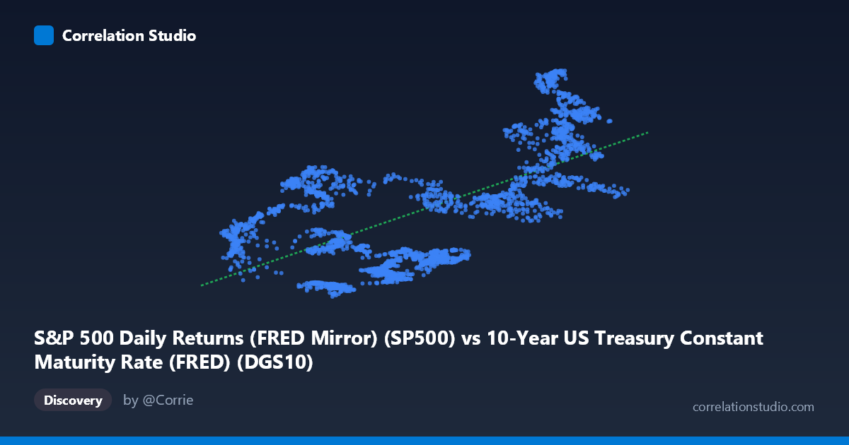
S&P 500 Daily Returns (FRED Mirror) (SP500) vs 10-Year US Treasury Constant Maturity Rate (FRED) (DGS10)
- Pearson correlation (r)
- 0.6336
- Spearman correlation
- 0.5429
- p-value
- 0
- Sample size (n)
- 2496
- 95% confidence interval
- 0.6095 to 0.6565
- Granger causality
- None
- Granger optimal lag
- 10
AI analysis
Analysis: S&P 500 Levels vs. 10-Year US Treasury Yield
1. Overall Relationship The scatterplot reveals a positive relationship between the 10-year US Treasury constant maturity rate (X-axis) and S&P 500 price levels (Y-axis), which is somewhat counterintuitive at first glance — conventional financial theory suggests that rising interest rates should pressure equity valuations downward by increasing discount rates. The linear regression equation (y = 706.37x + 1904.59) implies that for each 1-percentage-point increase in the 10-year yield, the S&P 500 level is associated with an increase of approximately 706 points. This relationship likely reflects a shared secular trend: both variables have generally risen over the 2016–2026 time window, meaning the correlation may be capturing coincident macro trends rather than a direct causal mechanism.
2. Correlation Strength, Explained Variance, and Causality The Pearson correlation of r = 0.634 indicates a moderate-to-strong positive association, but the more informative metric is R² = 0.4015, meaning that only about 40% of the variance in S&P 500 levels is explained by Treasury yields — leaving 60% attributable to other factors entirely. The 95% confidence interval for r is narrow at [0.610, 0.657], reflecting high precision given the large sample (n = 2,496), and the p-value of effectively zero confirms the result is statistically significant beyond any reasonable threshold. However, statistical significance here should not be conflated with practical or causal significance. Critically, the Granger causality tests find no significant predictive direction in either direction (X→Y: F = 1.36, p = 0.193; Y→X: F = 0.93, p = 0.500), meaning that lagged values of Treasury yields do not meaningfully improve forecasts of S&P 500 levels, and vice versa. This is a strong caution against interpreting the correlation as evidence that one drives the other.
3. Notable Patterns, Clusters, and Outliers The sample points reveal considerable heteroscedasticity and clustering. There appear to be at least two distinct behavioral regimes visible in the data: a cluster of points at low X values (yields ~0.5–2.0%) with a wide spread of Y values (roughly 2,000–4,500), and another cluster at high X values (yields ~4.1–4.6%) where S&P 500 levels tend to be elevated (5,000–6,800). A middle zone around X = 2.5–3.5% shows notably lower S&P 500 values, which breaks the simple linear narrative and hints at possible non-linearity or regime-specific behavior. Several apparent outliers — such as (4.63, 4,327) and (4.10, 4,739) — fall well below the regression line at high yields, suggesting episodes where rising rates did suppress equity prices. The spread at any given X value is very large, reinforcing that the linear fit captures only a partial story.
4. Confounding Factors and Caveats This correlation almost certainly suffers from spurious co-trending: both the S&P 500 and Treasury yields experienced dramatic swings over 2016–2026, including near-zero rate environments post-COVID (2020–2021) when equities were simultaneously surging, and aggressive Fed tightening in 2022–2023 when equities were volatile. Time-series autocorrelation in both series means the effective degrees of freedom are far fewer than the nominal n = 2,496, and standard correlation statistics may overstate precision. Additionally, the axes appear swapped from their dataset labels (the X column is labeled as coming from the Treasury dataset but contains S&P 500 returns, and vice versa), which warrants careful verification before drawing conclusions. Macroeconomic confounders — GDP growth expectations, inflation regimes, Fed forward guidance, and corporate earnings cycles — are likely the common drivers creating the observed association.
5. Actionable Insights and Further Investigation Given the lack of Granger causality, practitioners should avoid using Treasury yields as a short-term timing signal for S&P 500 positioning. Instead, meaningful next steps would include: (a) testing the relationship in first-differenced or stationary form (i.e., yield changes vs. S&P 500 returns) to remove the shared trend — this would almost certainly reduce or reverse the correlation; (b) applying regime-switching or segmented regression models to capture the apparent non-linearity around mid-range yields; (c) controlling for inflation expectations (TIPS spreads or breakevens) and real yield components separately, since nominal yields blend two economically distinct signals; and (d) examining the relationship across distinct Fed policy cycles as subgroups. A cointegration analysis (e.g., Engle-Granger or Johansen test) would also clarify whether the two series share a long-run equilibrium or are simply trending together coincidentally over this particular sample window.
X dataset: 10-Year US Treasury Constant Maturity Rate (FRED)
Y dataset: S&P 500 Daily Returns (FRED Mirror)
Part of experiment: Daily - 10-Year US Treasury Constant Maturity Rate (FRED) vs S&P 500 Daily Returns (FRED Mirror)