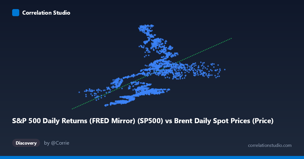
S&P 500 Daily Returns (FRED Mirror) (SP500) vs Brent Daily Spot Prices (Price)
- Pearson correlation (r)
- 0.4613
- Spearman correlation
- 0.5985
- p-value
- 0
- Sample size (n)
- 2480
- 95% confidence interval
- 0.4298 to 0.4918
- Granger causality
- None
- Granger optimal lag
- 10
AI analysis
Analysis: Brent Crude Oil Prices vs. S&P 500 Index
1. What the Visualization Reveals
The scatterplot displays a positive but notably diffuse relationship between Brent crude oil spot prices (X-axis, USD/barrel) and the S&P 500 index level (Y-axis). The linear regression line (y = 32.95x + 1,574.86) slopes upward, confirming a general tendency for higher oil prices to coincide with higher S&P 500 levels across this ~10-year window (2016–2026). However, the cloud of points is extremely wide, with substantial vertical scatter at virtually every X value — particularly in the mid-range of oil prices (50–85 USD/barrel), where S&P 500 values span nearly the full range from ~2,000 to ~7,000. This visual dispersion alone signals that oil price is a weak standalone predictor of equity index levels.
2. Correlation Strength, Direction, and Causality
The Pearson r of 0.4613 indicates a moderate positive correlation, but the explanatory power is modest: r² = 0.2128, meaning oil prices account for only ~21.3% of the variance in S&P 500 levels. The remaining ~79% is driven by factors entirely unrelated to oil. The 95% confidence interval [0.4298, 0.4918] is relatively tight given the large sample (n = 2,480), and the p-value of effectively zero confirms the correlation is statistically indistinguishable from chance being the cause — it is real and stable. Critically, however, Granger causality tests find no significant predictive direction in either direction: X→Y yields F = 1.74 (p = 0.067) and Y→X yields F = 0.56 (p = 0.849). Neither series reliably predicts the other temporally at the optimal 10-period lag. This means the correlation reflects co-movement — likely driven by shared macroeconomic conditions — rather than any actionable lead-lag relationship suitable for forecasting.
3. Notable Patterns, Clusters, and Outliers
Several structural features stand out in the sample points. There is a cluster of low oil prices (20–55 USD/barrel) paired with relatively low S&P 500 values (~2,000–3,500), likely capturing the 2016 oil downturn and the COVID-19 crash of early 2020. Conversely, a cluster of high S&P 500 readings (5,600–7,000) appears at moderate oil prices (65–82 USD/barrel), reflecting the post-2023 equity bull market where stocks surged while oil remained range-bound. The point near (21.74, 2846) is a probable outlier — very low oil price but a mid-range S&P level — consistent with the brief April 2020 oil price collapse. The Spearman ρ exceeding Pearson r explicitly flags a non-linear relationship, suggesting a logarithmic or polynomial fit would better capture the curve where equity gains accelerate at moderate oil prices but flatten or reverse at extremes.
4. Confounding Factors and Caveats
The most significant caveat is temporal confounding: both series trend upward over the 2016–2026 period due to inflation, economic growth, and monetary policy cycles, creating a spurious positive correlation that would partially dissolve after detrending or first-differencing. The relationship also likely regime-switches: during supply shocks (e.g., 2022 Russia-Ukraine), rising oil is bearish for equities; during demand-driven expansions, both rise together. Using price levels rather than returns conflates long-run trends with short-run dynamics. Additionally, the S&P 500 column appearing in the Brent dataset (and vice versa) suggests these were cross-joined time series, introducing potential date-alignment artifacts if trading calendars differ.
5. Actionable Insights and Further Investigation
Given the modest explanatory power and absence of Granger causality, oil prices alone should not be used as a forecasting signal for equity levels. Recommended next steps include: (1) rerunning the analysis on daily or weekly returns (first differences) rather than price levels to remove trend-driven spurious correlation; (2) fitting a polynomial or logarithmic regression as suggested by the Spearman/Pearson divergence to better characterize the non-linear structure; (3) segmenting by macroeconomic regime (expansion vs. recession, supply vs. demand shocks) to test whether the correlation sign itself flips across periods; and (4) incorporating additional variables — DXY (dollar index), Fed Funds Rate, global PMI — to build a multivariate model that contextualizes when oil-equity co-movement strengthens or breaks down. The relationship is real but context-dependent, not mechanistic.
X dataset: Brent Daily Spot Prices
Y dataset: S&P 500 Daily Returns (FRED Mirror)
Part of experiment: Daily - Brent Daily Spot Prices vs S&P 500 Daily Returns (FRED Mirror)