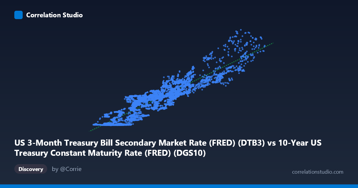
US 3-Month Treasury Bill Secondary Market Rate (FRED) (DTB3) vs 10-Year US Treasury Constant Maturity Rate (FRED) (DGS10)
- Pearson correlation (r)
- 0.9146
- Spearman correlation
- 0.9085
- p-value
- 0
- Sample size (n)
- 16083
- 95% confidence interval
- 0.912 to 0.9171
- Granger causality
- None
- Granger optimal lag
- 1
AI analysis
Analysis: US 3-Month T-Bill Rate vs. 10-Year Treasury Constant Maturity Rate
1. Overall Relationship The scatterplot reveals a strong, positive, and broadly linear relationship between the 3-month Treasury bill rate (X) and the 10-year Treasury constant maturity rate (Y) spanning over six decades of daily data (1962–2026). As short-term rates rise, long-term rates tend to rise in tandem, which is consistent with fundamental fixed-income theory — both instruments respond to the same macroeconomic drivers, particularly Federal Reserve monetary policy, inflation expectations, and broader economic cycle dynamics. The regression equation (y ≈ 0.978x − 1.278) indicates that the 10-year yield tracks the 3-month rate at nearly a one-to-one slope, but typically sits somewhat below it at very low rate levels, reflecting the term premium embedded in longer-duration instruments.
2. Correlation Strength and Statistical Significance The correlation of r = 0.9146 is exceptionally strong, with r² = 0.8365 indicating that approximately 83.6% of the variance in 10-year yields is explained by movements in the 3-month T-bill rate. The 95% confidence interval is extremely tight [0.9120, 0.9171], and the p-value is effectively zero across a sample of over 16,000 paired observations — leaving no statistical ambiguity about the existence of this relationship. However, the Granger causality results are notable and somewhat surprising: neither direction (X→Y nor Y→X) achieves statistical significance at lag 1 (F = 0.286, p = 0.593 for X→Y; F = 0.021, p = 0.884 for Y→X). This means that despite the strong contemporaneous correlation, neither rate reliably predicts the other's next-period movement — they move together but neither leads the other in a temporally meaningful way at this lag structure.
3. Patterns, Clusters, and Non-Linear Features The sample points reveal several important structural features. There is a dense cluster at low rate levels (X: 0–6%, Y: 0–6%), reflecting the prolonged post-2008 zero-interest-rate policy environment and the post-COVID low-rate period. A second, more dispersed cluster appears in the 6–15% range, corresponding to the high-inflation era of the late 1970s and early 1980s. Importantly, the relationship is not perfectly linear across all regimes: at very low rate levels, several points show near-zero 3-month rates paired with modestly positive 10-year yields, creating a slight "fan" effect that hints at yield curve steepening. Conversely, points like (13.46, 13.84) and (14.19, 12.18) suggest the yield curve can invert at high rate levels — where the 3-month rate exceeds or nearly equals the 10-year rate — a classic recession signal. Some outliers (e.g., (1.89, 0.03) and (3.84, 0.16)) suggest occasional periods where the 10-year rate compressed unusually, possibly reflecting flight-to-safety dynamics or quantitative easing distortions.
4. Confounding Factors and Caveats Several important caveats apply. First, the regime-dependency of this relationship is substantial: the correlation is driven across fundamentally different monetary eras (Bretton Woods, Volcker disinflation, Great Moderation, ZIRP, and post-pandemic tightening), and pooling them may obscure regime-specific dynamics. Second, Federal Reserve policy is a common driver of both rates, making this relationship partly spurious — both variables are responding to the same underlying force rather than causally influencing each other, which the Granger results support. Third, term premium fluctuations mean the yield curve slope can shift independently of rate levels, introducing noise into the linear fit (the remaining ~16.4% unexplained variance). Finally, data frequency and lag choice matter: Granger causality tested at lag 1 may miss longer-horizon predictive relationships (e.g., yield curve inversion predicting rate cuts 12–18 months forward).
5. Actionable Insights and Further Investigation Given these findings, several directions merit exploration. Regime-segmented analysis — separately modeling pre/post-1980, ZIRP periods, and current tightening cycles — would likely reveal that the slope and intercept of this relationship shift meaningfully across eras. Yield curve spread analysis (10Y minus 3M) as a standalone variable would better isolate the term premium and its predictive power for economic conditions. Extending Granger causality tests to longer lags (3, 6, 12 months) could reveal whether yield curve inversions carry delayed predictive signal for either rate. Additionally, incorporating inflation expectations (e.g., TIPS breakevens) or Fed Funds rate as covariates in a multivariate model would help disentangle the common-driver effect. For practitioners, the near-unity slope confirms that duration risk management must account for the co-movement of short and long rates, but the lack of Granger causality cautions against using one rate as a simple leading indicator for the other in tactical strategies.
X dataset: 10-Year US Treasury Constant Maturity Rate (FRED)
Y dataset: US 3-Month Treasury Bill Secondary Market Rate (FRED)
Part of experiment: Daily - 10-Year US Treasury Constant Maturity Rate (FRED) vs US 3-Month Treasury Bill Secondary Market Rate (FRED)