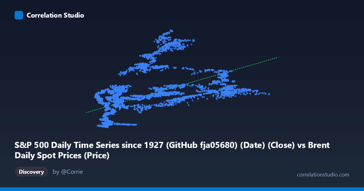
S&P 500 Daily Time Series since 1927 (GitHub fja05680) (Date) (Close) vs Brent Daily Spot Prices (Price)
- Pearson correlation (r)
- 0.5378
- Spearman correlation
- 0.6915
- p-value
- 0
- Sample size (n)
- 8140
- 95% confidence interval
- 0.5221 to 0.553
- Granger causality
- None
- Granger optimal lag
- 1
AI analysis
Analysis: Brent Crude Oil Prices vs. S&P 500 Index
1. What the Visualization Reveals
The scatterplot depicts the relationship between daily Brent crude oil spot prices (X-axis, USD/barrel) and S&P 500 closing values (Y-axis) across a shared timeframe spanning 1987–2019. The cloud of points shows a broadly positive trend — as oil prices rise, the S&P 500 tends to be higher — but with enormous vertical dispersion at nearly every X value. For instance, oil prices around $65–70/barrel correspond to S&P 500 values ranging anywhere from roughly 900 to over 3,200 points, illustrating that oil price alone is a weak determinant of equity index levels. The linear regression line (y = 11.52x + 650.96) captures the central tendency but visibly fails to hug the data tightly, reinforcing that a single-variable linear model is insufficient here.
2. Correlation Strength, Direction, and Causality
The Pearson correlation of r = 0.538 indicates a moderate positive association, but the more meaningful figure is r² = 0.289, meaning oil prices explain only about 29% of the variance in S&P 500 values. Roughly 71% of the index's movement is driven by other factors entirely. The 95% confidence interval [0.522, 0.553] is narrow — a direct consequence of the large paired sample (n = 8,140) — confirming the correlation estimate is precise and stable, not an artifact of small-sample noise. The p-value of effectively zero confirms this association is highly statistically significant, though significance here should not be conflated with practical importance given the modest r².
Critically, the Granger causality tests find no significant predictive direction in either direction (X→Y: F = 0.904, p = 0.342; Y→X: F = 0.863, p = 0.353). This means that past oil prices do not meaningfully predict future S&P 500 movements at a 1-period lag, and vice versa. The correlation reflects co-movement rather than temporal predictive leverage — both series are likely being pulled by shared macroeconomic forces (global growth cycles, inflation regimes) rather than one causing the other.
Notably, the Spearman ρ exceeds Pearson r, flagging a non-linear underlying relationship. A logarithmic or polynomial fit would likely better characterize how oil and equity prices co-vary, particularly given the compressed low-oil-price range and expanding S&P 500 range in later years.
3. Notable Patterns, Clusters, and Outliers
Several structural features stand out in the sample points and implied distribution:
- Left-side cluster (X < 25, Y < 500): Low-oil, low-S&P combinations likely corresponding to the late 1980s and early 1990s, when both assets were at historical lows. These form a relatively tight cluster. - Middle-range dispersion (X: 60–80): Extreme vertical scatter here — S&P values spanning ~900 to 3,200 — reflects that this oil price range has been visited across vastly different equity market regimes (pre-2008, post-2008 recovery, and late-cycle 2017–2019). - High-oil outliers (X 100): Points like (107, 1755) and (110, 1874) represent the 2011–2014 oil price spike era, where the S&P was in mid-recovery. These sit well below what a linear extrapolation might predict if the relationship were stronger. - Low-X, high-Y anomalies: Points like (10.89, 1100) and (13.15, 1299) — very low oil prices paired with moderate-to-high S&P values — likely correspond to the 2015–2016 oil price collapse period when equities remained elevated, directly contradicting a simple positive relationship.
4. Confounding Factors and Caveats
This correlation is heavily confounded by shared exposure to the global economic cycle. Both assets tend to rise during expansions and fall during recessions, creating spurious co-movement that does not imply a direct economic link. Key confounders include:
- Time trends / non-stationarity: Both series exhibit strong upward trends over 1987–2019. Much of the correlation may simply reflect that both series grew over time — a classic spurious regression problem with financial time series. Differencing or detrending the data before correlation analysis would be more rigorous. - Inflation and USD strength: Oil is priced in USD, so dollar depreciation inflates nominal oil prices and can simultaneously boost multinational S&P earnings, creating mechanical correlation. - Regime changes: The oil-equity relationship has historically flipped sign depending on whether oil moves are supply-driven (negative for equities) or demand-driven (positive). Pooling all regimes into one correlation obscures this dynamic. - Lagged structural breaks: The 2008 financial crisis, COVID-era data (near the end of the window), and OPEC policy shifts create discrete regime changes that violate the stationarity assumption of standard correlation.
5. Actionable Insights and Further Investigation
Several concrete next steps would deepen this analysis:
1. Detrend or difference both series before computing correlation. Calculating correlation on log-returns or first differences would test whether changes in oil prices relate to changes in the S&P, which is more economically meaningful and avoids spurious trend-driven correlation. 2. Fit a non-linear model (logarithmic or polynomial regression) given the Spearman Pearson signal. A log transformation of X in particular may linearize the relationship and improve fit. 3. Segment by economic regime (expansion vs. recession, supply shock vs. demand shock) to test whether the correlation is sign-stable or regime-dependent — this is where the most practically actionable insight likely resides. 4. Extend Granger causality to multiple lags (e.g., 5, 10, 22 trading days) to capture slower-moving transmission mechanisms that a 1-period lag would miss. 5. Control for confounders such as USD index, global PMI, or VIX in a multivariate regression to isolate the marginal explanatory power of oil prices on equity returns beyond shared macro exposure.
In summary, while the moderate positive correlation is statistically robust, its practical and causal interpretation is limited. The relationship appears largely coincidental — both series riding the same long-run economic growth wave — rather than reflecting a direct, exploitable link between oil prices and equity valuations.
X dataset: Brent Daily Spot Prices
Y dataset: S&P 500 Daily Time Series since 1927 (GitHub fja05680) (Date)
Part of experiment: Daily - Brent Daily Spot Prices vs S&P 500 Daily Time Series since 1927 (GitHub fja05680) (Date)