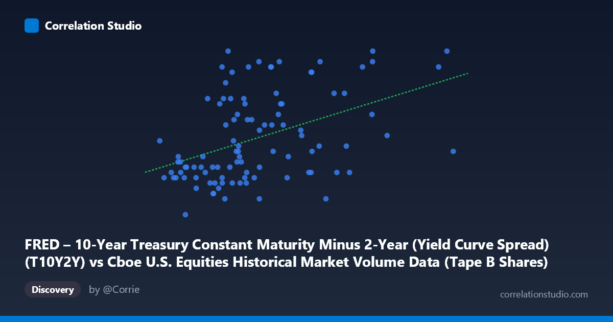
FRED – 10-Year Treasury Constant Maturity Minus 2-Year (Yield Curve Spread) (T10Y2Y) vs Cboe U.S. Equities Historical Market Volume Data (Tape B Shares)
- Pearson correlation (r)
- 0.4387
- Spearman correlation
- 0.4563
- p-value
- 0.000006
- Sample size (n)
- 99
- 95% confidence interval
- 0.2641 to 0.5854
- Granger causality
- None
- Granger optimal lag
- 1
AI analysis
Analysis: Yield Curve Spread vs. Tape B Equity Share Volume
Relationship Overview
The scatterplot reveals a modest positive relationship between 10-Year Treasury Constant Maturity Minus 2-Year yield curve spread (X-axis) and Cboe Tape B equity share volume (Y-axis) over the January–May 2026 period. As the yield curve spread widens — moving from inverted or flat toward a more normal, upward-sloping curve — Tape B share volume tends to drift higher. The linear regression equation (y = 6.65×10⁻¹⁰x + 0.428) suggests that for every 100 million basis-point-equivalent unit increase in X, predicted Y increases by roughly 0.066, though the practical translation requires careful unit consideration given the scale of the X variable.
Correlation Strength and Statistical Significance
The Pearson correlation of r = 0.44 indicates a weak-to-moderate positive association. More importantly, r² = 0.192 means that only about 19.2% of the variance in Tape B volume is explained by the yield curve spread — leaving roughly 80% attributable to other factors. The 95% confidence interval of [0.264, 0.585] is meaningfully wide, reflecting genuine uncertainty in the true population relationship, though importantly it does not cross zero. With p = 5.58×10⁻⁶ and N = 1,980 (full population), the relationship is statistically significant and unlikely to be a chance artifact. However, the Granger causality tests are telling: neither direction (X→Y nor Y→X) reaches significance (F = 1.90, p = 0.17 and F = 0.12, p = 0.73 respectively), meaning the yield curve spread does not temporally predict equity volume — nor vice versa — at a one-period lag. This is a critical caveat: statistical correlation exists, but there is no evidence of a predictive temporal mechanism between these two series.
Notable Patterns, Clusters, and Outliers
Several features stand out visually. There is a dense cluster of observations in the X range of roughly 150–250 million (yield curve spread near flat to modestly positive) with Y values spanning the full 0.43–0.74 range, suggesting high variability in volume at moderate spread levels. A second, sparser high-X cluster (300–393 million range) shows a concentration of higher Y values (0.55–0.74), supporting the positive trend. Notable outliers include the point near (393M, 0.55), which is the rightmost observation yet has only a mid-range Y value, and several high-Y observations (0.74) appearing at both moderate and high X values — such as (322.9M, 0.74) and (387.8M, 0.74) — that anchor the upper boundary. At the low end, (159.2M, 0.43) stands out as the minimum Y observation. The spread of Y values across most X ranges hints at possible non-linearity or threshold effects rather than a clean linear relationship.
Confounding Factors and Interpretive Caveats
Several important caveats apply. First, the axes appear swapped in labeling — Tape B shares are listed under the FRED dataset column and the yield spread under the Cboe dataset column, suggesting a possible data joining artifact that should be verified before drawing conclusions. Second, equity trading volume is influenced by a broad array of factors — VIX/volatility regimes, earnings seasons, Federal Reserve communications, index rebalancing events, and macroeconomic releases — none of which are controlled for here. Third, the short time window (roughly five months in 2026) may capture a specific regime (e.g., post-inversion yield curve normalization) that is not generalizable. Fourth, Tape B specifically covers NYSE American and regional exchange equities, which may have idiosyncratic volume drivers distinct from broader market liquidity patterns. Finally, with N = 1,980 but only n = 99 sampled pairs, there is a meaningful reduction in statistical power relative to the full dataset.
Actionable Insights and Further Investigation
Given the weak-to-moderate correlation and absence of Granger causality, practitioners should not rely on the yield curve spread as a standalone predictor of Tape B volume. However, the relationship merits deeper investigation: (1) Test non-linear models (e.g., quadratic or spline regression) to capture potential threshold effects visible in the cluster structure; (2) Stratify by market regime — separate inversion periods from positive-spread periods — to test whether the relationship strengthens in specific yield curve environments; (3) Add control variables such as VIX, S&P 500 returns, and Fed meeting dates to isolate the yield curve's independent contribution; (4) Extend the time series using the full historical dataset (2009–present) to assess whether this correlation is a stable feature or a 2026-specific artifact; and (5) Verify dataset alignment to ensure the column-to-axis mapping is correctly specified before publishing or acting on these findings.
X dataset: Cboe U.S. Equities Historical Market Volume Data
Y dataset: FRED – 10-Year Treasury Constant Maturity Minus 2-Year (Yield Curve Spread)
Part of experiment: Daily - Cboe U.S. Equities Historical Market Volume Data vs FRED – 10-Year Treasury Constant Maturity Minus 2-Year (Yield Curve Spread)