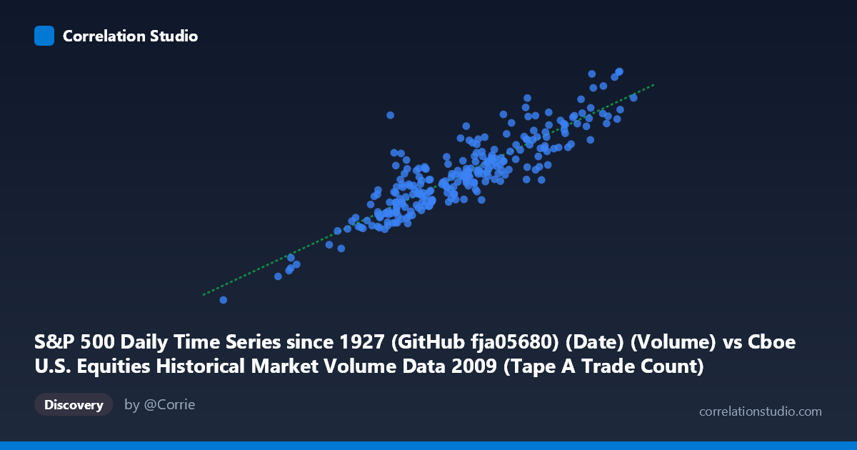
S&P 500 Daily Time Series since 1927 (GitHub fja05680) (Date) (Volume) vs Cboe U.S. Equities Historical Market Volume Data 2009 (Tape A Trade Count)
- Pearson correlation (r)
- 0.8881
- Spearman correlation
- 0.8631
- p-value
- 0
- Sample size (n)
- 252
- 95% confidence interval
- 0.8588 to 0.9117
- Granger causality
- None
- Granger optimal lag
- 10
AI analysis
Analysis: S&P 500 Daily Volume vs. Cboe Tape A Trade Count (2009)
Relationship Overview The scatterplot reveals a strong positive linear relationship between S&P 500 daily trading volume and Cboe Tape A trade count across 2009. As daily volume increases, the number of individual trades rises proportionally, which is intuitive: higher volume days tend to involve more discrete transactions rather than simply larger block trades. The fitted regression line (y = 3,003.66x + 6.79×10⁸) suggests that for every one-unit increase in volume, trade count rises by approximately 3,004 units, with a meaningful baseline intercept implying a floor of trade activity even on low-volume days.
Correlation Strength and Statistical Interpretation The Pearson correlation of r = 0.8881 is strong, and the coefficient of determination r² = 0.7888 indicates that roughly 78.9% of the variance in Tape A trade count is explained by S&P 500 volume alone — a notably high explanatory share for a single variable in financial market data. The 95% confidence interval of [0.8588, 0.9117] is narrow, reflecting high precision in the estimate given the sample of 252 paired observations drawn from a population of 3,232. The p-value of effectively zero confirms the relationship is not a statistical artifact. However, the Granger causality results complicate the directional narrative: neither X→Y (F = 0.35, p = 0.97) nor Y→X (F = 0.79, p = 0.63) reaches significance at the optimal 10-period lag, meaning that while the two variables are highly correlated contemporaneously, neither reliably predicts the other temporally. This is a critical distinction — correlation here appears to reflect simultaneous co-movement driven by common market forces rather than one variable leading the other.
Patterns, Clusters, and Outliers The scatterplot shows a fairly tight central cluster in the moderate-volume range (X ≈ 1.2M–2.0M; Y ≈ 4B–7B), consistent with typical trading days in 2009. There is a notable lower-left outlier at approximately (362,081; 1.27B) — almost certainly a low-activity holiday-adjacent session — and an upper cluster around (2.4M–2.55M; 8.2B–9.1B) representing the highest-volatility days of 2009, likely tied to the market's March 2009 bottom and subsequent recovery rally. The spread around the regression line widens slightly at higher volume levels, hinting at mild heteroscedasticity: on extreme volume days, the trade count becomes less predictable, possibly as large institutional block trades inflate volume without proportionally increasing trade count.
Confounding Factors and Caveats Several caveats warrant caution. First, the dataset conflates two different metrics — aggregate S&P 500 volume (a broad index measure) with Tape A trade count (exchange-specific) — introducing a scope mismatch that could inflate or distort the apparent relationship. Second, 2009 is a structurally unusual year: it encompasses the tail of the financial crisis, a historic market bottom in March, and a strong recovery, meaning market microstructure dynamics (algorithmic trading surges, panic selling, retail participation spikes) were atypical and may not generalize. Third, the rise of high-frequency trading in 2009 means trade count may have been disproportionately inflated by automated strategies, partially decoupling it from traditional volume-activity relationships. Finally, the common driver problem is significant — both variables are likely responding to the same upstream shocks (volatility, news events, macro releases) rather than causally influencing each other.
Actionable Insights and Further Investigation Despite the Granger non-result, the contemporaneous r² of ~79% makes volume a useful same-day proxy for exchange activity, valuable for liquidity modeling or risk dashboards. Practitioners should investigate the remaining ~21% of unexplained variance — likely attributable to volatility regimes (VIX), options expiration cycles, or algorithmic participation rates. A natural next step would be to segment the data by market regime (crisis vs. recovery periods) to test whether the relationship holds uniformly across 2009 or strengthens during high-stress periods. Adding VIX as a covariate in a multiple regression framework would likely improve explanatory power substantially. Testing this relationship across multiple years would also reveal whether 2009's unusual conditions inflate the observed correlation relative to normal market environments.
X dataset: Cboe U.S. Equities Historical Market Volume Data 2009
Y dataset: S&P 500 Daily Time Series since 1927 (GitHub fja05680) (Date)
Part of experiment: Daily - Cboe U.S. Equities Historical Market Volume Data 2009 vs S&P 500 Daily Time Series since 1927 (GitHub fja05680) (Date)