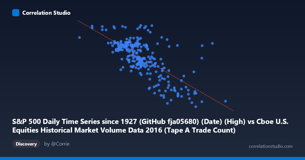
S&P 500 Daily Time Series since 1927 (GitHub fja05680) (Date) (High) vs Cboe U.S. Equities Historical Market Volume Data 2016 (Tape A Trade Count)
- Pearson correlation (r)
- -0.6944
- Spearman correlation
- -0.646
- p-value
- 0
- Sample size (n)
- 252
- 95% confidence interval
- -0.7533 to -0.6244
- Granger causality
- None
- Granger optimal lag
- 1
AI analysis
Analysis: S&P 500 High Price vs. Cboe Tape A Trade Count (2016)
Relationship Overview The scatterplot reveals a moderately strong negative relationship between the S&P 500 daily high price and the Cboe Tape A trade count throughout 2016. As the index traded at higher price levels, the number of individual trades on Tape A (NYSE-listed securities) tended to be lower. The linear regression equation (y = −0.0002295x + 2422.06) confirms this inverse slope, suggesting that for every 1,000-point increase in the S&P 500 high, trade count decreases by roughly 230 units. This is a somewhat counterintuitive finding at first glance, but it likely reflects the well-documented phenomenon where rising, low-volatility bull markets attract fewer active traders relative to turbulent, lower-price environments.
Correlation Strength and Statistical Robustness The Pearson correlation of r = −0.694 indicates a moderately strong negative association, and the R² of 0.482 means that approximately 48.2% of the variance in Tape A trade count is statistically explained by the S&P 500 high price level across this sample. That leaves roughly 52% of variance attributable to other factors, so while the relationship is meaningful, it is far from deterministic. The 95% confidence interval of [−0.753, −0.624] is relatively tight and does not approach zero, lending strong confidence to the direction and approximate magnitude of the effect. The p-value of effectively 0 (against N = 3,622) confirms this is highly unlikely to be a chance finding. However, the Granger causality results are notably absent in both directions — neither X→Y (F = 0.030, p = 0.863) nor Y→X (F = 0.524, p = 0.470) achieves significance — meaning that despite the strong contemporaneous correlation, neither variable reliably predicts the other in the next period. This is a critical distinction: the relationship is associative and likely driven by a shared underlying dynamic rather than one variable causing the other.
Patterns, Clusters, and Outliers The sample points reveal a discernible funnel or heteroscedastic pattern: at lower S&P price ranges (~800,000–1,200,000 range on X), trade counts are more dispersed and skewed upward, with several notable high-trade-count observations clustering near X values of 926,000–1,063,000. At higher price levels (above ~1,700,000), the data compresses toward lower trade counts with less spread. A few potential outliers are visible — particularly the point near (1,000,524; 2,271) and (1,428,848; 2,272), which register unusually high trade counts relative to their price level peers, possibly corresponding to specific high-volatility event days (e.g., Brexit aftermath in late June 2016). The bulk of observations cluster between X = 1,100,000–1,600,000 and Y = 2,050–2,200, forming the dense core of the negative trend.
Confounding Factors and Caveats Several important caveats apply. First, both variables are time-indexed to 2016, meaning the apparent correlation is almost certainly driven in part by a shared temporal trend: S&P 500 prices generally rose across 2016 (from post-January lows to year-end highs), while trade fragmentation and volume patterns shifted over the same period due to regulatory, structural, and seasonal effects. This creates classic spurious correlation via common time trend. Second, trade count on Tape A alone is a narrow measure — it excludes dark pools, off-exchange TRFs, and other tapes, potentially misrepresenting total market activity. Third, the Granger non-causality result at lag 1 strongly suggests the relationship is not mechanistic on a day-to-day basis, reinforcing that both variables are likely responding to the same latent drivers (e.g., market volatility regimes, macroeconomic news density) rather than influencing each other directly.
Actionable Insights and Further Investigation For market microstructure researchers or trading desk analysts, the most productive next step would be to partial out the time trend by detrending or differencing both series before re-examining correlation, to test whether the relationship survives beyond the shared secular trend. Including VIX or realized volatility as a covariate would likely absorb much of the shared variance and clarify whether price level per se or volatility regime is the true driver of trade count. Extending the Granger causality analysis to longer lags (5–10 days) might uncover delayed feedback effects not visible at lag 1. Additionally, analyzing all Tape categories combined and cross-referencing against known event dates (Fed announcements, Brexit, U.S. election) could isolate whether the high-trade-count outliers represent regime shifts rather than noise. Finally, replicating this analysis across multiple years would test whether this negative association is a stable structural feature of U.S. equity markets or specific to 2016's particular price trajectory.
X dataset: Cboe U.S. Equities Historical Market Volume Data 2016
Y dataset: S&P 500 Daily Time Series since 1927 (GitHub fja05680) (Date)
Part of experiment: Daily - Cboe U.S. Equities Historical Market Volume Data 2016 vs S&P 500 Daily Time Series since 1927 (GitHub fja05680) (Date)