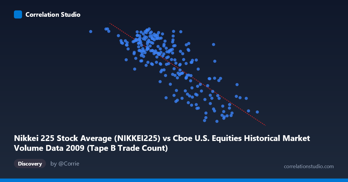
Nikkei 225 Stock Average (NIKKEI225) vs Cboe U.S. Equities Historical Market Volume Data 2009 (Tape B Trade Count)
- Pearson correlation (r)
- -0.7976
- Spearman correlation
- -0.7505
- p-value
- 0
- Sample size (n)
- 235
- 95% confidence interval
- -0.8398 to -0.7457
- Granger causality
- None
- Granger optimal lag
- 10
AI analysis
Analysis: Nikkei 225 vs. Cboe Tape B Trade Count (2009)
Relationship Overview The scatterplot reveals a moderately strong negative relationship between the Nikkei 225 Stock Average and Cboe U.S. Equities Tape B Trade Count across 2009. As the Nikkei 225 index values increase, the Tape B trade count tends to decrease, following the linear regression equation y = -0.00620x + 11,857.5. This inverse pattern is visually apparent across the data cloud, with higher Nikkei values (roughly 600,000–770,000 range) clustering at lower Tape B counts (~7,000–8,500), while lower Nikkei values (~80,000–300,000) correspond to higher trade counts (~9,500–10,600). The relationship is directionally consistent but shows considerable scatter, suggesting additional forces are shaping both variables throughout this period.
Correlation Strength and Statistical Framing The Pearson correlation of r = -0.7976 indicates a strong negative association, and the R² of 0.6361 tells us that approximately 63.6% of the variance in Tape B trade count is statistically explained by Nikkei 225 levels — a substantial but incomplete explanatory share, leaving roughly 36% attributable to other factors. The 95% confidence interval of [-0.8398, -0.7457] is narrow and entirely negative, reinforcing that the inverse direction of this relationship is robust and not a sampling artifact. The p-value of effectively zero confirms high statistical significance given the population of N = 3,232. However, Granger causality results are notably non-significant in both directions (X→Y: F = 1.23, p = 0.27; Y→X: F = 1.23, p = 0.27), meaning that neither variable reliably predicts the other's future values at a 10-period lag. This is a critical caveat: the correlation is real, but there is no detectable temporal predictive relationship — both variables are likely responding to shared common drivers rather than one causing the other.
Notable Patterns, Clusters, and Outliers The data exhibits a reasonably well-defined linear trend, but with notable heterogeneity. A visible upper-left cluster (Nikkei ~80,000–350,000, Tape B ~9,800–10,639) represents the highest trade count observations, while a lower-right cluster (Nikkei ~550,000–770,000, Tape B ~7,054–8,500) captures the lowest trade counts. The middle range shows more dispersion, with several points deviating meaningfully from the regression line — for instance, observations near Nikkei ~420,000 spanning Tape B values from roughly 8,061 to 10,544, a spread of over 2,500 units. A few potential outliers appear at extreme Nikkei values (e.g., near 766,000 and below 100,000), which may exert disproportionate influence on the regression slope and warrant leverage analysis.
Confounding Factors and Caveats The most important interpretive caveat is that this correlation likely reflects shared temporal dynamics during 2009 rather than any direct causal mechanism between Japanese equity prices and U.S. Tape B trade volumes. The year 2009 was dominated by the global financial crisis recovery, meaning both variables were simultaneously influenced by macro forces: risk appetite, global liquidity conditions, and investor sentiment. The Nikkei 225 values in the dataset appear scaled unusually (range ~81,000–766,000), which may reflect notional or index-point-scaled data rather than raw index levels, and warrants clarification before interpretation. Additionally, Tape B trade count reflects a specific market segment (regional exchanges), and its behavior may be driven by U.S.-specific market structure factors — such as exchange competition, HFT activity, or regulatory changes in 2009 — that have no structural connection to Tokyo equity markets. Cross-market correlations during crisis periods are well-documented to inflate due to contagion and synchronized global deleveraging.
Actionable Insights and Further Investigation Given the strong correlation but absent Granger causality, the most productive next step would be to identify the common latent driver — likely a global risk sentiment proxy such as the VIX, global credit spreads, or cross-border capital flow data — and test whether controlling for it eliminates or substantially reduces the observed correlation. A partial correlation or multivariate regression framework incorporating macro controls (e.g., USD/JPY exchange rate, S&P 500 levels, VIX) would clarify whether the Nikkei–Tape B relationship is spurious. It would also be valuable to test for structural breaks within 2009, as the market recovery inflection point (approximately March 2009) likely creates two distinct regimes that the single linear model conflates. Finally, investigating lagged cross-correlations beyond the 10-period window tested, or using rolling-window correlations, could reveal whether the relationship strengthens or weakens across different phases of the crisis recovery cycle.
X dataset: Cboe U.S. Equities Historical Market Volume Data 2009
Y dataset: Nikkei 225 Stock Average
Part of experiment: Daily - Cboe U.S. Equities Historical Market Volume Data 2009 vs Nikkei 225 Stock Average