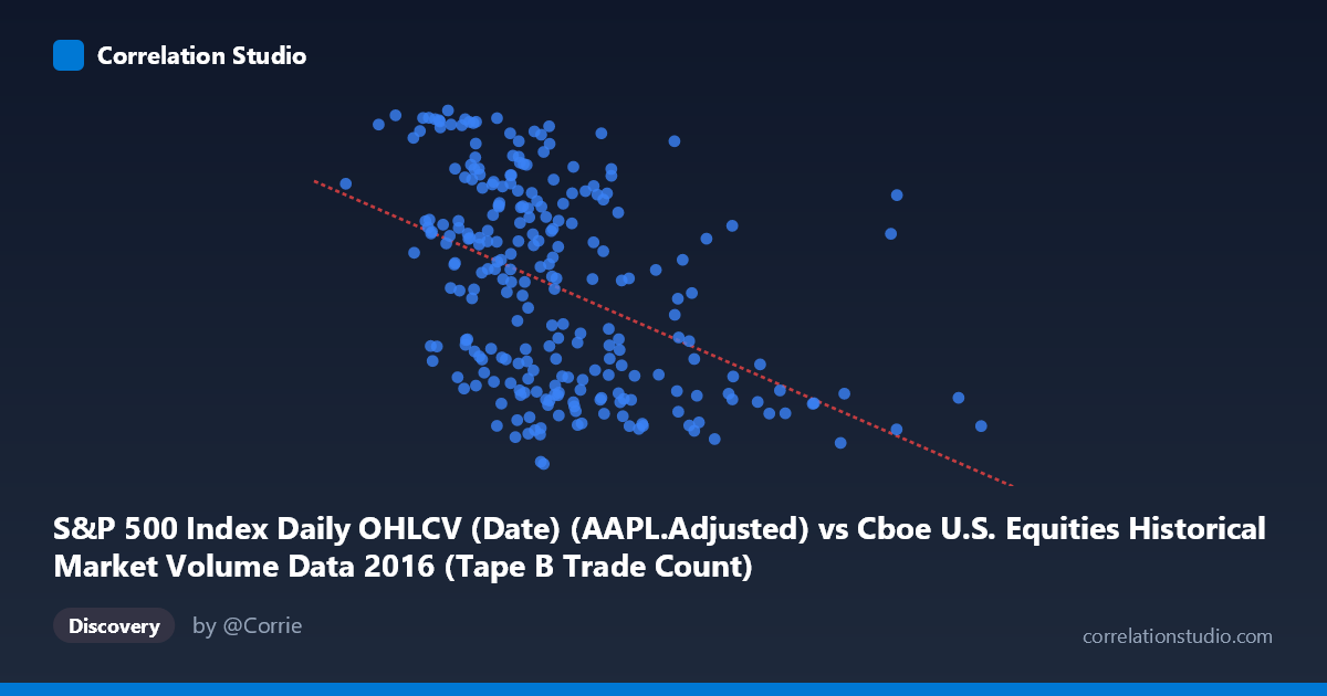
S&P 500 Index Daily OHLCV (Date) (AAPL.Adjusted) vs Cboe U.S. Equities Historical Market Volume Data 2016 (Tape B Trade Count)
- Pearson correlation (r)
- -0.4454
- Spearman correlation
- -0.4856
- p-value
- 0
- Sample size (n)
- 252
- 95% confidence interval
- -0.5393 to -0.3406
- Granger causality
- None
- Granger optimal lag
- 1
AI analysis
Analysis: AAPL Adjusted Price vs. Cboe Tape B Trade Count (2016)
Relationship Overview The scatterplot reveals a negative relationship between Apple's adjusted closing price (X-axis) and the Cboe U.S. Equities Tape B Trade Count (Y-axis) across 252 trading days in 2016. As AAPL's adjusted price increases, the Tape B trade count on Cboe exchanges tends to decline. This is visually apparent in the downward-sloping regression line (y = -3.757×10⁻⁵x + 115.145), though the scatter around this line is considerable, suggesting the relationship is real but far from deterministic. The data clusters most densely in the AAPL price range of roughly $225,000–$400,000 (in the scaled units used), with trade counts concentrated between approximately 92 and 115, while sparser observations extend toward higher price values with notably lower trade counts.
Correlation Strength and Statistical Significance The Pearson correlation of r = -0.4454 indicates a moderate negative association, and with r² = 0.1984, only about 19.8% of the variance in Tape B trade counts is explained by AAPL's adjusted price. This means roughly 80% of the variation in trade activity is attributable to other factors entirely. The 95% confidence interval of [-0.5393, -0.3406] is meaningfully negative throughout — it does not cross zero — and the p-value of 1.104×10⁻¹³ confirms the correlation is highly statistically significant, effectively ruling out chance as an explanation given the sample size of 252 paired observations. However, statistical significance here reflects the large sample rather than a strong or practically dominant relationship, and the modest r² demands caution against overstating its explanatory power.
Granger Causality and Temporal Direction Despite the significant contemporaneous correlation, Granger causality tests reveal no significant predictive directionality in either direction at the optimal lag of 1 period. Neither X→Y (F = 0.598, p = 0.440) nor Y→X (F = 0.490, p = 0.485) approaches conventional significance thresholds. This is a critical finding: knowing AAPL's price today does not meaningfully help predict tomorrow's Tape B trade count, and vice versa. The correlation observed is essentially synchronous — both variables may be responding to shared contemporaneous market forces rather than one leading the other. This substantially limits any causal narrative one might be tempted to construct from the negative correlation alone.
Notable Patterns and Outliers Several features stand out in the sample data. There is a visible cluster of high-Y, moderate-X observations (e.g., points near AAPL ~$202K–$265K with trade counts of 113–117), suggesting that when AAPL prices were relatively lower (likely earlier in 2016 when the stock had corrected), Cboe Tape B activity was elevated. Conversely, points at higher AAPL prices (e.g., ~$558K and ~$467K) correspond to notably low trade counts (~93–91), consistent with the negative slope. The point near (309K, 89.01) and (306K, 89.19) represents potential low-outlier trade counts worth flagging. The spread also appears somewhat heteroscedastic — variance in trade counts looks larger at mid-range AAPL prices, narrowing at extremes — which could mildly violate linear regression assumptions.
Caveats, Confounders, and Further Investigation Several confounding factors complicate interpretation. Temporal seasonality is a prime suspect: both AAPL prices and market-wide trade volumes follow predictable intra-year patterns (e.g., January volatility, summer lulls, year-end activity), and their coincidental phasing in 2016 could generate a spurious correlation. Market-wide risk sentiment — such as the Brexit vote in June 2016 or U.S. election uncertainty in Q4 — likely drove both variables simultaneously, confounding the apparent relationship. It is also worth noting the dataset label swap suggested by the metadata: the X-axis draws from a market volume dataset while the Y-axis draws from the S&P 500 OHLCV dataset, which warrants verification that units and alignment are correct. For further investigation, it would be valuable to control for market-wide volume trends, test the relationship across multiple years to assess stability, decompose the time series to remove seasonality before correlating, and explore whether sector rotation or index rebalancing events explain the clustering patterns observed in early versus late 2016.
X dataset: Cboe U.S. Equities Historical Market Volume Data 2016
Y dataset: S&P 500 Index Daily OHLCV (Date)
Part of experiment: Daily - Cboe U.S. Equities Historical Market Volume Data 2016 vs S&P 500 Index Daily OHLCV (Date)