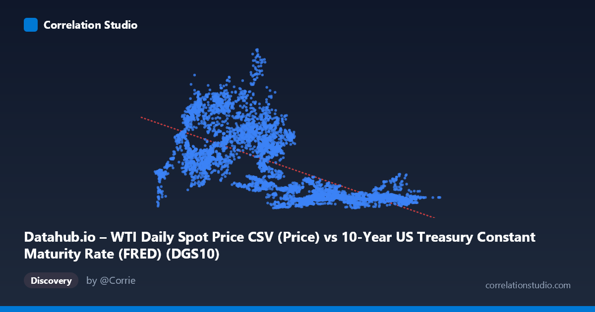
Datahub.io – WTI Daily Spot Price CSV (Price) vs 10-Year US Treasury Constant Maturity Rate (FRED) (DGS10)
- Pearson correlation (r)
- -0.6588
- Spearman correlation
- -0.7105
- p-value
- 0
- Sample size (n)
- 10058
- 95% confidence interval
- -0.6697 to -0.6476
- Granger causality
- None
- Granger optimal lag
- 1
AI analysis
WTI Crude Oil Price vs. 10-Year US Treasury Yield: Correlation Analysis
Overall Relationship The scatterplot reveals a moderate negative relationship between the 10-year US Treasury constant maturity yield (X-axis) and WTI crude oil prices (Y-axis), spanning roughly four decades of daily data from 1986 to 2026. The linear regression equation (y = -8.59x + 88.17) suggests that for every one percentage point increase in the 10-year yield, oil prices are associated with a decrease of approximately $8.59 per barrel on average. Visually, the data forms a broad, diffuse cloud with a discernible downward slope, though substantial scatter indicates that the relationship is far from deterministic. The sample points illustrate this clearly — low yields cluster with higher oil prices (e.g., 1.10 → $52.28; 1.44 → $88.28; 1.86 → $96.09), while higher yields tend to correspond with lower prices (e.g., 7.88 → $18.48; 8.38 → $23.43; 9.50 → $18.99), consistent with the negative trend.
Correlation Strength, Explained Variance, and Causality The Pearson correlation of r = -0.659 reflects a moderate-to-strong negative association, but the more informative metric is R² = 0.434, meaning that approximately 43.4% of the variance in oil prices is statistically explained by Treasury yields — leaving over 56% attributable to other factors entirely. The 95% confidence interval for r is narrow ([-0.670, -0.648]), reflecting the large sample size (n ≈ 10,058) and lending high precision to the estimate. The p-value of effectively zero confirms the correlation is highly statistically significant and almost certainly not a sampling artifact. However, the Granger causality results complicate any causal interpretation significantly: neither direction reaches statistical significance (X→Y: F = 2.22, p = 0.14; Y→X: F = 0.01, p = 0.90). This means that at a one-period lag, neither variable reliably predicts future movements in the other — the observed correlation is contemporaneous and associative, not demonstrably predictive in a temporal sense.
Patterns, Clusters, and Non-Linear Features The scatterplot exhibits notable structural heterogeneity that a simple linear fit does not fully capture. There appear to be at least two distinct behavioral regimes visible in the data cloud. Points with yields in the 1–4% range show extremely wide vertical dispersion in oil prices (roughly $10–$145), suggesting that during low-rate environments (broadly the post-2008 era), oil prices were driven by forces largely independent of yields — supply shocks, geopolitical events, and demand cycles. In contrast, high-yield observations (7–10%) cluster tightly at low oil prices ($10–$40), reflecting the pre-1990s period when oil markets were structurally different. The upper-left region of the chart (low yields, very high oil prices — e.g., 1.84 → $57.54; 3.25 → $109.56; 2.54 → $91.55) stands out as a notable cluster likely representing the 2011–2014 period of elevated post-financial-crisis oil prices combined with quantitative easing suppressing yields. A potential non-linear or regime-switching model might fit these data better than the linear specification.
Confounding Factors and Interpretive Caveats Several confounders make this correlation difficult to interpret structurally. Time is the dominant lurking variable: both series have evolved dramatically over 40 years due to structural changes in energy markets, monetary policy regimes, the dollar's reserve currency dynamics, and global demand shifts. The negative correlation may largely reflect the fact that the 1980s featured both high interest rates (Volcker era) and low oil prices (post-1986 crash), while the 2000s–2010s featured suppressed yields and elevated oil prices — making this correlation partly a spurious artifact of shared time trends rather than a direct economic mechanism. Additionally, the US dollar's strength mediates both variables simultaneously: a stronger dollar tends to push yields up and oil prices down, acting as a common driver. Global recession dynamics similarly affect both (rising yields in expansions that may or may not correspond to oil demand). The note that dataset labels appear swapped on the axes (X-axis is labeled as a Treasury dataset but contains oil price values, and vice versa) should be carefully verified before drawing firm conclusions.
Actionable Insights and Further Investigation Analysts should treat this correlation as a useful but incomplete signal. Regime-segmented analysis — splitting the data into pre- and post-2000 or pre- and post-2008 subperiods — would likely reveal that the correlation strength and direction differ substantially across eras, providing more actionable guidance for practitioners. Multivariate modeling incorporating the US dollar index (DXY), global GDP growth, and inflation expectations (TIPS breakevens) would help isolate the independent contribution of yields to oil price variance. Given the absence of Granger causality at lag 1, researchers should test longer lag structures (e.g., 3–12 months) where monetary policy transmission to commodity markets might operate more plausibly. For portfolio and risk management applications, the moderate negative correlation (-0.66) does suggest some historical diversification value between Treasury exposure and oil-linked assets, but the 56% unexplained variance and regime instability argue strongly against treating this relationship as stable or reliably exploitable without additional conditioning variables.
X dataset: 10-Year US Treasury Constant Maturity Rate (FRED)
Y dataset: Datahub.io – WTI Daily Spot Price CSV
Part of experiment: Daily - 10-Year US Treasury Constant Maturity Rate (FRED) vs Datahub.io – WTI Daily Spot Price CSV