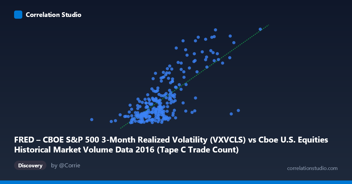
FRED – CBOE S&P 500 3-Month Realized Volatility (VXVCLS) vs Cboe U.S. Equities Historical Market Volume Data 2016 (Tape C Trade Count)
- Pearson correlation (r)
- 0.7376
- Spearman correlation
- 0.6545
- p-value
- 0
- Sample size (n)
- 252
- 95% confidence interval
- 0.6757 to 0.7893
- Granger causality
- None
- Granger optimal lag
- 1
AI analysis
Analysis: CBOE S&P 500 3-Month Realized Volatility vs. Tape C Trade Count (2016)
Relationship Overview The scatterplot reveals a moderately strong positive relationship between CBOE S&P 500 3-month realized volatility (VXVCLS) and Tape C trade count across U.S. equities exchanges in 2016. As volatility rises, trading activity on Tape C (NYSE Arca-listed securities) increases correspondingly. The linear regression equation (y = 1.53215E-05x + 7.327) confirms this upward slope, and the relationship is visually coherent — higher volatility regimes correspond to meaningfully elevated trade counts. This is intuitively consistent with market microstructure theory: uncertainty drives participants to reposition portfolios, hedge exposures, and respond to price discovery signals, all of which inflate transaction volumes.
Correlation Strength and Statistical Significance The Pearson correlation of r = 0.7376 indicates a moderately strong positive association, and with r² = 0.5441, approximately 54.4% of the variance in Tape C trade count is explained by VXVCLS — a substantial but incomplete explanatory share, meaning nearly half the variance originates elsewhere. The 95% confidence interval of [0.6757, 0.7893] is relatively tight and entirely positive, reflecting high precision given the sample of n = 252 drawn from a population of N = 3,622. The p-value of effectively zero confirms the correlation is highly statistically significant and extremely unlikely to reflect sampling noise. However, the Granger causality results complicate the narrative: neither direction (X→Y: F = 0.2695, p = 0.604; Y→X: F = 0.1848, p = 0.668) achieves significance at lag 1, meaning that despite the strong contemporaneous correlation, neither variable reliably predicts the other in the next period. This is a critical caveat — the relationship is largely synchronous rather than predictive.
Patterns, Clusters, and Outliers The scatterplot shows a relatively dense core cluster of points in the moderate volatility range (roughly 600,000–800,000 trade counts, 15–20 volatility units), consistent with typical 2016 market conditions. However, several high-leverage outliers are clearly visible in the upper-right region — points such as (1,023,027, 26.71), (990,202, 24.02), and (914,264, 24.47) represent days of exceptional simultaneous volatility and trading activity, likely corresponding to identifiable market events (e.g., post-Brexit aftermath in early July 2016 or the November U.S. election). At the lower end, points like (519,410, 15.09) and (504,690, 15.93) reflect unusually quiet days. The relationship also appears to exhibit mild heteroscedasticity — variance in trade counts widens at higher volatility levels — suggesting a linear model may underfit the high-volatility tail, where a log-linear or power-law specification might perform better.
Confounding Factors and Caveats Several confounds deserve attention. First, both variables may be jointly driven by macro events — market shocks simultaneously spike volatility and volume without one causing the other, making causal inference hazardous. Second, Tape C specifically covers NYSE Arca, and its trade count dynamics may reflect ETF arbitrage activity and algorithmic trading that responds to volatility in structurally distinct ways compared to Tape A or B venues. Third, secular intraday and day-of-week patterns in trade counts (e.g., higher volume on Mondays post-weekend news accumulation) are not controlled for here, potentially inflating the apparent correlation. Fourth, the 3-month realized volatility metric (VXVCLS) is a smoothed, backward-looking measure, which may introduce phase misalignment with daily trade count spikes — contributing to the Granger non-significance.
Actionable Insights and Further Investigation Practitioners could use this relationship as a rough regime indicator: VXVCLS levels above ~22–23 have historically corresponded to trade count surges that stress execution infrastructure, suggesting pre-positioning of capacity or liquidity buffers during elevated volatility environments. For further investigation, it would be valuable to (1) decompose Tape C volume by security type (ETFs vs. equities) to test whether ETF arbitrage mechanics drive the correlation disproportionately; (2) test longer Granger lags (2–5 periods) since the lag-1 non-significance may obscure delayed institutional responses; (3) apply a log-log regression to assess whether the relationship is better described as a power law; and (4) include cross-year replication using 2017–2023 data to test whether the r = 0.74 finding is stable across different volatility regimes or was specific to 2016's event-driven spikes.
X dataset: Cboe U.S. Equities Historical Market Volume Data 2016
Y dataset: FRED – CBOE S&P 500 3-Month Realized Volatility
Part of experiment: Daily - Cboe U.S. Equities Historical Market Volume Data 2016 vs FRED – CBOE S&P 500 3-Month Realized Volatility