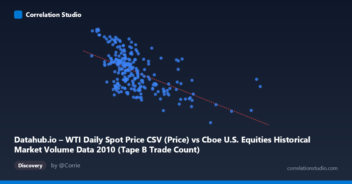
Datahub.io – WTI Daily Spot Price CSV (Price) vs Cboe U.S. Equities Historical Market Volume Data 2010 (Tape B Trade Count)
- Pearson correlation (r)
- -0.5644
- Spearman correlation
- -0.55
- p-value
- 0
- Sample size (n)
- 252
- 95% confidence interval
- -0.6431 to -0.4739
- Granger causality
- None
- Granger optimal lag
- 1
AI analysis
Analysis: WTI Oil Price vs. Tape B Trade Count (2010)
Relationship Overview The scatterplot reveals a moderate negative relationship between WTI daily spot prices (X-axis) and Cboe Tape B trade counts (Y-axis) across U.S. equity trading days in 2010. As oil prices increase, Tape B trade counts tend to decline, following the linear regression equation y = -2.34×10⁻⁵x + 86.578. This means that for every $1 increase in WTI price (approximately 1 unit on the X scale when expressed in the raw format), trade counts decrease modestly but consistently across the observed range. The relationship is visually discernible in the scatterplot, though substantial scatter around the regression line indicates this is far from a deterministic relationship.
Correlation Strength and Statistical Significance The Pearson correlation of r = -0.5644 reflects a moderate negative association. Critically, R² = 0.3186, meaning WTI prices explain only about 31.9% of the variance in Tape B trade counts — leaving roughly 68% of variation attributable to other factors. The 95% confidence interval of [-0.6431, -0.4739] is entirely negative and reasonably narrow, confirming directional confidence, and the p-value of effectively 0 (across N = 3,302) leaves no doubt about statistical significance. However, despite this strong statistical significance, the Granger causality tests show no significant predictive directionality in either direction (X→Y: F = 0.630, p = 0.428; Y→X: F = 2.503, p = 0.115). This is a crucial distinction — the variables are correlated contemporaneously, but neither reliably predicts the other one period ahead, suggesting the relationship may be driven by shared underlying forces rather than a causal mechanism.
Notable Patterns and Outliers Several features stand out in the sample data. There is a visible cluster of observations at lower oil price ranges (roughly $150,000–$350,000 on the raw X scale, corresponding to lower WTI values) where Tape B trade counts are more dispersed and generally higher (80–91 range), suggesting greater trading activity during periods of relatively cheaper oil. At the higher end of the oil price range — notably points like (918,659, 75.10), (778,565, 68.03), and (675,996, 64.78) — trade counts compress toward lower values, reinforcing the negative trend. The point at (675,996, 64.78) appears to be a potential outlier with an unusually low trade count, possibly reflecting a specific market event. There is also notable heteroscedasticity: variance in trade counts appears wider at lower oil prices and tighter at higher prices, suggesting the relationship is not uniformly linear across the full range.
Confounding Factors and Caveats Interpreting this correlation as meaningful requires significant caution. Both WTI prices and equity trade volumes in 2010 were likely influenced by macroeconomic forces — the post-financial crisis recovery, Federal Reserve policy, and broader risk sentiment — that could drive both variables simultaneously without any direct causal link. The dataset label mismatch (X-axis is described as WTI price but sourced from a market volume dataset, and vice versa) warrants careful verification of data provenance. Additionally, the 2010 timeframe encompasses specific events such as the Deepwater Horizon oil spill (April–July 2010), which could have created anomalous co-movements between oil prices and market activity in that period specifically, limiting generalizability. The absence of Granger causality further reinforces that this correlation is likely spurious or confounded rather than mechanistic.
Actionable Insights and Further Investigation Practitioners should avoid using WTI prices as a direct predictor of Tape B trade counts given the weak temporal predictive power shown by Granger causality tests. Instead, further analysis should explore multivariate models incorporating VIX (market volatility), S&P 500 returns, and broader economic indicators to better explain the ~68% unexplained variance. It would be valuable to extend the time series beyond 2010 to test whether this negative correlation is a persistent structural feature or an artifact of that specific macroeconomic environment. Investigating sector-specific trade counts (e.g., energy equities within Tape B) could reveal whether the negative relationship is concentrated in oil-sensitive stocks. Finally, applying rolling window correlations could help identify whether the relationship strengthens during specific market regimes, such as high-volatility or risk-off periods.
X dataset: Cboe U.S. Equities Historical Market Volume Data 2010
Y dataset: Datahub.io – WTI Daily Spot Price CSV
Part of experiment: Daily - Cboe U.S. Equities Historical Market Volume Data 2010 vs Datahub.io – WTI Daily Spot Price CSV