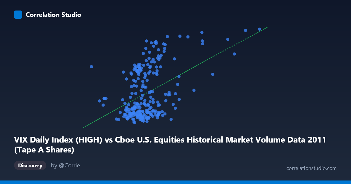
VIX Daily Index (HIGH) vs Cboe U.S. Equities Historical Market Volume Data 2011 (Tape A Shares)
- Pearson correlation (r)
- 0.4487
- Spearman correlation
- 0.342
- p-value
- 0
- Sample size (n)
- 252
- 95% confidence interval
- 0.3442 to 0.5422
- Granger causality
- None
- Granger optimal lag
- 1
AI analysis
Scatterplot Analysis: VIX Daily Index (HIGH) vs. Cboe Tape A Shares (2011)
Relationship Overview
The scatterplot reveals a moderate positive relationship between the VIX Daily Index High values and Cboe U.S. Equities Tape A share volume for 2011. As VIX high readings increase — indicating greater expected market volatility — Tape A share volume tends to rise as well. This is directionally intuitive: elevated fear or uncertainty in markets typically spurs increased trading activity as investors reposition portfolios, hedge exposures, or react to news-driven price swings. The linear regression equation (y = 5.87E-08x + 8.40) confirms a positive slope, though the relationship is far from deterministic, as evidenced by the considerable scatter around the fitted line visible across the full X range.
Correlation Strength and Statistical Significance
The Pearson correlation of r = 0.4487 indicates a moderate positive association, but the more sobering metric is r² = 0.2014: only about 20% of the variance in Tape A share volume is explained by VIX high readings, meaning roughly 80% of the variation in trading volume is driven by factors outside this relationship. The 95% confidence interval for r of [0.344, 0.542] is reasonably tight given the sample size (n = 252), suggesting the correlation estimate is stable and not an artifact of a small sample. The p-value of 6.88E-14 is extraordinarily small, confirming the correlation is highly statistically significant and extremely unlikely to have arisen by chance. However, statistical significance must not be conflated with practical or causal significance. Critically, the Granger causality tests failed in both directions (X→Y: F = 0.18, p = 0.68; Y→X: F = 0.01, p = 0.92), meaning neither variable temporally predicts the other at the optimal one-period lag. This rules out straightforward lead-lag predictive relationships and cautions strongly against causal interpretation.
Notable Patterns, Clusters, and Outliers
Several structural features stand out in the data. The bulk of observations cluster in the X range of roughly 200M–380M with Y values between approximately 15 and 35, forming a dense central cloud. There is a visible bifurcation in the Y-axis distribution: a lower band of points hovering near Y = 15–20 (low VIX readings) and an upper band clustering around Y = 30–48, suggesting the VIX may exhibit a bimodal character during 2011 — consistent with the relatively calm early-year period contrasted with the sharp August 2011 market sell-off driven by the U.S. debt ceiling crisis and European sovereign debt fears. Several high-leverage outliers appear at elevated X values (e.g., ~474M shares with VIX ~43, and ~446M shares with VIX ~26), where volume spikes disproportionately. Points such as (474,714,411; 42.88) and (338,897,200; 38.74) appear to anchor the upper-right cluster. Conversely, some high-volume observations pair with surprisingly low VIX readings, which may represent options expiration or other calendar-driven volume events unrelated to fear.
Confounding Factors and Interpretive Caveats
Several important caveats complicate interpretation. First, 2011 was an unusually volatile year for U.S. equities — featuring the August 2011 correction, European debt contagion fears, and a mid-year spike in the VIX to levels above 45 — meaning these results may not generalize to other market regimes. Second, reverse causality is conceptually plausible yet statistically unsupported by Granger testing: high trading volume could itself generate VIX movements, not just the reverse. Third, omitted variables almost certainly drive both series simultaneously — macroeconomic announcements, earnings seasons, Federal Reserve communications, and geopolitical events would inflate both volatility expectations and trading volume concurrently, creating spurious correlation. Fourth, the axes appear to be swapped from convention: the dataset labels indicate VIX High is on the X-axis while Tape A Shares is on the Y-axis, which is counter-intuitive given that VIX is typically treated as the independent variable in market microstructure studies. This labeling should be verified before drawing directional conclusions.
Actionable Insights and Further Investigation
Despite the caveats, the 20% explained variance is non-trivial in financial market contexts and suggests VIX readings retain practical utility as a partial predictor of daily volume regimes. Practitioners could use elevated VIX thresholds (e.g., VIX 30) as a signal to anticipate higher-than-average volume, informing execution strategy, liquidity provisioning, or market-making decisions. For further investigation, analysts should: (1) segment the analysis by calendar event type (e.g., FOMC days, options expiration, earnings blackout periods) to isolate structural volume drivers; (2) test non-linear models (e.g., piecewise regression or quantile regression) given the apparent bimodal Y distribution; (3) extend the dataset across multiple years to test whether this correlation is stable across different volatility regimes (e.g., the low-VIX environment of 2017 vs. the COVID spike of 2020); and (4) incorporate additional variables such as put/call ratios, term structure of VIX futures, or market breadth indicators to build a more complete multivariate model of daily volume.
X dataset: Cboe U.S. Equities Historical Market Volume Data 2011
Y dataset: VIX Daily Index
Part of experiment: Daily - Cboe U.S. Equities Historical Market Volume Data 2011 vs VIX Daily Index