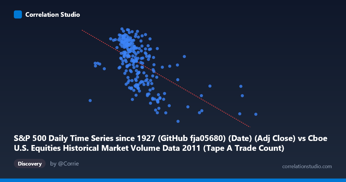
S&P 500 Daily Time Series since 1927 (GitHub fja05680) (Date) (Adj Close) vs Cboe U.S. Equities Historical Market Volume Data 2011 (Tape A Trade Count)
- Pearson correlation (r)
- -0.5681
- Spearman correlation
- -0.5891
- p-value
- 0
- Sample size (n)
- 252
- 95% confidence interval
- -0.6463 to -0.4781
- Granger causality
- None
- Granger optimal lag
- 1
AI analysis
Analysis: S&P 500 Adjusted Close vs. Cboe Tape A Trade Count (2011)
Relationship Overview The scatterplot reveals a negative relationship between the S&P 500 adjusted closing price (X-axis) and the Cboe Tape A trade count (Y-axis) across 252 trading days in 2011. As the S&P 500 index level rises, the number of individual trades on Tape A venues tends to decline, and conversely, elevated trade counts cluster around lower index price levels. This pattern is economically intuitive: periods of market stress or declining prices in 2011 — particularly surrounding the U.S. debt ceiling crisis and European sovereign debt turmoil — were accompanied by heightened trading activity and fragmentation into smaller, more numerous transactions, while calmer, higher-price periods saw more consolidated, lower-frequency trading.
Correlation Strength and Statistical Interpretation The Pearson correlation coefficient of r = −0.568 indicates a moderate negative linear association. The R² of 0.323 means that roughly 32.3% of the variance in Tape A trade counts is statistically explained by the S&P 500 price level, leaving nearly 68% attributable to other factors. The 95% confidence interval of [−0.646, −0.478] is reasonably tight and does not cross zero, and the p-value is effectively zero, confirming this relationship is highly statistically significant and not a sampling artifact. The linear regression equation (y = −0.000112x + 1,402) estimates that each 10,000-point increase in the index is associated with approximately 1.1 fewer trade-count units, though the practical unit scaling matters here. Critically, Granger causality tests show no significant predictive directionality in either direction (X→Y: F = 0.16, p = 0.69; Y→X: F = 0.002, p = 0.97), meaning that neither series reliably forecasts the other at a one-period lag. This distinguishes the relationship as contemporaneous and associative, not temporally predictive — a crucial caveat for any trading or forecasting application.
Notable Patterns, Clusters, and Outliers Several structural features stand out in the data. There is a dense cluster of observations between roughly X = 950,000–1,200,000 (lower S&P levels) and Y = 1,270–1,360 (higher trade counts), confirming the core negative trend. At the higher end of the X range — index levels above ~1,600,000–2,900,000 — trade counts drop noticeably and scatter more widely, suggesting reduced market participation during calmer, higher-price regimes. A few outliers are visible at extreme X values (e.g., points near X = 2,126,541 and X = 2,925,714) with relatively moderate Y values around 1,170–1,200, which may correspond to specific low-volatility periods or calendar effects. The sample point at X ≈ 1,453,966, Y ≈ 1,131 is notably low on the trade count axis, potentially representing a holiday-shortened session or a structural anomaly in reporting.
Confounding Factors and Caveats Several important caveats limit causal interpretation. First, 2011 was an unusually volatile year with discrete macro shocks (S&P U.S. credit downgrade in August, European debt crisis peaks) that simultaneously depressed index prices and spiked trading volumes — this creates a spurious-looking correlation driven by shared exposure to volatility regimes rather than a direct price-volume mechanism. Second, market microstructure changes such as high-frequency trading intensity, exchange fee schedules, and order routing rules can independently drive trade counts irrespective of price levels. Third, the X-axis labels suggest a possible dataset join artifact — the S&P 500 price series is sourced from one dataset while trade counts come from another, and alignment errors or timezone mismatches could introduce noise. Finally, the R² of 32% while statistically robust still leaves the majority of variance unexplained, warranting humility about the explanatory power of this single-variable model.
Actionable Insights and Further Investigation Practitioners should explore volatility (VIX) as a mediating variable, as it likely explains much of the shared variance between falling prices and rising trade counts — a multivariate regression including realized volatility or VIX levels would clarify whether the price-volume relationship persists after controlling for fear. It would also be valuable to segment the data by market regime (e.g., pre- and post-August 2011 downgrade) to test whether the correlation is structurally stable or driven entirely by a single stress episode. Investigating lagged relationships beyond one period — perhaps weekly or monthly lags — could uncover slower-moving dynamics not captured by the one-period Granger test. Finally, replicating this analysis across multiple calendar years would determine whether this negative correlation is a persistent feature of U.S. equity market microstructure or a 2011-specific artifact of an extraordinary macro environment.
X dataset: Cboe U.S. Equities Historical Market Volume Data 2011
Y dataset: S&P 500 Daily Time Series since 1927 (GitHub fja05680) (Date)
Part of experiment: Daily - Cboe U.S. Equities Historical Market Volume Data 2011 vs S&P 500 Daily Time Series since 1927 (GitHub fja05680) (Date)