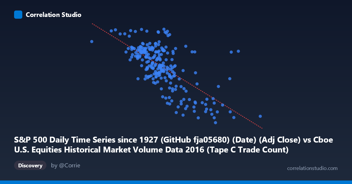
S&P 500 Daily Time Series since 1927 (GitHub fja05680) (Date) (Adj Close) vs Cboe U.S. Equities Historical Market Volume Data 2016 (Tape C Trade Count)
- Pearson correlation (r)
- -0.6782
- Spearman correlation
- -0.6181
- p-value
- 0
- Sample size (n)
- 252
- 95% confidence interval
- -0.7398 to -0.6053
- Granger causality
- None
- Granger optimal lag
- 4
AI analysis
Analysis: S&P 500 Price vs. Cboe Tape C Trade Count (2016)
Relationship Overview The scatterplot reveals a moderately strong negative relationship between the S&P 500 adjusted closing price (X-axis) and the Cboe Tape C trade count (Y-axis) across 252 trading days in 2016. As the S&P 500 price rises, the number of trades recorded on Tape C (NYSE Arca-listed securities) tends to decline. This is an intuitively interesting inverse pattern: rising equity prices are associated with fewer individual transactions, suggesting that bull-market conditions in 2016 were accompanied by reduced trading activity — consistent with lower volatility environments where investors hold rather than actively trade.
Correlation Strength and Statistical Significance The Pearson correlation of r = -0.678 indicates a moderate-to-strong negative linear association, and the R² of 0.460 means that roughly 46% of the variance in Tape C trade counts is explained by S&P 500 price levels — a meaningful but incomplete explanation, with 54% of variation attributable to other factors. The 95% confidence interval of [-0.740, -0.605] is relatively tight and sits entirely in negative territory, affirming the direction and reliability of the relationship. With a p-value effectively at zero and a sample of 252 paired observations drawn from a population of 3,622, the result is statistically robust. However, the Granger causality tests yield no significant directional predictive relationship in either direction (X→Y: F=0.35, p=0.85; Y→X: F=1.05, p=0.38), meaning that past S&P 500 prices do not help forecast future trade counts, and vice versa, at the tested lag of 4 periods. The correlation is real but temporally non-directional — likely reflecting a common driver rather than a causal chain.
Notable Patterns, Clusters, and Outliers Several structural features are visible in the data. The bulk of observations cluster in the 600,000–800,000 price range with trade counts between 2,050–2,200, forming a dense central cloud. There are notable outliers at high X values (e.g., ~1,023,027 and ~990,202) paired with low trade counts (~1,869 and ~1,893), pulling the regression line and reinforcing the negative slope. Conversely, a point near X=519,410 shows an unusually high trade count (~2,265), consistent with a low-price, high-activity period. The sample point at approximately (747,548, 2,262) also appears anomalous given its relatively mid-range price but very high trade count, suggesting a potential event-driven spike. The scatter around the regression line widens at lower price levels, hinting at heteroscedasticity — trade activity is more variable during lower-priced (likely more volatile) market conditions.
Confounding Factors and Caveats Several important caveats apply. First, price level is a proxy for time in a trending market — the S&P 500 rose through much of 2016, so this correlation partially reflects a temporal trend (higher prices = later in the year = different market structure conditions). A spurious correlation driven by shared time trends cannot be ruled out without detrending. Second, Tape C specifically covers NYSE Arca listings (often ETFs and certain equities), so trade counts here may be influenced by ETF creation/redemption activity, options expiration cycles, or algorithmic rebalancing that are not directly tied to index price. Third, macroeconomic events (e.g., the February 2016 volatility spike, post-Brexit uncertainty in June, and the post-election rally in November) could be driving both variables simultaneously, acting as confounders. Finally, the linear regression model (y = -0.000470x + 2430) is reasonable but may oversimplify what could be a curved or regime-dependent relationship.
Actionable Insights and Further Investigation Practitioners and researchers should consider several follow-up analyses. Detrending both series (e.g., using first differences or residuals from a time trend) would help isolate whether the correlation persists beyond shared temporal drift. Given the Granger causality null result, exploring contemporaneous common drivers — such as the VIX (volatility index), macroeconomic announcement calendars, or ETF rebalancing flows — could better explain the 54% of unexplained variance. Segmenting the data by market regime (low-volatility vs. high-volatility periods) may reveal whether the negative relationship strengthens during stress events. Additionally, comparing Tape C trade counts against Tape A and Tape B volumes would clarify whether this phenomenon is exchange-specific or market-wide. Finally, extending the analysis beyond 2016 would test whether this inverse price-volume relationship is a persistent structural feature or a one-year artifact.
X dataset: Cboe U.S. Equities Historical Market Volume Data 2016
Y dataset: S&P 500 Daily Time Series since 1927 (GitHub fja05680) (Date)
Part of experiment: Daily - Cboe U.S. Equities Historical Market Volume Data 2016 vs S&P 500 Daily Time Series since 1927 (GitHub fja05680) (Date)