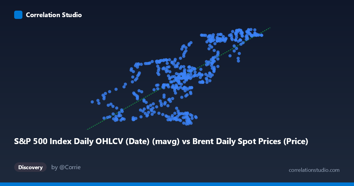
S&P 500 Index Daily OHLCV (Date) (mavg) vs Brent Daily Spot Prices (Price)
- Pearson correlation (r)
- 0.7175
- Spearman correlation
- 0.6961
- p-value
- 0
- Sample size (n)
- 504
- 95% confidence interval
- 0.6723 to 0.7574
- Granger causality
- None
- Granger optimal lag
- 1
AI analysis
Analysis: S&P 500 Moving Average vs. Brent Crude Oil Spot Prices (2015–2017)
Relationship Overview The scatterplot reveals a moderately strong positive relationship between the S&P 500 Index daily moving average (X-axis) and Brent crude oil spot prices (Y-axis) over the two-year period from February 2015 to February 2017. As the S&P 500 moving average increases, Brent crude prices tend to rise as well. The linear regression equation (y = 0.887x + 69.91) suggests that for each one-unit increase in the S&P 500 moving average, Brent crude prices increase by approximately $0.89 per barrel. This co-movement is visually apparent in the upward-sloping point cloud, though considerable scatter around the regression line is evident throughout the distribution.
Correlation Strength and Statistical Significance The Pearson correlation of r = 0.7175 indicates a meaningful positive association, but the R² of 0.5148 is the more sobering figure — it tells us that the S&P 500 moving average explains only about 51.5% of the variance in Brent crude prices, meaning nearly half the variation in oil prices is driven by factors entirely unrelated to equity market performance. The 95% confidence interval of [0.6723, 0.7574] is relatively tight given the large sample (n = 504), and the p-value of essentially zero confirms this correlation is highly unlikely to be a chance artifact. However, statistical significance should not be conflated with practical predictive power, particularly given the Granger causality results: neither X→Y nor Y→X reaches significance (F = 0.198, p = 0.657 and F = 0.107, p = 0.744, respectively). This is a critical finding — while the two series move together contemporaneously, neither variable temporally predicts the other at a one-period lag, strongly suggesting the correlation reflects shared co-movement with a third driver rather than any direct causal mechanism between them.
Notable Patterns and Structural Features Several distinct features are visible in the point cloud. There appears to be a lower-left cluster roughly in the range of X ≈ 26–40 and Y ≈ 94–112, corresponding to a period when both equity valuations and oil prices were depressed — likely the oil price slump of late 2015 to early 2016. A second upper-right cluster forms around X ≈ 55–66 and Y ≈ 124–130, suggesting a later recovery phase where both assets appreciated together. The mid-range (X ≈ 43–52) shows the greatest vertical scatter, with Y values spanning nearly the full range (≈95 to ≈124), indicating that at median S&P 500 levels, oil prices were highly variable and poorly predicted by equity performance alone. A few potential outliers are visible — notably points near (50.73, 96.49), (48.81, 95.18), and (49.05, 95.32), where moderate S&P 500 values coincide with unusually low oil prices — which may correspond to specific oil-market shock events within the period.
Confounding Factors and Caveats This correlation almost certainly reflects joint sensitivity to global macroeconomic conditions rather than any direct linkage between equity markets and crude oil prices. Both assets respond to global growth expectations, USD strength, risk appetite, and monetary policy — the 2015–2017 window was particularly dominated by Federal Reserve policy normalization, China slowdown fears, and the OPEC production war, all of which simultaneously influenced equities and oil. Additionally, the axis labels appear swapped relative to the dataset descriptions (the X dataset is labeled "Brent Daily Spot Prices" but contains an S&P 500 moving average column, and vice versa), which warrants careful data provenance verification before drawing firm conclusions. The use of a moving average for the S&P 500 also introduces autocorrelation and smoothing artifacts that can artificially inflate correlation coefficients between time series, a standard concern in financial time series analysis.
Actionable Insights and Further Investigation Given that the Granger causality tests rule out temporal predictability in either direction, practitioners should avoid using this correlation as a trading signal — the relationship is contemporaneous and likely spurious in the causal sense. Further investigation should include: (1) controlling for USD index movements, which independently drive both oil prices and S&P 500 valuations; (2) regime analysis to test whether the correlation strengthens or breaks down across different macroeconomic periods (e.g., pre- vs. post-OPEC November 2016 deal); (3) testing with raw S&P 500 prices instead of a moving average to eliminate smoothing-induced correlation inflation; and (4) applying vector autoregression (VAR) models with additional covariates (VIX, DXY, 10-year yields) to better isolate whether any residual relationship exists after controlling for common macro drivers.
X dataset: Brent Daily Spot Prices
Y dataset: S&P 500 Index Daily OHLCV (Date)
Part of experiment: Daily - Brent Daily Spot Prices vs S&P 500 Index Daily OHLCV (Date)