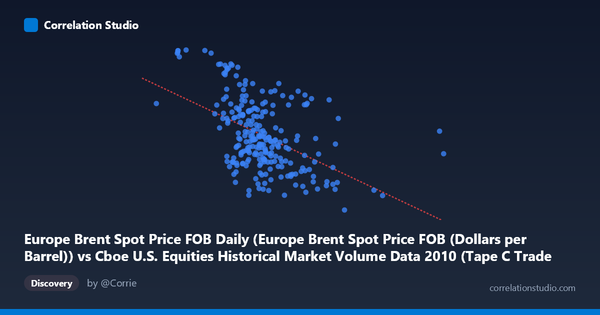
Europe Brent Spot Price FOB Daily (Europe Brent Spot Price FOB (Dollars per Barrel)) vs Cboe U.S. Equities Historical Market Volume Data 2010 (Tape C Trade Count)
- Pearson correlation (r)
- -0.4887
- Spearman correlation
- -0.4632
- p-value
- 0
- Sample size (n)
- 252
- 95% confidence interval
- -0.5774 to -0.3886
- Granger causality
- Y → X
- Granger optimal lag
- 1
AI analysis
Analysis: Europe Brent Spot Price vs. Cboe Tape C Trade Count (2010)
Relationship Overview The scatterplot reveals a moderate negative relationship between Europe Brent Spot Price (X-axis) and Cboe Tape C Trade Count (Y-axis) across 252 trading days in 2010. As crude oil prices increase, the number of trades on Tape C (NYSE-listed securities) tends to decline. The linear regression equation (y = -1.867×10⁻⁵x + 91.10) confirms this inverse slope, though the scatter around the regression line is substantial, indicating considerable unexplained variation. Visually, the data does not form a tight band but rather a diffuse cloud with a discernible downward tilt, suggesting the relationship is real but far from deterministic.
Correlation Strength and Statistical Significance The Pearson correlation of r = -0.489 indicates a moderate negative association. Critically, the R² of 0.239 means that only about 23.9% of the variance in Tape C trade counts is explained by Brent oil prices — leaving roughly 76% attributable to other factors. The 95% confidence interval of [-0.577, -0.389] is entirely negative and does not cross zero, reinforcing directional confidence. The p-value of 2.22×10⁻¹⁶ confirms the relationship is highly statistically significant at the population level (N = 3,302), making chance explanations implausible. However, statistical significance here reflects the large sample size as much as effect strength — the practical magnitude remains modest. The Granger causality results are particularly informative: Y Granger-causes X unidirectionally (F = 3.91, p = 0.049) with a 1-period lag, while X does not Granger-cause Y (F = 0.66, p = 0.419). This suggests that Tape C trade counts have modest predictive power over next-day Brent prices, but not vice versa — an unexpected and counterintuitive directional finding worth scrutinizing carefully.
Notable Patterns, Clusters, and Outliers Several features stand out in the sample data. There is a visible cluster of observations in the X range of roughly 480,000–650,000 (mid-range oil prices ~$75–$85/barrel) where trade counts span a wide range, suggesting high conditional variance in that zone. At lower oil price values (X < ~450,000), trade counts tend to be notably higher (e.g., 91.33, 91.25, 93.63, 93.55), forming a distinct upper-left cluster consistent with the negative trend. Conversely, at very high oil price values — particularly the extreme outlier at X ≈ 1,379,287 and points near 963,255 — trade counts drop to the 67–76 range, anchoring the lower-right portion of the plot. These high-X outliers may exert disproportionate leverage on the regression slope and correlation estimate, potentially inflating the apparent relationship.
Confounding Factors and Caveats Several important caveats apply. First, 2010 was a specific macro-economic regime — the post-financial crisis recovery period — during which both equity trading volumes and oil prices were influenced by common macroeconomic drivers (risk appetite, Federal Reserve policy, global demand recovery), creating conditions for spurious or confounded correlation. The negative relationship may reflect a risk-on/risk-off dynamic: rising oil prices in 2010 may have coincided with periods of lower market uncertainty and reduced speculative trading activity. Second, the Granger causality direction (Y→X) is surprising — it implies equity trade counts predict oil prices, which could reflect informed trading, liquidity spillovers, or more likely, a shared latent variable driving both. Third, the X-axis labeling appears to reflect a notional value or volume metric rather than a simple price, and unit clarification is essential before drawing firm conclusions. Finally, daily data introduces autocorrelation that standard correlation statistics do not fully account for.
Actionable Insights and Further Investigation Practitioners should not interpret this correlation as a reliable trading signal given the modest R² and the likely confounding by macro regime. However, several follow-up analyses are warranted: (1) Partial correlation analysis controlling for VIX (volatility index) and broader market volume to isolate the oil-equity trade relationship from risk-appetite effects; (2) Rolling correlation analysis to test whether the relationship was stable across sub-periods of 2010 or concentrated in specific months; (3) Nonlinear modeling (e.g., spline regression or segmented regression) to test whether the relationship changes character at extreme oil price levels given the visible outlier influence; (4) Replication across other years to determine whether the 2010 finding is idiosyncratic to post-crisis dynamics; and (5) Formal investigation of the Granger causality result using vector autoregression (VAR) with additional control variables to determine whether the Y→X predictive relationship survives multivariate conditioning.
X dataset: Cboe U.S. Equities Historical Market Volume Data 2010
Y dataset: Europe Brent Spot Price FOB Daily
Part of experiment: Daily - Cboe U.S. Equities Historical Market Volume Data 2010 vs Europe Brent Spot Price FOB Daily