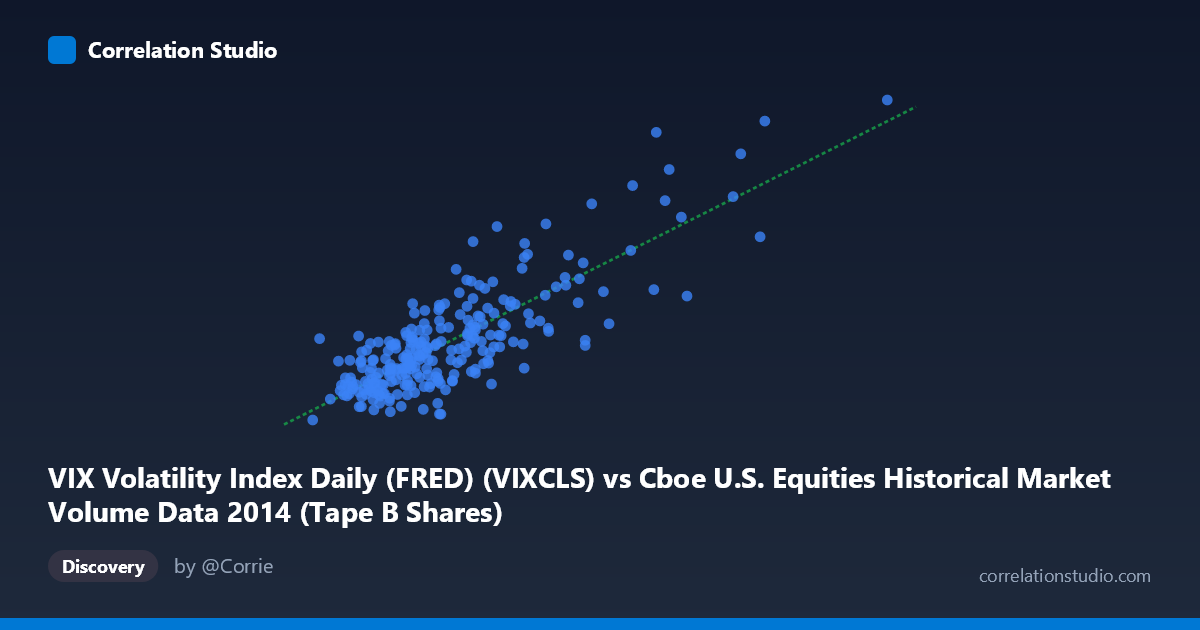
VIX Volatility Index Daily (FRED) (VIXCLS) vs Cboe U.S. Equities Historical Market Volume Data 2014 (Tape B Shares)
- Pearson correlation (r)
- 0.8195
- Spearman correlation
- 0.728
- p-value
- 0
- Sample size (n)
- 252
- 95% confidence interval
- 0.7743 to 0.8563
- Granger causality
- None
- Granger optimal lag
- 1
AI analysis
Analysis: VIX Volatility Index vs. Tape B Share Volume (2014)
Relationship Overview The scatterplot reveals a clear positive relationship between Cboe Tape B share volume (X-axis) and the VIX Volatility Index (Y-axis) across 252 trading days in 2014. As equity market volume on Tape B exchanges increases, implied volatility tends to rise in tandem — a relationship that makes intuitive sense, since elevated fear and uncertainty in markets typically drives both higher options-implied volatility and increased trading activity. The linear regression equation (y = 9.11×10⁻⁸x + 7.32) suggests that for every ~11 million additional shares traded, VIX rises approximately one point, with a baseline VIX of ~7.3 at zero volume (a theoretical extrapolation beyond the data range).
Correlation Strength and Statistical Significance The correlation is strong and statistically robust: r = 0.820 with a tight 95% confidence interval of [0.774, 0.856] and a p-value effectively at zero, leaving no doubt the relationship is real within this sample. The r² = 0.672 is particularly meaningful — roughly 67% of the day-to-day variance in VIX is explained by Tape B share volume, which is a remarkably high figure for a single predictor in financial markets. The remaining ~33% reflects other drivers of implied volatility not captured here. However, the Granger causality tests tell a critical story: neither direction (X→Y: F=0.15, p=0.698; Y→X: F=0.04, p=0.834) shows statistical significance at any conventional threshold. Despite the strong contemporaneous correlation, neither variable temporally predicts the other — ruling out a simple lead-lag relationship and complicating any causal narrative.
Notable Patterns, Clusters, and Outliers The data exhibits a distinct two-regime structure. The bulk of observations cluster tightly in the lower-left region (volume ~40M–100M shares, VIX ~10–17), suggesting relatively calm market conditions dominated 2014's trading calendar. A second, sparse cluster emerges at the upper right (volume ~140M–196M shares, VIX ~20–26), representing clear outlier days of market stress. Points like (162.5M shares, VIX 25.2) and (155.9M shares, VIX 23.6) are visually influential leverage points that likely drive a significant portion of the correlation's magnitude. Within the main cluster, scatter is considerable, with VIX values ranging from ~10.8 to ~17 at similar volume levels (~65M–75M shares), hinting at nonlinearity or heteroscedasticity that a linear model partially masks.
Confounding Factors and Caveats Several important caveats apply. First, both variables are jointly driven by common macro shocks — geopolitical events, Federal Reserve announcements, or earnings seasons simultaneously spike volume and volatility, making the correlation largely a reflection of shared external forcing rather than a direct causal link. This "common cause" confounding is the most likely explanation for why Granger causality fails despite a high r². Second, Tape B specifically covers regional exchanges (NYSE American, NYSE Arca, etc.), so its volume dynamics may differ from total market volume, potentially inflating or distorting the relationship versus a broader measure. Third, the 2014 sample period includes specific stress events (e.g., geopolitical tensions in Ukraine, Ebola fears in October 2014) that generated those high-volume/high-VIX outliers — a different year might yield a weaker correlation. Finally, daily aggregation may obscure intraday dynamics where the relationship behaves differently.
Actionable Insights and Further Investigation Practitioners should not use Tape B volume as a leading indicator for VIX — the Granger causality results firmly preclude that application. Instead, this correlation is better understood as a concurrent risk signal: days with abnormally elevated Tape B volume may serve as a real-time confirmation of stress regimes already visible in VIX. For further investigation, it would be valuable to (1) test nonlinear models (e.g., log-log or piecewise regression) given the apparent regime separation in the scatterplot; (2) include total market volume and options volume as competing predictors to assess whether Tape B's explanatory power is unique or proxied; (3) replicate across multiple years to assess whether 2014's specific stress events artificially inflate r²; and (4) examine residuals against identifiable macro events to better characterize the unexplained 33% of VIX variance.
X dataset: Cboe U.S. Equities Historical Market Volume Data 2014
Y dataset: VIX Volatility Index Daily (FRED)
Part of experiment: Daily - Cboe U.S. Equities Historical Market Volume Data 2014 vs VIX Volatility Index Daily (FRED)