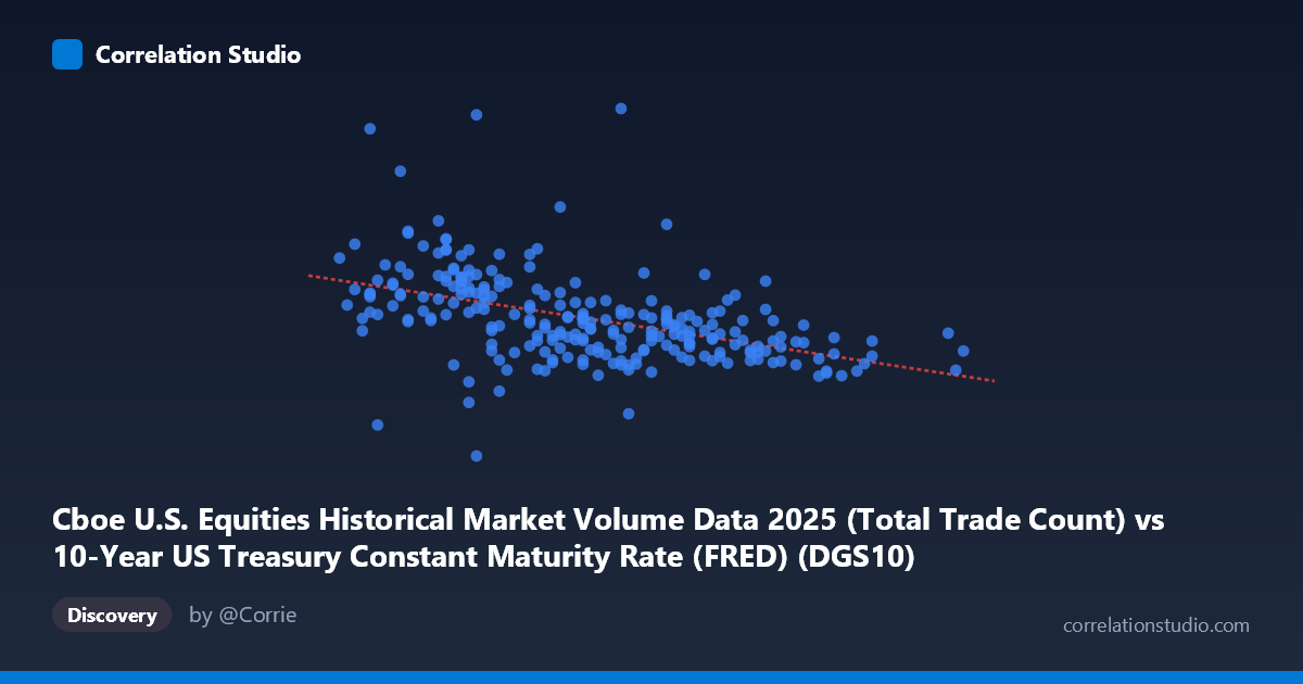
Cboe U.S. Equities Historical Market Volume Data 2025 (Total Trade Count) vs 10-Year US Treasury Constant Maturity Rate (FRED) (DGS10)
- Pearson correlation (r)
- -0.4627
- Spearman correlation
- -0.5644
- p-value
- 0
- Sample size (n)
- 248
- 95% confidence interval
- -0.5553 to -0.3589
- Granger causality
- None
- Granger optimal lag
- 10
AI analysis
Analysis: 10-Year Treasury Yield vs. Cboe Equity Trade Count (2025)
1. Visual Relationship Overview
The scatterplot reveals a moderate negative relationship between the 10-year US Treasury yield (X-axis) and total equity trade count on Cboe exchanges (Y-axis). As yields rise, trade counts tend to decline, and vice versa. The linear regression line (y = -2,534,150x + 16,512,700) slopes downward noticeably, but the data cloud is widely dispersed around this trend, indicating substantial unexplained variance. The relationship is visually discernible but far from deterministic — many data points deviate considerably from the fitted line, particularly in the mid-yield range around 4.15–4.35, where trade counts range wildly from roughly 2.6M to over 8.8M.
2. Correlation Strength, Direction, and Statistical Framing
The Pearson correlation of r = -0.4627 confirms a moderate negative association, but the more telling statistic is r² = 0.2141 — meaning only 21.4% of the variance in equity trade counts is explained by Treasury yield levels. The remaining ~79% is attributable to other factors entirely. The 95% confidence interval of [-0.5553, -0.3589] is reasonably tight and excludes zero, and the p-value of 1.465E-14 makes this correlation highly statistically significant given the sample of 248 paired observations drawn from a population of 4,805 — so the negative relationship is real and unlikely to be a sampling artifact. However, statistical significance should not be conflated with practical magnitude; the explained variance remains modest. Critically, Granger causality tests in both directions fail to reach significance (X→Y: F=0.99, p=0.45; Y→X: F=0.72, p=0.71) at the optimal 10-period lag. This means neither variable reliably predicts the future values of the other in a temporal sense — the correlation captures a contemporaneous association, not a directional, causal mechanism.
3. Notable Patterns, Clusters, and Outliers
Several features stand out in the data:
- Outliers at low yields with high trade counts: Points near X ≈ 4.05–4.10 show exceptionally high Y values (e.g., ~8.8M and ~7.0M trades), pulling the regression line and inflating the apparent strength of the negative relationship. The point at approximately (4.05, 8,817,286) is particularly extreme and warrants individual scrutiny. - Outliers at low yields with low trade counts: Conversely, (4.15, 2,646,353) sits dramatically below the trend at a yield level where most observations cluster between 5M–7M trades — a potential data anomaly or a distinct market event day. - Cluster compression at higher yields: Above X ≈ 4.45, trade counts compress into a narrower band (roughly 4.4M–5.5M), suggesting reduced variability in equity activity during higher-rate regimes. - The Spearman ρ exceeding Pearson r signals a monotonic but non-linear relationship — the negative association may be better captured by a logarithmic or polynomial fit rather than a straight line, particularly given the apparent flattening at higher yield levels.
4. Confounding Factors and Interpretive Caveats
Several important caveats apply:
- Directionality is ambiguous: The axis labels appear swapped in description (the X dataset is labeled as Treasury yield data but contains trade counts, and vice versa) — this should be verified before drawing conclusions, as it affects the causal narrative entirely. - Macroeconomic co-movement: Both variables are driven by broader market conditions. High-volatility market episodes (e.g., Fed announcement days, geopolitical shocks) simultaneously drive yields and trade volumes, creating spurious correlation without a direct link. - Seasonality and calendar effects: Trade counts are heavily influenced by day-of-week, holiday proximity, and quarter-end effects — none of which are controlled for here. - Regime changes: The 2025 yield range of 3.97–4.79 spans a meaningful policy range; structural breaks within the year could create subgroup patterns that a single linear model obscures. - Omitted variables: VIX (market fear index), equity index returns, and Fed communication events are likely stronger direct drivers of trade count than yield levels alone.
5. Actionable Insights and Further Investigation
Given the findings, the following steps are recommended:
1. Fit a non-linear model (logarithmic or piecewise linear with a breakpoint around 4.35) to better capture the apparent curvature suggested by the Spearman/Pearson divergence. 2. Investigate the outliers explicitly — particularly the ~8.8M trade day near 4.05 yield and the ~2.6M trade day near 4.15, as they may correspond to identifiable macro events (FOMC decisions, index rebalancing) that should be flagged or excluded in robustness checks. 3. Introduce volatility controls (e.g., VIX levels) as covariates in a multivariate regression to determine whether the yield-volume relationship persists after accounting for general market stress. 4. Segment by yield regime (e.g., rising vs. falling yield periods) to test whether the negative correlation is symmetric or asymmetric — flight-to-safety dynamics may produce different trading behavior during yield spikes versus yield declines. 5. Extend Granger testing with shorter lags (1–5 periods) to check for very short-term predictive relationships that the 10-period optimal lag may be masking.
X dataset: 10-Year US Treasury Constant Maturity Rate (FRED)
Y dataset: Cboe U.S. Equities Historical Market Volume Data 2025
Part of experiment: Daily - 10-Year US Treasury Constant Maturity Rate (FRED) vs Cboe U.S. Equities Historical Market Volume Data 2025