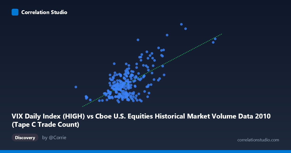
VIX Daily Index (HIGH) vs Cboe U.S. Equities Historical Market Volume Data 2010 (Tape C Trade Count)
- Pearson correlation (r)
- 0.6504
- Spearman correlation
- 0.4643
- p-value
- 0
- Sample size (n)
- 252
- 95% confidence interval
- 0.5728 to 0.7164
- Granger causality
- Y → X
- Granger optimal lag
- 1
AI analysis
Scatterplot Analysis: VIX High vs. Tape C Trade Count (2010)
Relationship Overview The scatterplot reveals a moderate-to-strong positive relationship between the CBOE Volatility Index (VIX) daily high values and Tape C trade counts on U.S. equities exchanges throughout 2010. As market volatility increases (higher VIX readings), trading activity on Tape C (NYSE Arca-listed securities) rises correspondingly. This is intuitive: periods of elevated fear or uncertainty tend to drive heavier trading volumes as investors reposition portfolios, execute hedges, or react to news events. The linear regression equation (y = 2.497×10⁻⁵x + 8.32) confirms a positive slope, though the intercept suggests a meaningful baseline trade count even at low volatility levels.
Correlation Strength and Statistical Significance The Pearson correlation of r = 0.6504 indicates a moderately strong positive association, but the more telling statistic is r² = 0.4230 — meaning VIX daily highs explain approximately 42.3% of the variance in Tape C trade counts. While meaningful, this leaves nearly 58% of variance unexplained by this relationship alone. The 95% confidence interval of [0.5728, 0.7164] is reasonably tight and entirely positive, providing confidence that the true population correlation is reliably non-trivial. The p-value of effectively zero (given N = 3,302) confirms this association is not a statistical artifact. Critically, Granger causality runs unidirectionally from Y→X (F = 5.74, p = 0.0173), meaning past Tape C trade counts have statistically significant predictive power over future VIX high levels, while the reverse direction (X→Y, F = 2.90, p = 0.090) falls short of the conventional significance threshold. This is a striking and somewhat counterintuitive finding — trading volume activity appears to lead volatility index movements rather than simply responding to them.
Notable Patterns, Clusters, and Outliers The scatterplot exhibits several structurally important features. The bulk of observations cluster in a dense core roughly between VIX values of 16–28 and moderate trade counts, reflecting the relatively calm market environment that characterized much of 2010. However, a distinct upper-right cluster of high-leverage points — including coordinates like (1,379,287, 42.15), (1,086,790, 48.20), and (963,255, 43.74) — represents episodes of elevated volatility coinciding with surging trade activity, likely tied to events such as the May 2010 Flash Crash or European sovereign debt anxieties. The point at (1,086,790, 48.20) is a particularly notable outlier, representing one of the highest VIX readings in the dataset. There also appear to be cases of high trade counts at relatively moderate VIX levels (e.g., ~900K trades at VIX ~25), suggesting some decoupling between volume and volatility in specific market conditions.
Confounding Factors and Caveats Several important caveats temper straightforward causal interpretation. First, Tape C specifically covers NYSE Arca-listed ETFs and securities, so its trade count reflects a structurally distinct market segment where volatility-driven ETF arbitrage activity could artificially amplify the correlation. Second, secular trends in algorithmic and high-frequency trading throughout 2010 may create spurious correlation — both VIX and trade counts could be jointly driven by macroeconomic shocks (e.g., Flash Crash, Fed announcements) rather than one causing the other. Third, the Granger causality result, while statistically significant, operates at a 1-period lag and captures temporal precedence, not true causation — feedback loops between volume and volatility are well-documented in market microstructure literature. Finally, the time series structure of the data means observations are not independent, which can inflate apparent correlation strength.
Actionable Insights and Further Investigation The Granger causality finding — that Tape C trade count leads VIX movements — warrants serious follow-up. Practitioners could investigate whether unusually high Tape C volumes serve as an early warning signal for volatility spikes, potentially useful for risk management or options positioning. Further analysis should include: (1) decomposing Tape C by instrument type (ETFs vs. equities) to identify whether ETF arbitrage flows specifically drive the VIX predictability; (2) applying non-linear models (e.g., regime-switching or GARCH frameworks) given the heteroscedastic spread visible in the upper tail; (3) controlling for macroeconomic event dates to test whether the correlation holds outside of shock episodes; and (4) extending the analysis across multiple years to determine whether the 2010 Granger causality result is a persistent structural feature or an artifact of that year's unique volatility regime.
X dataset: Cboe U.S. Equities Historical Market Volume Data 2010
Y dataset: VIX Daily Index
Part of experiment: Daily - Cboe U.S. Equities Historical Market Volume Data 2010 vs VIX Daily Index