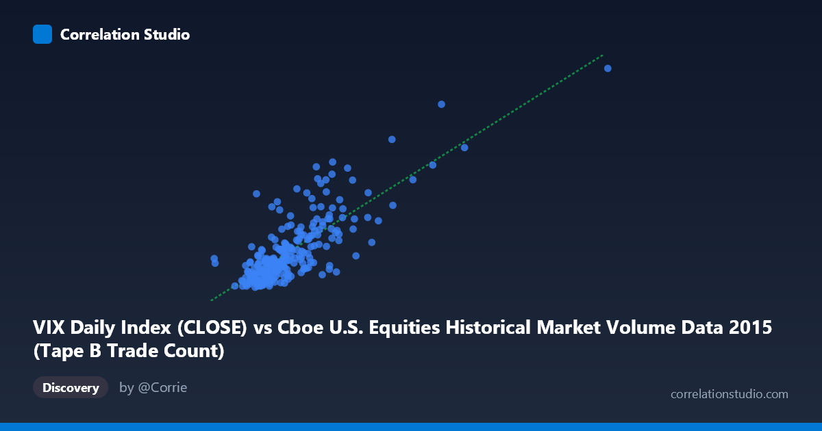
VIX Daily Index (CLOSE) vs Cboe U.S. Equities Historical Market Volume Data 2015 (Tape B Trade Count)
- Pearson correlation (r)
- 0.7902
- Spearman correlation
- 0.7286
- p-value
- 0
- Sample size (n)
- 252
- 95% confidence interval
- 0.7387 to 0.8325
- Granger causality
- None
- Granger optimal lag
- 1
AI analysis
Analysis: VIX Daily Index vs. Tape B Trade Count (2015)
Relationship Overview The scatterplot reveals a clear positive relationship between the CBOE Volatility Index (VIX) closing values and Tape B trade counts across U.S. equity exchanges in 2015. As VIX rises — reflecting elevated market fear or uncertainty — the number of Tape B trades increases correspondingly. This is an intuitive finding: periods of heightened volatility typically drive greater trading activity as market participants react to price movements, hedge positions, or opportunistically trade momentum. The linear regression equation (y = 3.67×10⁻⁵x + 5.678) captures this upward trend, though the scatter around the line suggests the relationship is meaningful but imperfect.
Correlation Strength and Statistical Significance The correlation is strong and positive (r = 0.790), and the r² of 0.624 means that roughly 62% of the variance in Tape B trade counts is explained by VIX levels — a notably high proportion for financial market data. The 95% confidence interval [0.739, 0.833] is tight and entirely positive, indicating high precision in this estimate, and the p-value of effectively zero confirms this is not a chance finding across the 252 paired observations (drawn from a population of N = 3,302). However, the Granger causality tests tell a more nuanced story: neither direction (X→Y: F = 0.483, p = 0.488; Y→X: F = 0.0004, p = 0.983) achieves significance at lag-1. This means that while VIX and Tape B trade counts are strongly contemporaneously correlated, neither variable reliably predicts the other one period ahead. The relationship appears to be one of co-movement driven by common underlying forces rather than a clean directional, temporal causal pathway.
Notable Patterns, Clusters, and Outliers The data forms a relatively coherent linear cloud in the lower-left region — the bulk of observations cluster around VIX values of 130,000–400,000 and trade counts of 12–20, reflecting the relatively calm equity environment that characterized much of 2015. However, there is a distinct upper-right cluster of outliers with VIX readings exceeding 500,000 and trade counts reaching 27–36, most visibly including points near (621,009, 28.0), (640,679, 36.0), and (1,014,195, 40.7). These almost certainly correspond to the August 2015 volatility spike, when China's currency devaluation triggered a global equity sell-off and VIX briefly exceeded 40. These extreme observations are consistent with the known dataset timeframe (Jan–Dec 2015) and exert considerable leverage on the regression fit. Notably, even at lower VIX ranges, there is meaningful vertical scatter, suggesting other factors modulate trade counts independently of volatility.
Confounding Factors and Caveats Several important caveats apply. First, reverse causality cannot be ruled out on a conceptual basis even though Granger tests show no lag-1 predictive direction — high trading volumes can themselves amplify price swings and push VIX higher intraday, meaning the relationship may be bidirectional and contemporaneous. Second, the August 2015 outliers likely inflate r substantially; removing those extreme observations would almost certainly reduce the correlation and r² meaningfully, and the relationship in "normal" market conditions may be considerably weaker. Third, Tape B specifically covers NYSE American (AMEX) and regional exchange-listed securities, which may not behave identically to broader market volume metrics — the correlation with total market volume or Tape A/C data could differ. Fourth, 2015 was a single calendar year with one major volatility event, limiting the generalizability of these findings to other market regimes.
Actionable Insights and Further Investigation Practitioners could explore several follow-up analyses. Removing or separately modeling the August 2015 event would clarify how robust the VIX–trade count relationship is during normal volatility regimes. Extending the analysis to multiple years — including 2008, 2011, 2020 — would test whether this correlation is stable across different crisis types and market structures. Given the absence of Granger causality, researchers should investigate common drivers (e.g., macro news releases, Federal Reserve announcements, earnings seasons) that simultaneously elevate both VIX and trading activity rather than assuming one causes the other. Finally, a non-linear or regime-switching model (e.g., distinguishing low-, medium-, and high-VIX regimes) may better capture the apparent curvature visible at the extremes of the distribution, potentially yielding more actionable trading or risk management signals.
X dataset: Cboe U.S. Equities Historical Market Volume Data 2015
Y dataset: VIX Daily Index
Part of experiment: Daily - Cboe U.S. Equities Historical Market Volume Data 2015 vs VIX Daily Index