FRED – 10-Year Treasury Constant Maturity Minus 2-Year (Yield Curve Spread) (T10Y2Y) vs Cboe U.S. Equities Historical Market Volume Data 2009 (Tape A Shares)
- Pearson correlation (r)
- -0.4332
- Spearman correlation
- -0.4549
- p-value
- 0
- Sample size (n)
- 250
- 95% confidence interval
- -0.5288 to -0.3267
- Granger causality
- None
- Granger optimal lag
- 1
- Time coverage
- 2009-01-02 to 2009-12-31
- Recomputed on refreshed data
- 2026-10-23 (r was -0.4332)
AI analysis
Analysis: Yield Curve Spread vs. Tape A Equity Share Volume (2009)
Relationship Overview
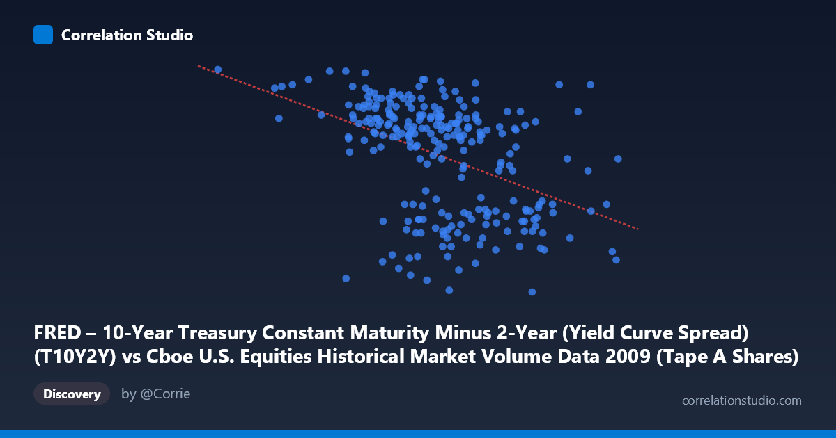
The scatterplot reveals a moderate negative relationship between Cboe Tape A equity share volume (X-axis) and the 10-Year minus 2-Year Treasury yield curve spread (Y-axis) across 250 trading days in 2009. The linear regression equation (y = -1.4703×10⁻⁹x + 2.953) confirms that as daily equity share volume increases, the yield curve spread tends to narrow. This makes intuitive financial sense in the context of 2009: the year began in the depths of the Global Financial Crisis, when equity markets were volatile and highly active (high volume), while the Federal Reserve's aggressive rate cuts had already compressed short-term yields, keeping the curve steep. As markets stabilized through the year, volumes moderated and the spread continued to evolve — though not always in lockstep with trading activity.
Correlation Strength and Statistical Significance
The correlation coefficient of r = -0.4332 indicates a moderate negative association. Critically, the R² of 0.1877 means that only about 18.8% of the variance in yield curve spread is explained by equity share volume — leaving more than 80% attributable to other factors. The 95% confidence interval of [-0.5288, -0.3267] is entirely negative and does not cross zero, and the p-value of 7.376×10⁻¹³ confirms this relationship is highly statistically significant, making chance an implausible explanation given N = 3,232 observations. However, statistical significance should not be conflated with practical or causal significance. The Granger causality tests tell a sobering story: neither X→Y (F = 0.476, p = 0.491) nor Y→X (F = 0.236, p = 0.628) is significant at any conventional threshold. This means neither variable temporally predicts the other — the correlation reflects a shared contemporaneous pattern (likely both responding to the same macroeconomic backdrop) rather than any directional, predictive relationship.
Patterns, Clusters, and Notable Features
Several structural features are visible in the data. There is a notable cluster of high-spread observations (Y ≈ 2.4–2.8) concentrated at lower-to-mid volume levels (roughly 200M–450M shares), consistent with the first half of 2009 when crisis-era uncertainty kept spreads wide. A second cluster of lower-spread, higher-volume points (X 550M, Y ≈ 1.6–2.0) likely corresponds to periods of acute market stress with extreme volume spikes. The point at (105,713,299, 2.82) — minimum volume paired with maximum spread — is a clear outlier on the low-volume end, potentially reflecting a holiday-shortened session or data anomaly. Conversely, (704,192,148, 2.29) represents peak volume with a mid-range spread. The relationship also appears to have non-linear characteristics: the negative trend is more pronounced at volume extremes, with considerable scatter in the mid-range, suggesting a simple linear fit may be underselling structural complexity.
Confounding Factors and Interpretive Caveats
Several confounders complicate causal interpretation. 2009 is a structurally unusual year — spanning the market bottom (March 9), the Fed's zero-interest-rate policy, and the subsequent recovery rally — meaning both variables are simultaneously driven by a common latent factor: macroeconomic crisis severity and risk appetite. Tape A volume specifically represents NYSE-listed securities and may not capture full market breadth. The yield curve spread is itself a policy-endogenous variable heavily influenced by Fed forward guidance, not purely a market signal. Furthermore, day-of-week effects, earnings seasons, and VIX spikes could independently drive volume surges while the curve remained relatively stable, introducing noise. The axis labels in the provided data also appear transposed (X described as T10Y2Y in dataset notes but labeled as volume), warranting verification of variable assignment before drawing firm conclusions.
Actionable Insights and Further Investigation
Despite the modest explanatory power, the negative correlation offers a meaningful market signal worth exploring further. Practitioners could investigate whether extreme high-volume days ( 600M Tape A shares) systematically precede yield curve compression in subsequent sessions, even if Granger causality at a 1-day lag is absent — longer lags (5–20 days) should be tested. Regime-segmentation analysis separating the crisis phase (Jan–March 2009) from the recovery phase (April–December 2009) would likely reveal whether the correlation is driven entirely by one sub-period. Adding VIX as a control variable would help isolate whether the volume-spread relationship survives after accounting for generalized fear. Finally, replicating this analysis across multiple years (2007–2010) would clarify whether this is a crisis-specific artifact or a persistent structural feature of equity-bond market interaction.
X dataset: Cboe U.S. Equities Historical Market Volume Data 2009
Y dataset: FRED – 10-Year Treasury Constant Maturity Minus 2-Year (Yield Curve Spread)
Part of experiment: Daily - Cboe U.S. Equities Historical Market Volume Data 2009 vs FRED – 10-Year Treasury Constant Maturity Minus 2-Year (Yield Curve Spread)