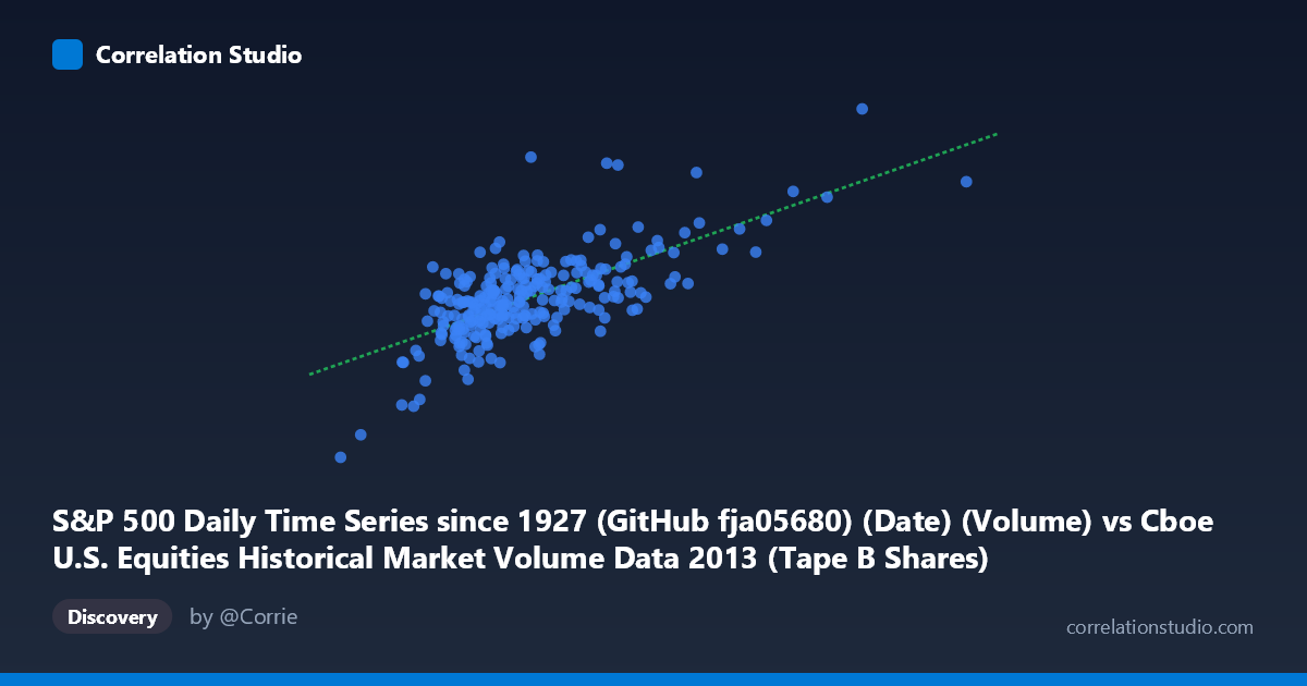
S&P 500 Daily Time Series since 1927 (GitHub fja05680) (Date) (Volume) vs Cboe U.S. Equities Historical Market Volume Data 2013 (Tape B Shares)
- Pearson correlation (r)
- 0.6863
- Spearman correlation
- 0.5988
- p-value
- 0
- Sample size (n)
- 252
- 95% confidence interval
- 0.6148 to 0.7465
- Granger causality
- None
- Granger optimal lag
- 10
AI analysis
Analysis: S&P 500 Daily Volume vs. Cboe Tape B Shares (2013)
Relationship Overview The scatterplot reveals a moderate positive relationship between S&P 500 daily trading volume (X-axis, sourced from GitHub fja05680) and Cboe Tape B shares (Y-axis) across 252 trading days in 2013. As overall market volume increases, Tape B share volume tends to rise proportionally, which is intuitive given that Tape B represents a subset of broader U.S. equity market activity. The linear regression equation (y = 20.96x + 1.879B) suggests that for every additional unit of S&P 500 volume, Tape B shares increase by approximately 20.96 units, with a substantial baseline intercept reflecting the floor-level activity in Tape B securities regardless of broader market conditions.
Correlation Strength and Statistical Significance The correlation of r = 0.686 is statistically robust, with a p-value of effectively zero and a tight 95% confidence interval of [0.615, 0.747], leaving little doubt that a genuine positive association exists in the population (N = 3,780). However, the r² of 0.471 means that only 47.1% of the variance in Tape B shares is explained by overall S&P 500 volume — meaning more than half of Tape B's day-to-day variability is driven by other factors entirely. Despite the strong correlation, the Granger causality results are unambiguous: neither variable significantly predicts the other temporally (X→Y: F = 0.566, p = 0.841; Y→X: F = 0.666, p = 0.755). This means the relationship is contemporaneous and associative — knowing yesterday's S&P 500 volume does not help forecast today's Tape B activity, and vice versa, even at an optimal lag of 10 periods.
Notable Patterns, Clusters, and Outliers The scatterplot shows a moderately tight central cluster concentrated roughly between 55M–85M on the X-axis and 3.0B–3.8B on the Y-axis, consistent with typical 2013 trading conditions. Several notable outliers are visible: the point near (46M, 1.97B) and (47M, 2.05M) represent unusually low-volume sessions where both metrics compressed simultaneously — likely holiday-adjacent or summer lull sessions. On the upper end, points near (135M, 4.66B) and (119M, 3.95B) represent high-activity outliers, potentially corresponding to index rebalancing events, macro announcements, or end-of-quarter surges. The spread widens noticeably at higher X values, suggesting mild heteroscedasticity — Tape B volume becomes less predictable on high-volume days, possibly because extreme volume events affect different market segments unevenly.
Confounding Factors and Caveats Several important caveats temper interpretation. First, this is a same-day, within-year correlation — both variables respond simultaneously to the same market-wide catalysts (e.g., Fed announcements, earnings seasons, macroeconomic data releases), so the correlation may largely reflect shared exposure to common drivers rather than any meaningful structural relationship between the two series. The absence of Granger causality reinforces this — they move together because they react to the same external shocks, not because one drives the other. Second, 2013 was a distinctive year (strong bull market, post-crisis recovery, taper tantrum in May–June), limiting generalizability to other market regimes. Third, the dataset note flags no explicit alignment methodology between the two sources, raising potential date-matching inconsistencies that could distort the measured correlation. Finally, Tape B specifically covers NYSE American (AMEX) and regional exchange listings, which may have structural volume differences from S&P 500 components.
Actionable Insights and Further Investigation Practitioners should investigate which specific events drive the high-volume outliers, as those sessions disproportionately anchor the regression slope and may represent regime-specific behavior worth modeling separately. Given the unexplained 52.9% variance, a multivariate model incorporating volatility (VIX), options expiration calendars, and macro event dummies would likely improve predictive power substantially. Researchers should also test whether the correlation holds across different years and market regimes — a rolling-window correlation analysis would reveal whether r = 0.686 is stable or episodic. Finally, since Granger causality failed even at 10 lags, intraday data at finer granularity might reveal lead-lag dynamics invisible at the daily level, particularly around market open and close where Tape B activity concentrations may differ from S&P 500 aggregate volume patterns.
X dataset: Cboe U.S. Equities Historical Market Volume Data 2013
Y dataset: S&P 500 Daily Time Series since 1927 (GitHub fja05680) (Date)
Part of experiment: Daily - Cboe U.S. Equities Historical Market Volume Data 2013 vs S&P 500 Daily Time Series since 1927 (GitHub fja05680) (Date)