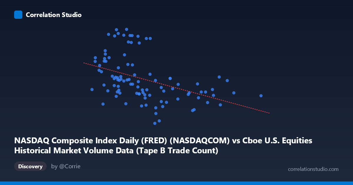
NASDAQ Composite Index Daily (FRED) (NASDAQCOM) vs Cboe U.S. Equities Historical Market Volume Data (Tape B Trade Count)
- Pearson correlation (r)
- -0.4316
- Spearman correlation
- -0.5172
- p-value
- 0.000008
- Sample size (n)
- 99
- 95% confidence interval
- -0.5796 to -0.2559
- Granger causality
- None
- Granger optimal lag
- 10
AI analysis
Analysis: NASDAQ Composite Index vs. Cboe Tape B Trade Count
Relationship Overview
The scatterplot reveals a moderate negative relationship between the NASDAQ Composite Index level and Cboe U.S. Equities Tape B Trade Count over the January–May 2026 observation window. As the NASDAQ index rises, Tape B trade counts tend to decline, and the linear regression equation (y = −0.00248x + 26,052.8) quantifies this inverse slope. Visually, the data points slope downward from left to right, though with considerable vertical scatter, indicating the relationship is real but far from deterministic. The spread of Y values (roughly 20,795 to 26,656 trades) at any given X level underscores that many other forces are simultaneously shaping Tape B activity.
Correlation Strength and Statistical Significance
The Pearson correlation of r = −0.432 reflects a moderate negative association, but the more telling figure is R² = 0.186: the NASDAQ index level explains only 18.6% of the variance in Tape B trade counts, leaving over 80% attributable to other factors. The 95% confidence interval [−0.580, −0.256] is entirely negative, confirming the direction is reliable, and the p-value of 8.2 × 10⁻⁶ establishes high statistical significance, making a chance finding very unlikely given n = 99 and N = 1,980. However, the Granger causality tests are both non-significant (X→Y: F = 1.18, p = 0.321; Y→X: F = 1.24, p = 0.283), meaning neither variable temporally predicts the other in a lead-lag sense at any lag up to 10 periods. This is a critical caveat: the correlation reflects a contemporaneous co-movement, not a directional predictive relationship.
Notable Patterns, Clusters, and Outliers
Several structural features stand out in the point cloud. There is a visible cluster of high-Y outliers (trade counts above ~25,500) concentrated at lower X values (roughly 700,000–1,000,000 index range), consistent with the negative slope but also suggestive of a non-linear or threshold effect — trade counts appear to spike sharply at lower index levels rather than declining smoothly. Conversely, the right side of the distribution (NASDAQ above ~1,400,000) shows tightly compressed, uniformly low trade counts, suggesting a floor effect or saturation. Two notable high-leverage points near X = 1,808,758 and X = 1,623,470 sit at the far right with relatively average Y values, and the point at Y = 26,656 (the maximum) near X = 892,624 appears as a potential outlier worth examining individually.
Confounding Factors and Interpretive Caveats
Several confounds complicate a causal reading of this correlation. Market regime and volatility (e.g., VIX spikes) simultaneously depress equity prices and inflate trade counts as investors react defensively — this alone could generate the observed negative correlation without any direct mechanism linking index level to Tape B specifically. Tape B composition (NYSE American, regional exchanges) means its trade count reflects routing decisions and market structure dynamics that differ from Tape A/C, adding noise. The time compression (just ~5 months of 2026) may also capture a specific market episode — such as a correction or elevated volatility period — rather than a generalizable structural relationship. Additionally, the dataset merges daily NASDAQ index closes with daily Cboe volume data, and any timestamp alignment issues or non-trading day interpolations could introduce spurious correlations.
Actionable Insights and Further Investigation
Given the moderate but unexplained 81% residual variance, several follow-up analyses are warranted. First, incorporate realized volatility (VIX or REALIZED VOL) as a covariate to test whether it mediates the negative relationship, which would be the most theoretically grounded explanation. Second, segment the data by market regime (trending vs. mean-reverting periods) to see if the correlation strengthens or reverses in different environments. Third, compare Tape B with Tape A and C trade counts under identical conditions to determine whether this is an exchange-routing-specific phenomenon or a broad market microstructure effect. Finally, extending the time series well beyond 5 months and applying rolling-window correlations would reveal whether this relationship is stable or episodic — a critical distinction before drawing any operational or trading conclusions from it.
X dataset: Cboe U.S. Equities Historical Market Volume Data
Y dataset: NASDAQ Composite Index Daily (FRED)
Part of experiment: Daily - Cboe U.S. Equities Historical Market Volume Data vs NASDAQ Composite Index Daily (FRED)