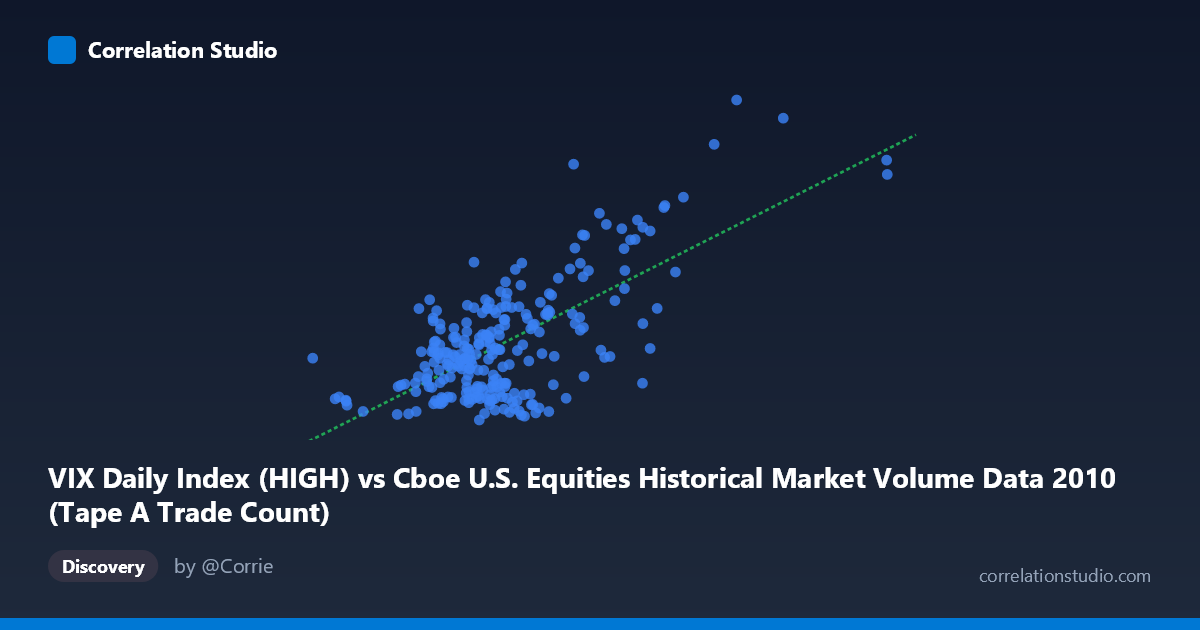
VIX Daily Index (HIGH) vs Cboe U.S. Equities Historical Market Volume Data 2010 (Tape A Trade Count)
- Pearson correlation (r)
- 0.683
- Spearman correlation
- 0.4593
- p-value
- 0
- Sample size (n)
- 252
- 95% confidence interval
- 0.611 to 0.7438
- Granger causality
- Bidirectional
- Granger optimal lag
- 1
AI analysis
Analysis: VIX High vs. Tape A Trade Count (2010)
Relationship Overview
The scatterplot reveals a moderately strong positive relationship between the CBOE Volatility Index (VIX) daily high values and Tape A trade counts on U.S. equity exchanges throughout 2010. As VIX high readings increase, trade counts tend to rise correspondingly, which aligns intuitively with market microstructure theory: elevated volatility typically drives higher trading activity as market participants reposition portfolios, execute hedges, and respond to price uncertainty. The linear regression equation (y = 1.0275×10⁻⁵x + 10.1645) indicates that for every one-unit increase in the VIX high, trade counts increase by approximately 1.03×10⁻⁵ units, suggesting a meaningful but not overwhelming marginal effect across the observed range.
Correlation Strength and Statistical Significance
The Pearson correlation of r = 0.683 indicates a moderate-to-strong positive association, but the explanatory power deserves careful framing: R² = 0.4665 means that roughly 46.7% of variance in Tape A trade counts is explained by VIX highs, leaving over half the variance attributable to other factors. The 95% confidence interval [0.611, 0.744] is relatively tight given the sample size of n = 252, and the p-value of effectively zero confirms this relationship is highly unlikely to be a statistical artifact. The bidirectional Granger causality result (X→Y: F = 3.89, p = 0.050; Y→X: F = 6.55, p = 0.011) is particularly noteworthy — both variables temporally predict each other at a one-period lag. The stronger Y→X direction (trade count predicting future VIX highs) is arguably the more surprising finding, suggesting that surging trading volume may itself contribute to or anticipate subsequent volatility spikes, not merely respond to them.
Notable Patterns, Clusters, and Outliers
The data exhibits a visible heteroscedastic structure — scatter increases substantially at higher VIX values, indicating that the relationship becomes less predictable during high-volatility regimes. Several clear outliers stand out at extreme coordinates: points near (2,474,888, 48.20) and (3,216,587, 42.15) represent days of exceptionally high volume and volatility simultaneously, likely corresponding to specific market stress events in 2010 (e.g., the May 6 Flash Crash). There also appears to be a dense cluster concentrated in the lower-left region (VIX highs roughly 16–25, trade counts 800,000–1,400,000), representing the majority of "calm market" trading days. A secondary, more dispersed cluster emerges in the upper range, hinting at a possible regime separation between normal and stressed market conditions rather than a purely linear continuum.
Confounding Factors and Caveats
Several important caveats apply. First, 2010 was an atypical year, bracketed by post-financial-crisis recovery and the Flash Crash, which may inflate the apparent correlation compared to calmer multi-year periods. Second, Tape A trade counts reflect only NYSE-listed securities, meaning the relationship could be partly driven by security composition effects (e.g., large-cap stocks dominating both volume and volatility responses). Third, bidirectional Granger causality does not imply true economic causation — both variables may be jointly driven by common latent factors such as macroeconomic news releases, Federal Reserve announcements, or European sovereign debt developments in 2010. The single optimal lag of one period is also short and could reflect shared intraday momentum rather than a structural predictive mechanism. Finally, the heteroscedasticity visible in the plot suggests a log-linear or power-law specification may better characterize this relationship than the fitted linear model.
Actionable Insights and Further Investigation
Practitioners and researchers should consider several follow-up directions. The bidirectional Granger result warrants a vector autoregression (VAR) model to properly disentangle the dynamic feedback between volatility and trading activity. Given the apparent regime behavior, a threshold regression or Markov-switching model separating calm (VIX < 25) from stressed (VIX 25) periods could reveal that the relationship strengthens dramatically during market stress — with direct implications for liquidity risk management and market surveillance. Testing whether this correlation is stable across multiple years (2008–2023) would clarify whether 2010 is representative or anomalous. For trading applications, the Y→X Granger result suggests that unusual spikes in Tape A volume could serve as an early warning signal for subsequent VIX escalation, a potentially actionable input for volatility forecasting models or options hedging triggers.
X dataset: Cboe U.S. Equities Historical Market Volume Data 2010
Y dataset: VIX Daily Index
Part of experiment: Daily - Cboe U.S. Equities Historical Market Volume Data 2010 vs VIX Daily Index