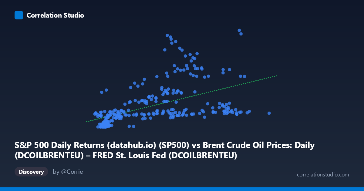
S&P 500 Daily Returns (datahub.io) (SP500) vs Brent Crude Oil Prices: Daily (DCOILBRENTEU) – FRED St. Louis Fed (DCOILBRENTEU)
- Pearson correlation (r)
- 0.5118
- Spearman correlation
- 0.6839
- p-value
- 0
- Sample size (n)
- 297
- 95% confidence interval
- 0.4225 to 0.5911
- Granger causality
- None
- Granger optimal lag
- 10
AI analysis
Analysis: Brent Crude Oil Prices vs. S&P 500
1. Overall Relationship Pattern The scatterplot reveals a modest positive association between S&P 500 values and Brent crude oil prices, spanning nearly four decades of data (1987–2026). While the linear regression line (y = 23.14x + 561.85) captures a general upward trend, the data cloud is notably wide and heteroscedastic — variance in oil prices clearly expands at higher S&P 500 levels. This fanning pattern is a strong visual cue that a simple linear model is insufficient, and the fact that Spearman ρ exceeds Pearson r explicitly flags a non-linear underlying structure, suggesting logarithmic or polynomial fits may be more appropriate.
2. Correlation Strength, Direction, and Causality The Pearson r of 0.51 indicates a moderate positive correlation, but the r² of 0.262 is the more sobering figure — only 26.2% of the variance in Brent crude prices is explained by S&P 500 levels. The remaining ~74% is driven by factors entirely outside this bivariate relationship. The 95% confidence interval [0.42, 0.59] is reasonably tight given n = 297, and the p-value of ~0 confirms statistical significance at any conventional threshold, so the relationship is real but far from deterministic. Critically, Granger causality is absent in both directions (X→Y: F = 1.00, p = 0.45; Y→X: F = 0.95, p = 0.48), meaning neither variable reliably predicts the other temporally, even at an optimal lag of 10 periods. This is an important caveat: the correlation reflects co-movement likely driven by shared macroeconomic forces rather than any directional predictive relationship.
3. Notable Patterns, Clusters, and Outliers Several structural features stand out in the data. There is a dense cluster at lower S&P 500 values (roughly 10–40) with oil prices spanning 250–1,500, suggesting a period of historically low equity valuations or early sample years. At higher S&P 500 values (60–120+), oil prices scatter widely from under 1,000 to over 7,000, producing the heteroscedastic fan. Notable outliers include points like (67.09, 6584), (73.63, 5930), and (84.82, 5171), which sit far above the regression line and likely represent commodity price spikes (e.g., 2008 or post-COVID surges) coinciding with moderate equity levels. Conversely, high S&P values like 115.55 and 113.34 pair with relatively modest oil prices (~1,500), suggesting equity bull markets do not always coincide with elevated crude prices.
4. Confounding Factors and Interpretation Caveats The most significant caveat is that both variables are heavily influenced by shared macroeconomic drivers — global GDP growth, monetary policy cycles, inflation regimes, and geopolitical events — which can induce spurious or inflated correlation without implying any causal mechanism. The axes themselves warrant scrutiny: X appears to be S&P 500 price levels (not returns, despite the dataset label suggesting "daily returns"), while Y is Brent crude in USD/barrel, creating a nominal price comparison vulnerable to long-run inflation and secular trend effects. Both series have strong upward trends over 1987–2026, meaning much of the measured correlation could be attributable to shared non-stationarity rather than genuine co-movement. Additionally, the mismatch between daily oil prices and monthly S&P 500 data introduces temporal aggregation inconsistency.
5. Actionable Insights and Further Investigation Given these findings, several steps would sharpen the analysis. First, detrend or difference both series (log returns or first differences) to remove secular trends and test whether correlation persists after stationarity is enforced — this would reveal whether the relationship is structural or trend-driven. Second, fit a logarithmic or polynomial regression as flagged by the Spearman/Pearson divergence, which may better capture the non-linear, heteroscedastic structure. Third, regime-segment the data by era (e.g., pre-2000, 2000–2008, post-GFC, COVID period) since the correlation likely varies dramatically across commodity super-cycles and equity regimes. Fourth, consider introducing intermediate variables such as the US Dollar Index (DXY) or global industrial production as controls, since dollar strength simultaneously suppresses oil prices and reflects equity conditions. Finally, extending Granger causality testing across a wider lag range and with cointegration testing (Johansen or Engle-Granger) would clarify whether any long-run equilibrium relationship exists beneath the noise.
X dataset: Brent Crude Oil Prices: Daily (DCOILBRENTEU) – FRED St. Louis Fed
Y dataset: S&P 500 Daily Returns (datahub.io)
Part of experiment: Daily - Brent Crude Oil Prices: Daily (DCOILBRENTEU) – FRED St. Louis Fed vs S&P 500 Daily Returns (datahub.io)