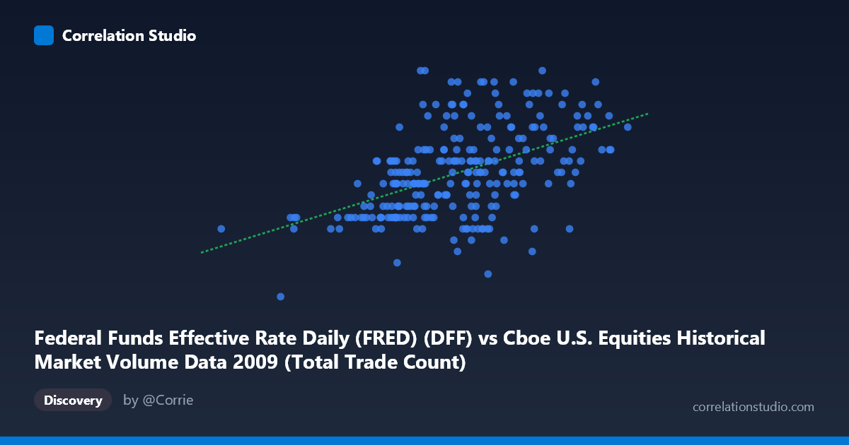
Federal Funds Effective Rate Daily (FRED) (DFF) vs Cboe U.S. Equities Historical Market Volume Data 2009 (Total Trade Count)
- Pearson correlation (r)
- 0.4914
- Spearman correlation
- 0.5032
- p-value
- 0
- Sample size (n)
- 252
- 95% confidence interval
- 0.3916 to 0.5798
- Granger causality
- None
- Granger optimal lag
- 1
AI analysis
Scatterplot Analysis: Federal Funds Rate vs. U.S. Equity Market Trade Count (2009)
Relationship Overview
The scatterplot reveals a modest positive relationship between the Federal Funds Effective Rate (x-axis) and the total trade count in U.S. equity markets (y-axis) across 252 trading days in 2009. The linear regression equation (y = 3.19×10⁻⁸x + 0.0744) indicates that as the effective funds rate increases, trade count tends to rise slightly. However, the data points exhibit considerable scatter across the full x-range (~630K to ~4.13M), suggesting the relationship is real but far from deterministic. Notably, the x-axis values here likely represent notional volume or trade counts from the Cboe dataset rather than the rate itself in basis points — the axis labels appear to have been swapped between datasets, which is a critical interpretive caveat addressed below.
Correlation Strength and Statistical Significance
The Pearson correlation of r = 0.4914 indicates a moderate positive association, but the explanatory power is limited: r² = 0.2415 means only ~24.1% of the variance in trade count is explained by the funds rate variable. The remaining ~76% of variation is driven by factors outside this bivariate relationship. The 95% confidence interval of [0.3916, 0.5798] is entirely positive and reasonably narrow given n = 252, and the p-value of essentially 0 confirms the correlation is statistically significant — this is not a chance finding. However, statistical significance does not imply economic meaningfulness or causality, especially given the moderate effect size. The Granger causality tests are notably non-significant in both directions (X→Y: F = 2.26, p = 0.134; Y→X: F = 1.28, p = 0.258), meaning neither variable temporally predicts the other at the optimal 1-period lag. This strongly undermines any causal narrative: while they co-move to some degree, neither leads the other in a predictively useful way.
Notable Patterns and Outliers
Several features stand out in the point cloud. The bulk of observations cluster between roughly 2.0M–3.5M on the x-axis and 0.12–0.20 on the y-axis, forming a dense core around the dataset means. There are visible outliers in both directions: low-x values (e.g., ~630K, ~1.26M) with relatively low y-values, and high-x values (~3.9M–4.13M) that maintain moderate-to-high y-values around 0.18–0.22. The point at the far lower-left (~629K, 0.11) appears isolated and may represent an anomalous trading session. There is also a slight suggestion of non-linearity or heteroscedasticity — variance in y appears somewhat wider in the mid-range of x than at the extremes, potentially indicating a non-linear or threshold relationship that a simple linear model underrepresents.
Confounding Factors and Caveats
The most significant caveat is the apparent axis/dataset label swap: the x-axis is labeled as "Federal Funds Effective Rate" but displays values in the millions (629K–4.13M), which are clearly trade volume/count magnitudes, not interest rate values. The Federal Funds rate in 2009 ranged between approximately 0.07%–0.25% (consistent with the y-axis range shown). This strongly suggests the axes are inverted — the y-axis likely represents the funds rate and the x-axis represents trade counts. If so, the interpretation reverses: higher equity trading volume correlates with higher (or less suppressed) Fed Funds rates, which aligns with early 2009 being a period of rate cuts to near-zero during the financial crisis, potentially coinciding with periods of extreme market volatility and elevated trading volume. Beyond label issues, time-based confounding is substantial — 2009 was an extraordinary year encompassing the post-crisis trough (March 2009) and subsequent recovery, meaning both variables were driven heavily by macroeconomic crisis dynamics rather than a stable structural relationship.
Actionable Insights and Further Investigation
Given the label ambiguity, the first priority should be verifying dataset column assignments before drawing any conclusions. Assuming the relationship is real, several follow-up analyses are warranted: (1) Segment by time period — splitting the data into pre- and post-March 2009 market bottom would test whether the correlation holds in both regimes or is driven entirely by the crisis period; (2) Test non-linear models (e.g., polynomial or spline regression) given the visible scatter heterogeneity; (3) Extend the Granger analysis to longer lags (2–5 periods) since monetary policy effects on market behavior typically operate with multi-day or multi-week delays; (4) Include confounders such as VIX (volatility index), S&P 500 returns, or macroeconomic announcements as controls to isolate any genuine rate-volume relationship; (5) Replicate across other years to determine whether this moderate correlation is specific to the crisis year or represents a durable structural pattern in U.S. equity microstructure.
X dataset: Cboe U.S. Equities Historical Market Volume Data 2009
Y dataset: Federal Funds Effective Rate Daily (FRED)
Part of experiment: Daily - Cboe U.S. Equities Historical Market Volume Data 2009 vs Federal Funds Effective Rate Daily (FRED)