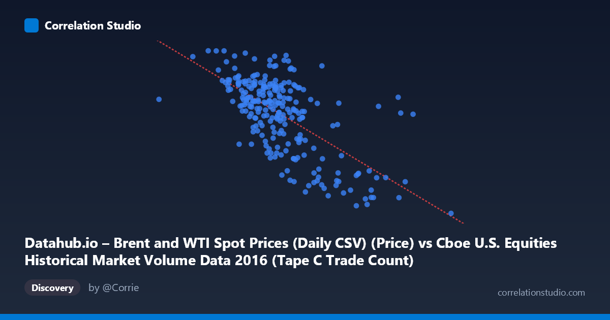
Datahub.io – Brent and WTI Spot Prices (Daily CSV) (Price) vs Cboe U.S. Equities Historical Market Volume Data 2016 (Tape C Trade Count)
- Pearson correlation (r)
- -0.6498
- Spearman correlation
- -0.5868
- p-value
- 0
- Sample size (n)
- 251
- 95% confidence interval
- -0.716 to -0.572
- Granger causality
- None
- Granger optimal lag
- 1
AI analysis
Analysis: Brent Oil Prices vs. Cboe Tape C Trade Count (2016)
Relationship Overview The scatterplot reveals a moderate negative relationship between U.S. equity market trading volume (Tape C trade count, on the Y-axis) and Brent crude oil spot prices (on the X-axis) across 2016. As oil prices increase, Tape C trade counts tend to decline, and vice versa. The linear regression equation (y = -2.979E-05x + 64.94) confirms this inverse slope, suggesting that for every unit increase in the volume/price metric on the X-axis, the Brent price decreases by approximately 0.00003 units. Visually, the data cloud slopes downward from left to right, though with considerable scatter around the trend line, indicating the relationship is real but far from deterministic.
Correlation Strength and Statistical Significance The Pearson correlation of r = -0.650 indicates a moderate-to-strong negative linear association. The R² of 0.422 means that roughly 42% of the variance in Brent oil prices is statistically accounted for by Tape C trade counts — meaningful, but leaving 58% unexplained by this variable alone. The 95% confidence interval of [-0.716, -0.572] is relatively tight and does not cross zero, reinforcing confidence in the direction and approximate magnitude of the effect. With a p-value reported as 0 (effectively p < 0.0001) across a sample of 251 paired observations drawn from a population of 3,622, the correlation is highly statistically significant and unlikely to be a chance finding. However, Granger causality tests show no significant predictive directionality in either direction (X→Y: p = 0.547; Y→X: p = 0.355), meaning neither variable reliably predicts the other one period ahead. This is a critical nuance: the variables are correlated contemporaneously, but neither appears to lead the other temporally.
Notable Patterns, Clusters, and Outliers Several features stand out in the data. There is a visible cluster of high trade-count, lower oil-price observations concentrated in the left-center of the chart (roughly X: 500,000–700,000, Y: 46–54), suggesting a period when equity trading was elevated while oil remained depressed — consistent with early-to-mid 2016 when Brent was near multi-year lows. Conversely, a sparse cluster of low trade counts and higher oil prices appears toward the right (X 900,000), likely reflecting the oil price recovery in late 2016. Several notable outliers are visible: the point at approximately (1,323,308, 26.01) sits far to the right with very low oil prices and extremely high trade volume, and points near (1,023,027, 27.59) and (990,202, 33.01) similarly anchor the high-volume, low-price region. These extreme values may disproportionately influence the regression slope.
Confounding Factors and Caveats This correlation almost certainly reflects a shared temporal driver rather than a direct causal mechanism between equity trade counts and oil prices. Both variables were heavily influenced by the macroeconomic narrative of 2016: oil prices were depressed through early 2016 (creating high market uncertainty and trading activity) and recovered through the year following OPEC agreements, while equity volatility — and thus trade counts — shifted accordingly. Volatility regimes (e.g., VIX levels), broader market sentiment, and macro events (Brexit, U.S. elections) likely drove both series simultaneously, acting as confounders. The Granger non-causality result supports this interpretation: the variables move together due to a common cause rather than influencing each other. Additionally, the axis labels appear swapped in the dataset metadata (the dataset descriptions reference each other's variables), which warrants verification before drawing firm conclusions.
Actionable Insights and Further Investigation Given the absence of Granger causality, practitioners should not use one variable to forecast the other in a trading or operational context without additional covariates. Instead, the correlation is better understood as a coincident indicator of broader market stress conditions in 2016. Useful next steps would include: (1) incorporating a volatility index (VIX) or macro uncertainty measure as a mediating variable to test whether the correlation disappears when controlling for market stress; (2) extending the time series beyond 2016 to test whether the relationship holds across different oil price regimes; (3) performing rolling-window correlation analysis to identify whether the relationship was stable throughout the year or concentrated in specific sub-periods (e.g., the February 2016 oil trough); and (4) disaggregating trade counts by sector to determine whether energy-sector equities specifically drive the Tape C relationship, which would provide a more theoretically grounded explanation for the observed pattern.
X dataset: Cboe U.S. Equities Historical Market Volume Data 2016
Y dataset: Datahub.io – Brent and WTI Spot Prices (Daily CSV)
Part of experiment: Daily - Cboe U.S. Equities Historical Market Volume Data 2016 vs Datahub.io – Brent and WTI Spot Prices (Daily CSV)