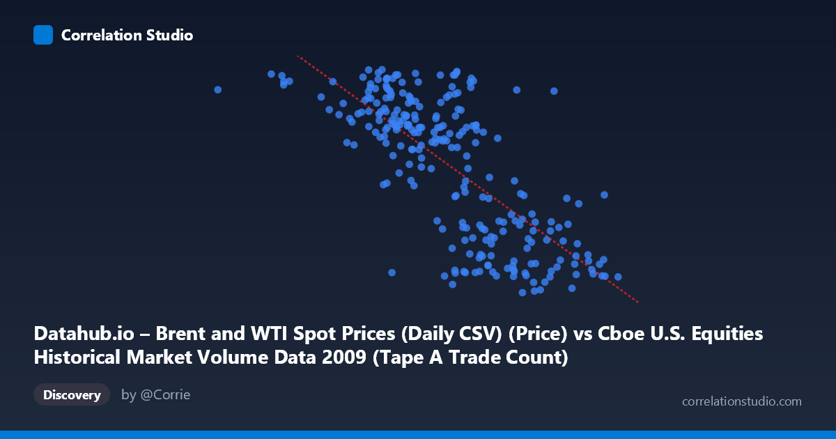
Datahub.io – Brent and WTI Spot Prices (Daily CSV) (Price) vs Cboe U.S. Equities Historical Market Volume Data 2009 (Tape A Trade Count)
- Pearson correlation (r)
- -0.7366
- Spearman correlation
- -0.719
- p-value
- 0
- Sample size (n)
- 252
- 95% confidence interval
- -0.7884 to -0.6744
- Granger causality
- None
- Granger optimal lag
- 1
AI analysis
Analysis of Brent/WTI Oil Prices vs. U.S. Equity Market Trade Counts (2009)
Relationship Overview The scatterplot reveals a moderately strong negative relationship between U.S. equity market daily trade counts (X-axis) and Brent/WTI spot oil prices (Y-axis) across 252 trading days in 2009. As market trade volume increases, oil prices tend to decrease — a pattern that is visually apparent as a downward-sloping cloud of points spanning from roughly 362,000 to 2,549,000 trade counts on the X-axis and $39–$79 per barrel on the Y-axis. The linear regression equation (y = -2.336×10⁻⁵x + 99.80) suggests that each additional million trades is associated with approximately a $23.36 decline in oil price, though this mechanical interpretation should be treated cautiously given the temporal and structural complexities at play.
Correlation Strength, Direction, and Causality The Pearson correlation of r = -0.737 indicates a moderately strong negative association, with r² = 0.543 meaning that roughly 54.3% of the variance in oil prices is statistically explained by trade count levels in this sample. The 95% confidence interval of [-0.788, -0.674] is relatively tight and does not include zero, and the p-value is effectively 0, confirming this is not a chance finding within this dataset. However, the Granger causality results tell a more sobering story: neither X→Y (F = 0.258, p = 0.612) nor Y→X (F = 1.010, p = 0.316) achieves significance at even a lenient threshold. This means that despite the strong contemporaneous correlation, neither variable temporally predicts the other at a one-period lag — the correlation reflects co-movement rather than a directional, predictive relationship.
Patterns, Clusters, and Outliers The data exhibits two loosely distinguishable clusters that likely reflect 2009's distinct market regimes: a high-trade-count / low-oil-price cluster (roughly X 1,800,000; Y < 55), and a lower-trade-count / higher-oil-price cluster (X < 1,500,000; Y 65). This bifurcation aligns with 2009's macro narrative — early-year crisis conditions drove extreme equity trading volumes amid depressed commodity prices, while the second half saw recovery with rising oil and stabilizing (lower) trade counts. One notable outlier appears at approximately (362,081; 75.15) — an unusually low trade count paired with elevated oil prices — which may represent a holiday-shortened or anomalous session. A few points in the mid-range (e.g., ~1,744,000; 75.56 and ~1,748,000; 77.18) deviate from the general trend and warrant inspection.
Confounding Factors and Caveats The most critical caveat here is spurious correlation driven by shared time dependency. Both variables were profoundly shaped by the 2009 financial crisis recovery arc: equity trade volumes were elevated during peak uncertainty (Q1 2009) and gradually normalized, while oil prices recovered from historic lows in tandem with broader risk sentiment. This means the negative correlation may largely reflect a common third driver — macroeconomic conditions and investor risk appetite — rather than any structural link between oil prices and equity trade counts. Additionally, the dataset's note labels appear inverted (X-axis described as oil prices but labeled as market volume, and vice versa), suggesting a potential metadata mismatch that should be verified before drawing firm conclusions. The population N of 3,232 vs. sample n of 252 also warrants attention regarding representativeness.
Actionable Insights and Further Investigation Given the strong contemporaneous correlation but absent Granger causality, analysts should resist using trade count as a predictive signal for oil prices (or vice versa) in isolation. A more productive path would be to introduce a common macro factor — such as the VIX, S&P 500 returns, or USD index — as a control variable to test whether the correlation persists after accounting for shared risk-sentiment drivers. A time-series decomposition separating the crisis period (Q1) from the recovery period (Q2–Q4) would help determine whether the correlation is stable or regime-dependent. Additionally, non-linear modeling (e.g., a segmented regression or LOESS fit) may better capture the apparent clustering behavior visible in the chart. Finally, resolving the potential axis/metadata labeling inconsistency is a necessary first step before any findings are acted upon operationally.
X dataset: Cboe U.S. Equities Historical Market Volume Data 2009
Y dataset: Datahub.io – Brent and WTI Spot Prices (Daily CSV)
Part of experiment: Daily - Cboe U.S. Equities Historical Market Volume Data 2009 vs Datahub.io – Brent and WTI Spot Prices (Daily CSV)