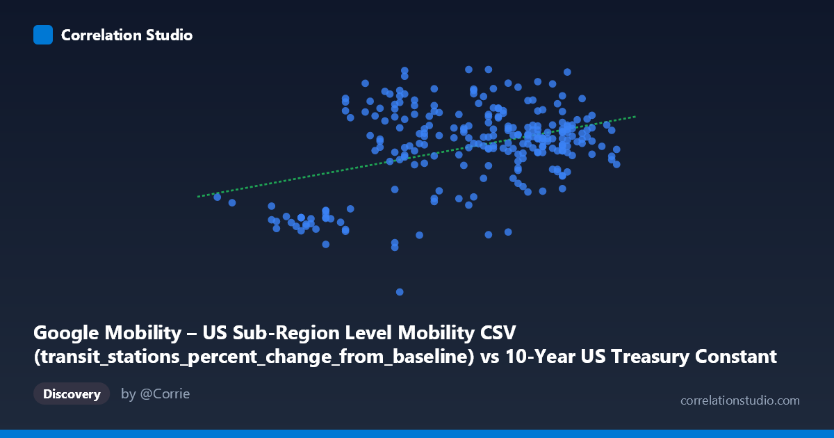
Google Mobility – US Sub-Region Level Mobility CSV (transit_stations_percent_change_from_baseline) vs 10-Year US Treasury Constant Maturity Rate (FRED) (DGS10)
- Pearson correlation (r)
- 0.4003
- Spearman correlation
- 0.1969
- p-value
- 0
- Sample size (n)
- 251
- 95% confidence interval
- 0.2909 to 0.4994
- Granger causality
- None
- Granger optimal lag
- 1
AI analysis
Analysis: Transit Station Mobility vs. 10-Year Treasury Yield (2021)
1. Overall Relationship The scatterplot reveals a modest positive relationship between the 10-Year US Treasury Constant Maturity Rate (x-axis) and transit station mobility changes from baseline (y-axis) across 2021. As Treasury yields increased — broadly reflecting economic reopening optimism and inflation expectations throughout the year — transit station visits also tended to recover toward and above baseline levels. The linear regression (y = 23.62x − 34.33) captures this upward trend, but the wide vertical scatter at virtually every x-value makes immediately clear that yield alone is a weak predictor of mobility behavior.
2. Correlation Strength and Statistical Significance The correlation of r = 0.40 is statistically significant (p = 4.45×10⁻¹¹), but practically modest. More tellingly, r² = 0.16 means that only ~16% of the variance in transit mobility is explained by Treasury yield levels — the remaining 84% is attributable to other forces entirely. The 95% confidence interval [0.29, 0.50] confirms the effect is reliably positive but spans a range that would be considered weak-to-moderate at best. Critically, the Granger causality analysis finds no significant predictive directionality in either direction (X→Y: F = 0.66, p = 0.42; Y→X: F = 0.89, p = 0.35), meaning that knowing yesterday's Treasury yield does not help predict today's mobility change, and vice versa. This strongly cautions against any causal or even leading-indicator interpretation of the correlation.
3. Notable Patterns, Clusters, and Outliers Several features stand out in the data. There is a dense cluster of points between x = 1.45–1.65 (the dominant yield range for mid-to-late 2021), where mobility values span the entire range from roughly −25 to +20, illustrating how weakly constrained mobility was even at similar yield levels. The lower-left region (yields ~0.93–1.20) contains several severe negative outliers — including points near −38, −22, and −21 — almost certainly corresponding to the winter wave of COVID-19 in early January 2021 when both yields were suppressed and mobility was deeply negative. A point at (1.30, −38.26) is a particularly stark outlier. Conversely, positive mobility values above +10 appear scattered across a wide yield range (1.19 to 1.63), suggesting that local or regional reopening dynamics, not yield levels, drove those recoveries.
4. Confounding Factors and Caveats This correlation is almost certainly spurious or substantially confounded by a shared temporal trend — the most important caveat here. Both variables moved in a broadly similar direction over 2021 simply because the year progressed from pandemic suppression in winter to economic reopening in spring and summer. Rising yields reflected Federal Reserve expectations and inflation dynamics; recovering mobility reflected vaccination rollout, lifting of restrictions, and behavioral adaptation. These are both downstream of the same macro-epidemiological timeline, not causally linked to each other. Additionally, the geographic aggregation mismatch is significant: Treasury yield is a single national daily value, while mobility data is at the US sub-region (county) level — mixing a scalar economic variable with spatially heterogeneous behavioral data introduces enormous noise. Seasonal patterns, local policy variation, demographic differences across counties, and variant-driven surges (Delta in summer/fall 2021) all independently drive mobility in ways yield cannot capture.
5. Actionable Insights and Further Investigation Given the absence of Granger causality and the large unexplained variance, this correlation should not be used as a predictive or causal tool. However, several avenues merit further investigation. First, detrending both series (removing the shared 2021 temporal trend) before computing correlation would reveal whether any genuine co-movement exists beyond the common calendar effect. Second, stratifying mobility by geography (urban vs. rural counties, or by state policy stringency) could reveal subgroup relationships that are masked in the aggregate. Third, examining lagged relationships at longer horizons (e.g., 4–8 week lags rather than just 1 period) might uncover delayed behavioral responses to financial conditions. Finally, a multivariate model incorporating vaccination rates, case counts, and policy stringency alongside Treasury yields would allow proper attribution of variance — likely showing yield's independent contribution shrinks considerably or disappears once epidemiological controls are included.
X dataset: 10-Year US Treasury Constant Maturity Rate (FRED)
Y dataset: Google Mobility – US Sub-Region Level Mobility CSV
Part of experiment: Daily - 10-Year US Treasury Constant Maturity Rate (FRED) vs Google Mobility – US Sub-Region Level Mobility CSV