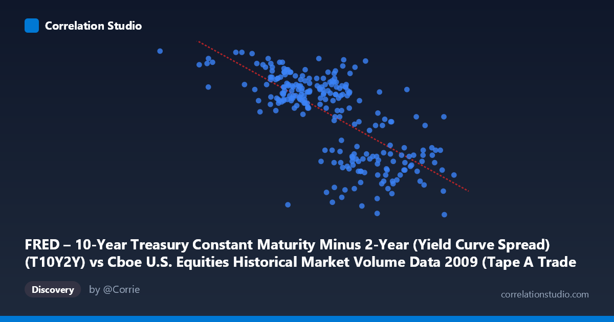
FRED – 10-Year Treasury Constant Maturity Minus 2-Year (Yield Curve Spread) (T10Y2Y) vs Cboe U.S. Equities Historical Market Volume Data 2009 (Tape A Trade Count)
- Pearson correlation (r)
- -0.7043
- Spearman correlation
- -0.6931
- p-value
- 0
- Sample size (n)
- 250
- 95% confidence interval
- -0.7618 to -0.6357
- Granger causality
- None
- Granger optimal lag
- 1
AI analysis
Analysis: Yield Curve Spread vs. Tape A Trade Count (2009)
Relationship Overview
The scatterplot reveals a moderate-to-strong negative relationship between the 10-Year minus 2-Year Treasury yield curve spread (X-axis) and Tape A trade counts on U.S. equity exchanges (Y-axis) throughout 2009. As the yield curve steepened — meaning long-term rates rose further above short-term rates — daily equity trade counts generally declined. This pattern is economically intuitive for the post-financial crisis environment of 2009: early in the year, markets were highly distressed, producing elevated trading activity (panic selling, forced liquidations, high-frequency repositioning), while the yield curve was relatively flat or inverted. As the year progressed and the Federal Reserve's near-zero short-term rate policy took hold, the spread widened dramatically, coinciding with calmer, lower-volume equity markets. The linear regression equation y = -6.01×10⁻⁷x + 3.287 quantifies this decline, suggesting that for every 100,000-unit increase in the spread measure, Tape A trade count falls by roughly 0.06 units on the Y-scale.
Correlation Strength, Direction, and Statistical Significance
The Pearson correlation of r = -0.704 indicates a moderately strong negative association, with the 95% confidence interval spanning [-0.762, -0.636] — a relatively tight band that excludes zero entirely and confirms the direction with high certainty. The p-value of essentially 0 across a paired sample of 250 drawn from a population of 3,232 trading observations leaves no ambiguity about statistical significance. However, r² = 0.496 is the more practically important figure: the yield curve spread explains approximately 49.6% of the variance in Tape A trade counts, meaning roughly half the variation in daily trading activity is associated with changes in the spread, while the other half is driven by factors this model does not capture. This is a meaningful but incomplete explanatory relationship — strong enough to be economically interesting, but insufficient for standalone prediction. Critically, the Granger causality tests fail in both directions (X→Y: F = 1.91, p = 0.168; Y→X: F = 0.01, p = 0.917), meaning neither variable temporally predicts the other in a statistically meaningful way at a one-period lag. This strongly cautions against interpreting the correlation as a causal or directionally predictive mechanism — both series are likely being driven by a common third force, namely the broader arc of the 2009 financial crisis recovery.
Notable Patterns, Clusters, and Outliers
Several structural features are visible in the sample data. There is a notable cluster of high-spread, moderate-to-low trade count observations concentrated in the X range of roughly 1,500,000–2,000,000, reflecting mid-to-late 2009 conditions as markets stabilized. Conversely, points in the lower-left region of the chart (low spread, high trade count near 2.7–2.8) correspond to early 2009 crisis-period activity — the observation at X ≈ 362,081 with Y = 2.82 is a conspicuous outlier at the extreme low end of the spread, representing peak crisis volatility. Similarly, the point at X ≈ 2,549,192 with Y = 1.82 anchors the upper-right extreme. There also appear to be two loose sub-clusters within the middle range: one where trade counts remain elevated (Y ≈ 2.4–2.7) despite moderate spreads, and another where trade counts are suppressed (Y ≈ 1.6–2.0) at higher spreads, suggesting a possible non-linear or threshold effect around X ≈ 1,800,000–2,000,000 where the relationship steepens.
Confounding Factors and Interpretive Caveats
The most significant caveat is temporal autocorrelation masquerading as cross-sectional correlation: both series evolve together over calendar time in 2009, and what appears as a cross-variable relationship may simply reflect two separate time trends sharing a common temporal driver — the crisis-to-recovery trajectory. The yield curve spread widened almost monotonically as the Fed held short rates near zero while long rates normalized, and trade volumes declined as panic subsided. A spurious correlation driven by shared trending is a serious concern here. Additional confounders include: regulatory changes and exchange competition dynamics affecting Tape A specifically; the introduction of new trading venues and dark pools in 2009 that may have diverted volume; macroeconomic announcements (TARP, stress tests, stimulus) creating discrete volume spikes unrelated to the spread; and seasonal patterns in both equity volume and yield curve behavior. The dataset's granularity (daily frequency) also means that short-term noise may obscure the structural relationship the model implies.
Actionable Insights and Further Investigation
Despite the Granger causality null result, the ~50% variance explanation is substantial enough to warrant deeper investigation. First, a time-detrended or first-differenced analysis should be performed to separate genuine co-movement from shared temporal drift — if the correlation persists after detrending, the relationship is more robust. Second, the apparent non-linearity around the 1.8–2.0 million spread threshold warrants testing a piecewise or polynomial regression model, which may improve upon the linear r² of 0.496. Third, researchers should examine whether the relationship holds in other years (2008, 2010) or whether it is entirely a 2009 crisis artifact — if it disappears in non-crisis years, it has limited generalizability. Fourth, controlling for VIX or overall market volatility as a covariate would help isolate whether the yield curve spread carries independent information beyond general risk sentiment. Finally, disaggregating Tape A trade counts by exchange or trader type (institutional vs. retail vs. high-frequency) could reveal whether the volume-spread relationship is concentrated in specific market participant behavior, which would have more targeted practical implications for market structure analysis.
X dataset: Cboe U.S. Equities Historical Market Volume Data 2009
Y dataset: FRED – 10-Year Treasury Constant Maturity Minus 2-Year (Yield Curve Spread)
Part of experiment: Daily - Cboe U.S. Equities Historical Market Volume Data 2009 vs FRED – 10-Year Treasury Constant Maturity Minus 2-Year (Yield Curve Spread)