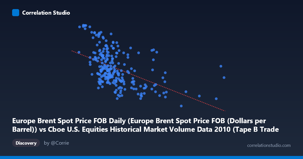
Europe Brent Spot Price FOB Daily (Europe Brent Spot Price FOB (Dollars per Barrel)) vs Cboe U.S. Equities Historical Market Volume Data 2010 (Tape B Trade Count)
- Pearson correlation (r)
- -0.4964
- Spearman correlation
- -0.5404
- p-value
- 0
- Sample size (n)
- 252
- 95% confidence interval
- -0.5842 to -0.3972
- Granger causality
- None
- Granger optimal lag
- 1
AI analysis
Analysis: Europe Brent Spot Price vs. Cboe Tape B Trade Count (2010)
Relationship Overview The scatterplot reveals a moderate negative relationship between Europe Brent Spot crude oil prices (X-axis, in dollars per barrel) and Cboe U.S. Equities Tape B trade counts (Y-axis). As oil prices increase, trade counts on Tape B (which covers NYSE American-listed securities, ETFs, and regional exchange issues) tend to decline. The fitted regression line (y = -2.27×10⁻⁵x + 86.50) reflects this downward slope, though the scatter around the line is substantial, indicating that many other forces are simultaneously shaping trade activity throughout the 2010 trading year.
Correlation Strength and Statistical Interpretation The Pearson correlation of r = -0.4964 indicates a moderate inverse association. However, the R² of 0.2464 means that Brent crude price explains only about 24.6% of the variance in Tape B trade counts — leaving roughly three-quarters of the variation unexplained by this relationship alone. The 95% confidence interval of [-0.584, -0.397] is meaningfully narrow and sits entirely in negative territory, confirming the direction is reliable. The p-value of essentially zero, combined with a large population of N = 3,302, confirms this is not a chance finding. That said, Granger causality tests found no significant predictive directionality in either direction (X→Y: F = 0.28, p = 0.59; Y→X: F = 2.58, p = 0.11), meaning that knowing yesterday's oil price does not statistically improve forecasts of today's trade count, and vice versa. This is a critical caveat: the correlation is real but lacks temporal predictive power at a one-period lag.
Notable Patterns, Clusters, and Outliers Several features stand out in the sampled data. There is a visible cluster of observations at lower oil price ranges (roughly $150,000–$350,000 in the scaled X units) with trade counts spanning a wide range from ~74 to over 93, suggesting high variance in trading activity when oil prices are moderate. At higher oil price values (above ~$500,000 units), trade counts compress noticeably into a narrower, lower range (~67–76), consistent with the negative trend. A few notable outliers are visible: the point near (918,659, 76.48) sits far to the right with a relatively average trade count, while points like (120,757, 93.63) and (134,700, 93.55) exhibit very high trade counts at low oil prices — these high-leverage points likely exert meaningful influence on the regression slope. The relationship also shows possible non-linearity, with a steeper decline at higher price levels and more scatter at lower prices.
Confounding Factors and Interpretive Caveats This correlation almost certainly reflects shared temporal dynamics rather than a direct causal mechanism between oil prices and Tape B equity trade counts. Both series unfold across the same calendar year (January–December 2010), a period during which broader macroeconomic recovery from the 2008–2009 financial crisis was underway. Rising oil prices in 2010 generally corresponded with a later phase of the year when market volatility was declining and overall equity trading volumes were contracting from post-crisis highs — making a common time trend the most plausible confound. Additionally, Tape B specifically covers smaller-cap and ETF activity, which may respond to risk appetite and volatility indices (like the VIX) more directly than to oil prices. The absence of Granger causality further supports the interpretation that this is a spurious or confounded correlation driven by a shared underlying temporal variable.
Actionable Insights and Further Investigation Given the moderate but unexplained variance and the absence of Granger causality, practitioners should be cautious about using oil price as a direct input for predicting Tape B trading activity. Recommended next steps include: (1) introducing a time-trend control variable or detrending both series to test whether the correlation persists after removing shared temporal drift; (2) extending the Granger causality analysis to longer lag structures (beyond 1 period) to check whether predictive relationships emerge at weekly or multi-day horizons; (3) incorporating volatility measures (VIX, realized variance) and broader market volume (Tape A and C) as covariates to better isolate any oil-specific signal; and (4) running a rolling-window correlation analysis across the year to detect whether the relationship strengthens or weakens during specific market regimes (e.g., Q1 vs. Q4 2010). The high-trade-count outliers at low oil prices also warrant closer inspection, as they may correspond to specific market events that distort the overall fit.
X dataset: Cboe U.S. Equities Historical Market Volume Data 2010
Y dataset: Europe Brent Spot Price FOB Daily
Part of experiment: Daily - Cboe U.S. Equities Historical Market Volume Data 2010 vs Europe Brent Spot Price FOB Daily