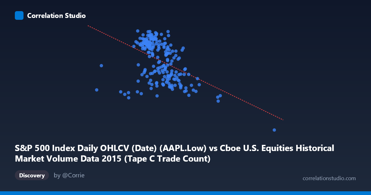
S&P 500 Index Daily OHLCV (Date) (AAPL.Low) vs Cboe U.S. Equities Historical Market Volume Data 2015 (Tape C Trade Count)
- Pearson correlation (r)
- -0.4541
- Spearman correlation
- -0.4608
- p-value
- 0
- Sample size (n)
- 222
- 95% confidence interval
- -0.5528 to -0.343
- Granger causality
- None
- Granger optimal lag
- 1
AI analysis
Scatterplot Analysis: AAPL Low Price vs. Cboe Tape C Trade Count (2015)
Relationship Overview The scatterplot reveals a negative relationship between Apple's daily low price (X-axis) and the Cboe U.S. Equities Tape C trade count (Y-axis) over the 2015 trading year. As AAPL's low price increases, the Tape C trade count tends to decrease, following the linear regression equation y = -2.58×10⁻⁵x + 139.34. This is a somewhat counterintuitive pairing — one variable reflects a single equity's pricing and the other reflects broad market-wide trading activity — yet the data shows a discernible downward trend across the scatter. The relationship likely reflects the broader market context of 2015, during which AAPL experienced a notable price decline in the second half of the year, coinciding with periods of elevated market-wide trading volume driven by volatility.
Correlation Strength and Statistical Significance The Pearson correlation of r = -0.4541 indicates a moderate negative association, but the explanatory power is meaningfully limited: r² = 0.2062, meaning only about 20.6% of the variance in Tape C trade counts is explained by AAPL's low price. While statistically robust — the p-value of 1.075×10⁻¹² is extraordinarily small, confirming this is not a chance finding — the 95% confidence interval of [-0.5528, -0.3430] reminds us there is still meaningful uncertainty in the precise magnitude of the relationship. In practical terms, roughly 79% of the variation in trade count is driven by factors entirely unrelated to AAPL's price level. The Granger causality results are equally important: neither direction shows significant predictive causality (X→Y: F = 0.4447, p = 0.506; Y→X: F = 0.0199, p = 0.888), meaning this correlation does not translate into a useful temporal forecasting relationship — knowing one variable does not help predict the other in subsequent periods.
Notable Patterns, Clusters, and Outliers The bulk of the data clusters in a core band roughly between AAPL Low prices of $600,000–$900,000 (likely scaled/indexed values) and trade counts of 110–131, forming a moderately dense cloud with visible downward slope. However, two notable outlier regions stand out. First, the point at approximately (1,611,853, 92.0) is a dramatic outlier — far to the right and well below the main cluster — likely corresponding to a single extreme trading day (possibly the August 2015 market sell-off) that anchors the regression slope considerably. Second, there are a handful of points near (291,078–499,837) on the low end of X, suggesting unusual low-price days. A possible non-linear feature is also visible: the relationship appears steeper at the extremes and flatter in the core cluster, hinting that a simple linear fit may not fully capture the dynamics at play.
Confounding Factors and Caveats Several important caveats apply. First, the axis labeling appears swapped in the dataset metadata — AAPL Low is listed as coming from the Cboe dataset and Tape C trade count from the S&P 500 dataset, suggesting a data joining artifact that should be verified before drawing firm conclusions. Second, both variables are likely driven by a common latent factor: broad market volatility. The dramatic August 2015 correction caused simultaneous AAPL price drops and volume spikes across all exchanges, which could artificially inflate the apparent correlation. Third, the N = 506 population vs. n = 222 paired sample discrepancy means roughly 56% of trading days lack paired observations, potentially introducing selection bias. Finally, the relationship may be spurious co-movement rather than any structural economic link between a single stock's price and total market trade counts.
Actionable Insights and Further Investigation Given that the Granger causality tests show no predictive temporal direction, this correlation should not be used for forecasting purposes. However, several follow-up analyses are warranted: (1) Remove or isolate the August 2015 outlier to determine how much of the r = -0.45 is driven by that single event cluster; (2) Include a volatility index (VIX) as a covariate to test whether it mediates the relationship, effectively absorbing both variables as symptoms of market stress; (3) Verify the dataset join logic to confirm the axis assignments are correct; and (4) Test non-linear models (e.g., polynomial or piecewise regression) given the potential curvature in the extremes. Understanding whether this correlation persists in calmer market years (e.g., 2016–2017) would help distinguish a structural relationship from a 2015-specific volatility artifact.
X dataset: Cboe U.S. Equities Historical Market Volume Data 2015
Y dataset: S&P 500 Index Daily OHLCV (Date)
Part of experiment: Daily - Cboe U.S. Equities Historical Market Volume Data 2015 vs S&P 500 Index Daily OHLCV (Date)