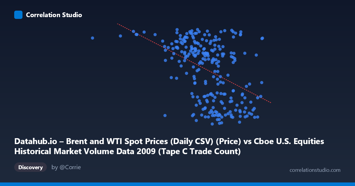
Datahub.io – Brent and WTI Spot Prices (Daily CSV) (Price) vs Cboe U.S. Equities Historical Market Volume Data 2009 (Tape C Trade Count)
- Pearson correlation (r)
- -0.445
- Spearman correlation
- -0.4451
- p-value
- 0
- Sample size (n)
- 252
- 95% confidence interval
- -0.539 to -0.3402
- Granger causality
- None
- Granger optimal lag
- 1
AI analysis
Analysis: Brent Oil Prices vs. Cboe Tape C Trade Count (2009)
Relationship Overview The scatterplot reveals a negative relationship between U.S. equity market trading volume (Cboe Tape C Trade Count, on the X-axis) and Brent crude oil spot prices (Y-axis) across 252 trading days in 2009. As exchange trade counts increase — reflecting higher market activity — Brent oil prices tend to be lower, and conversely, lower trading volumes coincide with higher oil prices. The linear regression equation (y = −5.49×10⁻⁵x + 96.66) quantifies this: for every one-unit increase in trade count, oil prices decline by roughly 0.0000549 USD per barrel, though the practical interpretation is more meaningful when considering the full range of X values (~185,000 to ~848,000 trades), which spans roughly a 36 USD/barrel difference in predicted oil price.
Correlation Strength and Statistical Significance The Pearson correlation of r = −0.445 indicates a moderate negative association, with R² = 0.198, meaning that approximately 19.8% of the variance in Brent oil prices is explained by trade count levels. While statistically robust — the p-value of 1.16×10⁻¹³ strongly rejects the null hypothesis of no correlation, and the 95% confidence interval [−0.539, −0.340] is entirely negative and relatively tight — the explanatory power remains modest. Over 80% of the variation in oil prices is attributable to other factors not captured by this variable alone. Critically, Granger causality tests find no significant predictive direction in either direction (X→Y: F=1.17, p=0.281; Y→X: F=1.44, p=0.232), meaning that past trade count values do not help forecast oil prices and vice versa at the tested lag. This is an important caveat: the correlation is contemporaneous rather than temporally predictive.
Notable Patterns and Outliers The scatterplot exhibits a moderately dispersed cloud with a discernible downward trend, though with substantial vertical scatter across all X values, consistent with the moderate R². Several notable features emerge from the sample points. The extreme left outlier at approximately (185,887, 75.15) stands out as an unusually low-volume day with relatively high oil prices — likely an early January 2009 holiday-adjacent trading session when volumes were thin and oil had not yet collapsed from its late-2008 peak. High-volume days (X 750,000) cluster predominantly in the 40–55 USD/barrel range, while lower-volume days (X < 600,000) show greater price dispersion, spanning roughly 42–78 USD/barrel. There is also some suggestion of a non-linear or bimodal structure: oil prices appear to occupy two loose bands (roughly 40–55 and 65–78 USD), potentially reflecting 2009's oil price recovery trajectory from early-year lows (~$35–40) to year-end levels (~$75–80), which may interact with changing volume regimes rather than reflecting a smooth linear relationship.
Confounding Factors and Caveats This correlation almost certainly reflects a shared temporal confound rather than a direct causal mechanism. In 2009, global markets experienced a dramatic recovery from the financial crisis: equity trading volumes were extremely elevated during the high-volatility, crisis-era months of early 2009 when oil prices were depressed, and volumes normalized as markets stabilized later in the year when oil had recovered. Both variables are therefore being driven largely by the macroeconomic recovery cycle — risk appetite, institutional positioning, and the broader flight-to-risk narrative — rather than directly influencing one another. Additionally, Tape C specifically reflects NYSE Arca-listed securities, which may over-represent ETFs and sector-specific instruments, introducing selection bias. The axis labels also appear potentially swapped in the dataset description (X is labeled as oil price data source but contains trade count ranges; Y is labeled as Cboe data but contains oil price ranges), suggesting possible metadata inconsistency that warrants verification before drawing firm conclusions.
Actionable Insights and Further Investigation Given that the correlation is statistically significant but explained variance is limited and Granger causality is absent, this relationship is best treated as a coincident indicator of macro regime rather than a trading signal. Analysts should consider: (1) controlling for date/time by including a temporal trend variable to determine how much of the correlation dissolves once the 2009 recovery trajectory is accounted for; (2) segmenting the year into crisis (Q1), recovery (Q2–Q3), and stabilization (Q4) phases to test whether the correlation is consistent or driven by a specific sub-period; (3) testing alternative volume metrics such as notional value traded, which may better capture the risk-on/risk-off dynamic; and (4) extending the analysis across multiple years to determine whether this negative relationship persists or was uniquely a 2009 crisis-recovery artifact. A multivariate regression incorporating VIX, USD index, and S&P 500 returns as co-variates would help isolate whether any independent relationship between trade activity and oil prices survives controlling for broader market conditions.
X dataset: Cboe U.S. Equities Historical Market Volume Data 2009
Y dataset: Datahub.io – Brent and WTI Spot Prices (Daily CSV)
Part of experiment: Daily - Cboe U.S. Equities Historical Market Volume Data 2009 vs Datahub.io – Brent and WTI Spot Prices (Daily CSV)