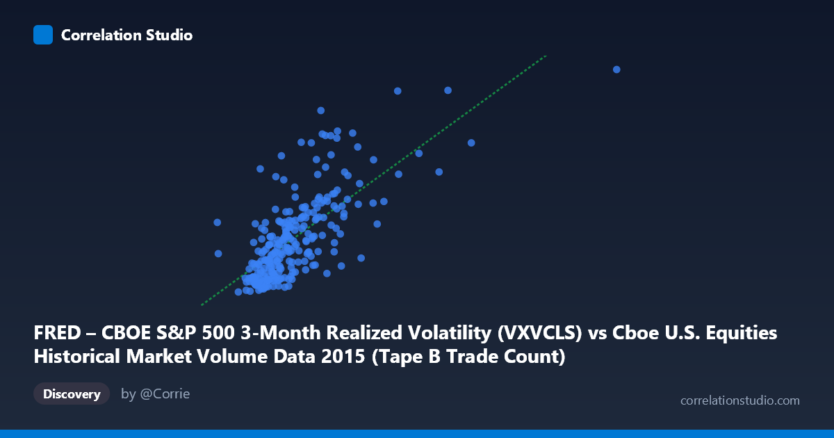
FRED – CBOE S&P 500 3-Month Realized Volatility (VXVCLS) vs Cboe U.S. Equities Historical Market Volume Data 2015 (Tape B Trade Count)
- Pearson correlation (r)
- 0.7141
- Spearman correlation
- 0.713
- p-value
- 0
- Sample size (n)
- 252
- 95% confidence interval
- 0.6477 to 0.7698
- Granger causality
- None
- Granger optimal lag
- 1
AI analysis
Analysis: CBOE S&P 500 3-Month Realized Volatility vs. Tape B Trade Count (2015)
Relationship Overview
The scatterplot reveals a moderately strong positive relationship between CBOE S&P 500 3-month realized volatility (VXVCLS) and Tape B trade counts across U.S. equity exchanges in 2015. As realized volatility increases, the number of Tape B trades tends to rise correspondingly, consistent with the well-established market microstructure principle that volatile periods attract heightened trading activity. The linear regression equation (y = 2.45×10⁻⁵x + 11.16) suggests that for every 100,000-unit increase in trade volume, volatility increases by approximately 2.45 index points, though the relationship is clearly not perfectly linear across the full range of the data.
Correlation Strength and Statistical Significance
The Pearson correlation of r = 0.714 indicates a moderately strong positive association, and the R² of 0.510 means that approximately 51% of the variance in volatility is explained by Tape B trade count. While statistically meaningful, this also implies that roughly half of the variation in realized volatility remains unexplained by this single variable alone. The 95% confidence interval for r [0.648, 0.770] is relatively tight, reflecting the substantial sample size (n = 252 trading days), and the p-value of effectively zero confirms the relationship is highly unlikely to be due to chance. However, the Granger causality results are notably absent in both directions — X→Y (F = 0.068, p = 0.795) and Y→X (F = 0.002, p = 0.966) both fail to reach significance — meaning that neither variable reliably predicts the other in the subsequent period at a one-period lag. This is a critical caveat: the correlation reflects a contemporaneous co-movement, not a temporal lead-lag relationship suitable for forecasting.
Notable Patterns, Clusters, and Outliers
The scatterplot displays several visually distinct features worth noting. The bulk of observations cluster in the lower-left region, roughly where trade counts fall below 400,000 and volatility sits between 14 and 22 — consistent with the relatively calm first half of 2015. A separate, more dispersed cluster appears in the upper-right, corresponding to the elevated volatility and volume spike during the August 2015 market correction, where data points like (640,679; 29.58) and (621,009; 23.47) stand out as potential outliers or high-leverage points. These extreme observations likely exert disproportionate influence on the regression slope and may partially inflate the correlation coefficient. There is also a suggestion of heteroscedasticity — variance in volatility appears to fan out as trade count increases — which undermines the assumption of uniform residual variance in the linear model.
Confounding Factors and Interpretive Caveats
Several important caveats apply here. First, reverse causality is plausible: elevated volatility may drive traders to increase activity, rather than trade volume causing volatility — and the Granger test's failure to resolve directionality reinforces this ambiguity. Second, both variables are likely jointly driven by common macro shocks — such as the China-driven selloff in August 2015, Federal Reserve rate uncertainty, or broad risk-off episodes — making it difficult to isolate a structural relationship. Third, Tape B specifically covers NYSE American (formerly AMEX) and regional exchange listings, which may respond differently to volatility regimes than Tape A (NYSE) or Tape C (Nasdaq) stocks, limiting generalizability. Finally, the 3-month realized volatility measure is backward-looking and smoothed, potentially introducing a temporal mismatch with daily trade count observations that could both suppress and distort the measured correlation.
Actionable Insights and Further Investigation
Despite the lack of Granger causality, the strong contemporaneous correlation (r = 0.714) suggests that Tape B trade volume could serve as a real-time coincident indicator of volatility regimes, useful for intraday risk monitoring or margin management. Practitioners should investigate whether this relationship holds across Tape A and Tape C volumes, or whether Tape B's specific listing universe is uniquely sensitive to volatility. Further analysis should test for non-linear specifications (e.g., log-log or polynomial regression), which may better capture the fanning behavior at high-volume extremes and improve explanatory power beyond the current 51%. It would also be valuable to partial out the August 2015 correction period to assess whether the correlation persists in calmer regimes, or whether it is largely driven by a handful of high-stress trading days — a finding that would substantially change how practitioners should weight this relationship in normal market conditions.
X dataset: Cboe U.S. Equities Historical Market Volume Data 2015
Y dataset: FRED – CBOE S&P 500 3-Month Realized Volatility
Part of experiment: Daily - Cboe U.S. Equities Historical Market Volume Data 2015 vs FRED – CBOE S&P 500 3-Month Realized Volatility